关键词 > GGRA30
GGRA30: Geographic Information Systems (GIS) and Empirical Reasoning Assignment #1 Fall 2025
发布时间:2025-09-26
Hello, dear friend, you can consult us at any time if you have any questions, add WeChat: daixieit
GGRA30: Geographic Information Systems (GIS) and Empirical Reasoning
Assignment #1
Intro to Data Presentation using Excel
Fall 2025
Due Date: Sept. 24 before lecture.
Total marks possible: 19
1 Learning Outcomes
When this assignment is completed you will have achieved the following learning outcomes:
• Demonstrated familiarity with Excel.
• Demonstrated the use of Excel to summarize and visualize quantitative data.
• Demonstrated the use and interpretation of histograms and pivot tables for working with quan- titative data.
Answer all questions in Section 5. Mark values are given there.
2 Assignment Submission
Submit your neatly typed and formatted assignment by uploading a single document to the Quercus assignment. All elements, including required screenshots and written answers, should be included within the body of your document. Include your name and student number in your assignment docu- ment or it won’t be graded (see syllabus). The upload will accept a PDF. If you write your document in Word, you can export to create a PDF for upload.
The required screenshots must be legible within a full page view of the document. Therefore, you must carefully frame the elements to be included in the screenshot, capturing the required elements but not your entire screen. Paste the screenshot into your document to create a legible result. When marking, we will not magnify your document to account for a poorly planned, illegible screenshot. If we need to print your document, your screenshots should still be legible. See Section 4for information on taking screenshots.
3 Data Provided
File name: Selected_TDYP_PD_PD_Student_TripDist.xlsx
The file was derived from Transportation Tomorrow Surveys (TTS) data managed and provided by the Data Management Group, Department of Civil Engineering, University of Toronto.
The Excel file contains daily commute information for full- and part-time students, based on sur- veys. Each record shows an estimate of the number of daily commuting trips of a certain distance (in kilometres), completed between a pair of selected planning districts (PD) in Toronto and surrounding municipalities (Durham, York and Peel). The actual start and end of each trip is not recorded but trips are categorized according to which PDs the trip started and ended in and the distance travelled. The file contains the following columns:
• year: each record is tagged with the survey year in which the data was collected (1986, 1991, 1996, 2001, 2006, 2011, 2016 or 2022). Note that records tagged as “2022” were collected in 2022 and 2023 due to delays in the survey procedures caused by the COVID-19 pandemic.
• dist_km: straight line trip length in kilometres (based on actual start and finish locations).
• from_pd: Planning District (PD) from which the trip began. Numeric field. Although these in- structions describe PD using string tags like “PD06”, the PD identifiers in this column and to_pd are encoded as integers: 1 = “PD01”, 2 = “PD02”, etc.
• to_pd: Planning District (PD) where the trip ended.
• ntrips: estimate of the number of daily commuting trips that fit the criteria (year, from_pd, to_- pd, dist_km) specified by the other fields in the record.
For example, the record shown in Table 1 estimates that in 1986 there were 1537 daily trips by full- or part-time students from PD01 to PD06 which had a trip length of 5 km.
• The table will also contain other records showing the number of trips between those same zones in 1986 that had different trip lengths. Therefore, you should not interpret this record as showing the total number of daily trips from PD01 to PD06 in 1986. To calculate that total you must find all records in which from_pd is PD01, to_pd is PD06, and the year is 1986 and then sum all of the ntrips values contained in those records.
• Furthermore, the record in Table 1 only shows the number of trips in one direction. There may be another record showing the number of trips in the opposite direction (from_pd=PD06, to_- pd=PD01).
• If a record does not exist, the number of trips fitting the criteria (year, dist_km, from_pd, and to_pd) was zero.
Figure 1 shows the selection of Planning Districts (PD) for which records have been kept in the data provided for this assignment. University of Toronto Scarborough is in PD15.
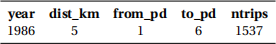
Table 1: Example record from the commute data.
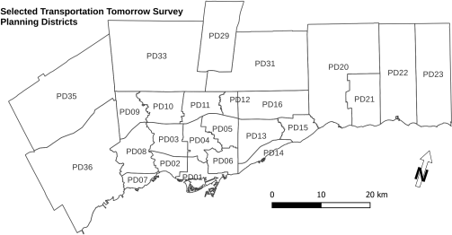
Figure 1: Map of selected planning districts (PD) in the Transportation Tomorrow Survey (TTS) data used for this assignment.
4 Procedures
All of the procedures required to answer the questions in this assignment are described in the instruc- tions for Practicals 1 (Week 2) and 2 (Week 3). They are not repeated here.
Question 3 asks you to create a screen capture to paste into your assignment. For tips on taking screenshots, including how to capture only parts of the screen, see:
• Windows: http://www.wikihow.com/Take-a-Screenshot-in-Microsoft-Windows(especially Snipping Tool methods and especiallynot the full-screen methods such as using the “Print Screen” button)
• Mac OS X: https://support.apple.com/en-us/HT201361
Do not take a photo of your computer screen using your phone or anyother camera. These are gen- erally much harder to read, ranging from bad to terrible, and will not be graded. Use your computer’s capabilities to capture an image of its own display.
5 Questions
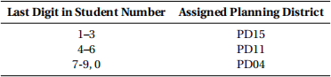
Answer the questions below using the 2022 data only. Some questions will ask you to answer only using records that describe trips that end in your assigned Planning District. The planning district you are to use depends on the last digit of your student number as shown in the table below.
The mark value of each question is included at the beginning of the question.
1. (1 mark) Use a filter to select only the survey records for 2022. How many are there?
2. Use filters to select only the survey records for daily commuting trips during 2022 that started from (from_pd) your assigned planning district.
(a) (1 mark) How many records are there?
(b) (1 mark) A trip “category” is defined as all of the trips that are collected into a single record in the data, having the same criteria (i.e., contain the same values) for the from_pd, to_pd, year, and dist_km fields. Which category of trip occurs most frequently of those in the 2022 data that end in, but don’t originate in, your assigned planning district? For the category that occurred most often, state the PD the trip category started in, the PD the trip ended in, the distance, and the estimated number of daily trips.
3. Clear all column filters except the filter to show only the 2022 data. Copy all columns of the filtered data, create a new sheet, and paste the copied data into this sheet. Add a label for a new column total_dist and enter formulae to calculate each cell in this column:
total_dist = dist_km * ntrips (‘*’ multiplies the cells)
Each entry calculates the total distance travelled by students to complete the estimated number of trips shown by that record. You will have to enter the formula using cell references and not just type the column names as shown above (see Practical instructions for entering formulae).
(a) Create a pivot table for all ofthe data in this sheet showing the total distance travelled by all daily commuting trips that start in each PD (from_pd). There should be one column show- ing the PD where the trips start and another column showing the total distances travelled from each PD.
i. (2 marks) You will insert a legible screen capture showing this pivot table and its con- figuration panel, along with the frequency table and chart you will create following instructions for questions 3b and 3c below. The pivot table as shown in that screen- shot is what we will grade for the value of this question and it must appear in a single screenshot with the frequency table and chart. Nothing else needs to appear in your assignment write-up to demonstrate completion of this question.
ii. (1 mark) Which 3 planning districts are the starting regions for the daily trips resulting in the greatest total distance travelled by commuters in the 2022 data? What are the total distances for each of these 3 PD?
(b) (4marks) On the same sheet as the pivot table just created, create a frequency table showing the number of PDs from which trips start with total distances that fall into each of a set of 6 classes, using terminology from Nevo (2014, p. 51), with equal class width intervals that are also nice round numbers. That is, don’t just apply Sturges’s formula as discussed by Nevo.
(c) (3 marks) Create a histogram (vertical bar chart) of the frequency table you just created. Label the class interval boundaries on the the x-axis and show frequencies on the y-axis (see the Practical #2 instructions). Add clear titles to the chart and both axes so that the chart is reasonably well explained.
|
Screenshot instructions Create an image showing the sheet including the pivot table and its configuration panel, the frequency table, and the histogram to include in your assignment write-up. This must be a legible screen capture showing those elements and pasted into your document. Ensure that the details in the image are clear and legible when we view your submit- ted PDF for grading. |
4. New pivot table specific to your assigned PD.
(a) Repeat 3 but changing the pivot table to show only the total number of trips that start in your assigned PD and end in each PD. This should still only use the 2022 data. I suggest you make a copy of the workbook sheet containing the pivot table for 3 and modify that to avoid messing up the first one in case you need it again.
i. (1 mark) Correctly reconfigure the pivot table.
ii. (1 mark) Answer 3(a)ii but for the total number of trips instead of total distances trav- elled.
(b) (2 marks) Modify the frequency table (and recalculate it, if necessary) to work from your new pivot table but do not include your assigned PD as a destination PD in frequency cal- culations. Adjust classes to again achieve six equal width classes using nice round class boundary values.
(c) (1 marks) If you have copied the workbook sheet with your first pivot table and updated the frequency table for this question, the frequency chart should be pretty much ready to go. Ensure that the labelling clearly states what each of the charts shows so that your reader can understand which is which.
5. (1 mark) For each variable in the data provided for this assignment, give its scale of measurement (Nevo’s terminology), sometimes also known as the measurement level of the variable.
1 See Practical #2 (Week 3) for an example of creating class intervals using nice round class width intervals but for a greater number of classes. Ensure that you cover the full trip distance data range.
References
Nevo, D. (2014). Making Sense of Data through Statistics: An Introduction. Not generally available - pub- lisher out of business. Hard copy in UTSC library course reserve. I have a digitial copy and exercise materials. Legerity Digital Press.