关键词 > visualizefinancialdata
Using data analytics to query and visualize financial data: A teaching case using SQL and Tableau
发布时间:2024-05-21
Hello, dear friend, you can consult us at any time if you have any questions, add WeChat: daixieit
Using data analytics to query and visualize financial data: A teaching case using SQL and Tableau
The Case
After thinking through the analysis, you plan to complete the following five parts:
1) You need to extract data that is saved in different tables. Therefore, you first need to find the connections between tables by generating the Unified Modeling Language (UML) of the database from Microsoft SQL Server Management Studio. It is also a good habit to get sample data of each table first before moving into the in-depth analysis (for example, using the SQL statement SELECT TOP 10 * FROM TABLE). This step will allow you to find missing data, abnormal data, and incorrect format of data recognized by Tableau.
2) Extract data from the Microsoft server. Write a SQL query to extract TRAN_AMT,
ORIG_PRICE, SALE_PRICE, TRAN_DATE, COST, DEPT_DESC, STATE, DEPTCENT_DESC from Dillard’s database. Additionally, to analyze discount levels and profit margins, you need to generate two calculated fields: DISCOUNT_RATE = (ORIG_PRICE-SALE_PRICE)/ORIG_PRICE and PROFIT_MARGIN = (TRAN_AMT-COST)/TRAN_AMT. Get cosmetic department’s data for the period between Dec, 1st, 2015 and Jan, 31st, 2016. Exclude abnormal data if sale price is greater than original price and transact amount equals 0.01. Data Dictionary is provided in the Appendix B. (Note: to calculate discount rate and profit margin, the denominators (ORIG_PRICE and TRAN_AMT) can’t be zero).
3) Conduct initial analyses and visualize the results. Specifically, you need to create the following four graphs in Tableau:
a) A geographic map that shows the average discount rates of each state. Set 5% as
your targeted discount rate by adjusting the center of the color. Use Filters function to get data for December.
b) A word cloud for the total sales of each cosmetic brand. Add STATE to pages.
Get data for Florida.
c) The box-and-whisker plots that show the distribution of the average discount rates of each state on each weekday. Add a reference line for the targeted return rate of 5%.
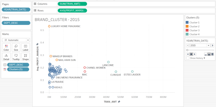
d) A clustering analysis to find natural clusters of cosmetic brands determined by the total sales and average profit margin.
4) Create a story that will be used during the presentation and highlight important information of each graph.
5) Create a dashboard to enable the interaction between different graphs.
You plan to retrieve data from Microsoft SQL Server in Tableau directly. The other option is to get data from Microsoft SQL Server in Excel and then import data into Tableau. Your analysis
will proceed through the following steps in Tableau:
a) Extract, Transform, and Load (ETL) data.
b) Create four visualization graphs as mentioned.
c) Create a story and highlight insights of each graph.
d) Create a dashboard and use the word cloud as the filter of the dashboard.
e) Create a static report including screenshots and insights.
f) Prepare a presentation to present and interpret analysis results.
You can decide the color, fonts, styles, etc. Examples of UML and visualization graphs are provided in Figure 1 to Figure 5. Your work should be similar to these images.
Figure 1 UML for Transact, SKU and Department Tables
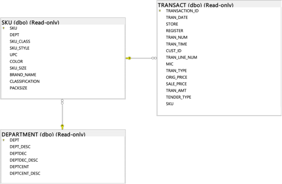
Figure 2 Geographic Map: state average discount rates for the Christmas Season
(December and January)
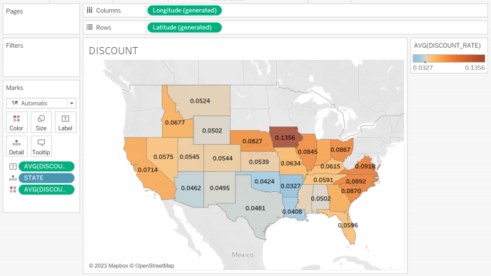
Figure 3 Word Cloud: total sales of cosmetic brands in Texas.
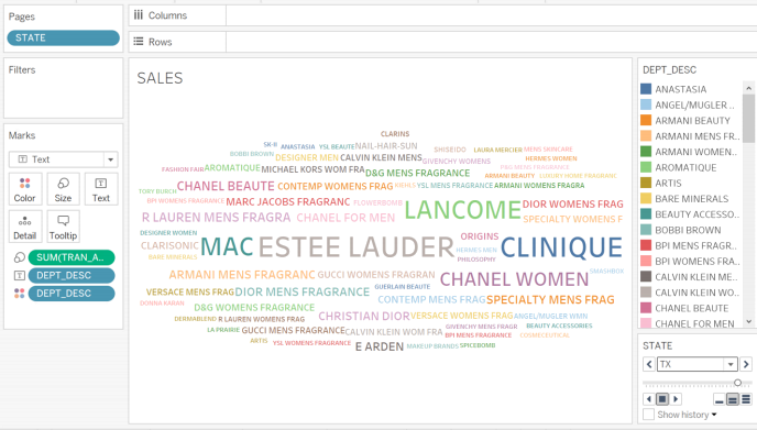
Figure 4 Box-and-Whisker Plots: state average discount rates per weekday in December 2015
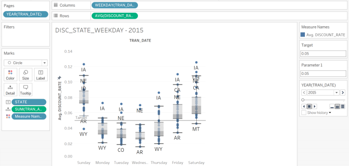
Figure 5 Clustering Analysis: brand clusters for December, 2015 (outliers excluded)
Deliverables
You need to prepare a presentation to communicate your analysis with the CEO and other senior managers. The static report is required to be submitted before the presentation.
Specifically, you need to provide the following items:
1) An analysis report (12-point Times New Roman font, single-spaced, one-inch margins)
summarizing the key findings, including the analysis of the discount level of different states, the trend of discount levels of states over weekdays, popular cosmetic brands, and natural clusters of cosmetic brands based on the profit margin and total sales. Under each graph, you need to provide insightful discussions about the findings and suggestions by answering the questions below:
a) Analysis of the discount level of states (8 points).:
i. Include a geographic map that presents the average discount rates of each state. Add average discount rates as labels. Explain the meaning of colors and the color center you used. Use Filters function to get monthly data. Take a screenshot of the geographic map for the month of December.
ii. List the name of states that meet the target (average discount rate lower than
0.05) of the discount level in December.
iii. Compare the discount rate before and after Christmas. What trends do you observe? After Christmas, which state experienced a notable increase in its discount rate?
b) Analysis of sales of cosmetic brands (8 points).:
i. Include a word cloud that presents the total sales of the cosmetic brand during the Christmas season.
iv. Add STATE to Pages. Take screenshots of the word cloud for the states of Florida and Louisiana. Discuss the five most popular brands in Florida and Louisiana. Are there any differences in customer preference in these states?
c) Analysis of the distribution of discount rates of states across weekdays discount rates (8 points):
i. Include the box-and-whisker plots that shows the distribution of the discount rate of each state per weekday during the Christmas season. Use state as labels. Take a screenshot.
ii. Do you see any trends over weekdays?
iii. Do you see any trends across states?
d) Clustering Analysis (8 points)
i. Include a cluster analysis that shows the nature clusters of brands based on the average profit margin and total sales. You can decide the number of clusters that best presents the results. Take a screenshot.
ii. How would you name these clusters?
iii. Propose promotion strategies for two clusters.
e) Dashboard (4 points)
Include a dashboard that includes the four graphs you created. Use the geographic map as the filter of the dashboard. Choose one state and discuss the popular brands, profitable brands, discount levels and profit margins of this state. Make suggestions to the CEO based on the performance of this state.
f) Story (4 points)
Tableau's Story feature is an effective tool to create compelling narratives that convey data insights, provide context, establish connections between decisions and outcomes, and make a compelling case. Additionally, it serves as a powerful tool for leading presentations with real-time data access. Create a story in Tableau using the four graphs you created. Add captions for the key conclusions of each graph. Add notes to the graphs to highlight important information for a more comprehensive analysis.
2) Upload the static report, Tableau file, and presentation slides to the applicable
Learning Management Systems (e.g., Canvas, or Blackboard). The slides should be 5 to 10 pages.
3) Show up at the scheduled time for the presentation. Connect your Tableau file to the server.
![]() Appendix Dictionary
Appendix Dictionary
|
Name |
Description |
|
TRAN_AMT |
Total transaction amount. |
|
ORIG_PRICE |
Original selling price. |
|
SALE_PRICE |
Selling price. |
|
TRAN_DATE |
Transaction dates. |
|
COST |
Cost of the products. |
|
DEPT_DESC |
Brand names. |
|
STATE |
State of stores. |
|
DEPTCENT_DESC |
Department descriptions. |