关键词 > Excel代写
Lab #2: Thailand
发布时间:2023-12-07
Hello, dear friend, you can consult us at any time if you have any questions, add WeChat: daixieit
Lab #2: Thailand
In this lab you will join population and GDP data for Thailand from an excel sheet to shapefiles in ArcGIS Pro.
Adding Data: The first step is to clean and add all data you will be using for this lab.
1. Download and save the administrative shapefiles for Thailand from DivaGIS (linked on Latte).
2. Open a blank excel sheet and import GDP and population data from the sites on Latte. You should have three rows: province name, GDP, population.
3. Clean this data by making sure province names are consistent, there are no duplicates and data types are consistent.
4. Once your data is correctly formatted, open a blank map in ArcGIS Pro and
input the Thailand shapefiles and the excel sheet using the “Add Data” button.

5. You will have four shapefiles loaded, by looking at the attribute tables for each layer, you can determine which administrative level matches your GDP data.
**Hint: To improve performance, you can remove the default basemaps for this lab (right click the basemap layer in the Contents window and select ‘remove’, repeat for the other layer).
Joining Data: Once you have determined which layer you need, you can join your excel data to
the shapefile. You will not need the other layers so you can remove these layers to avoid confusion.
1. Open the attribute table and your excel data table to ensure all your data has transferred in properly. If there are discrepancies, go back into the data and repeat data cleaning steps.
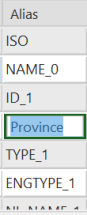
**Hint: You can change the label of the column rows to make identification easier:
a. Right click the title of the column
b. Click “Fields”
c. Under alias, double click the column you want to rename and enter your desired title.
d. Click save in the top ribbon and close the Field tab.
2. Join your excel data to the shapefile:
a. Right click the shapefile layer
b. “Joins and Relates”
c. Click “Add Joins”
3. In the dialogue box that appears:
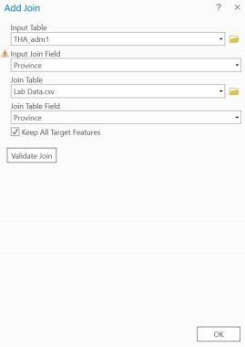
a. Select your shapefile layer as “Input Table” and select the field containing the province names as the “Input Join Field”.
b. Select your excel data as “Join Table” and the field containing the province names as the “Join Table Field”.
c. Select “Validate Join” and verify that all
records match (the dialog box that appears will say at the end how many records matched).
d. Click “OK” to finalize the join.
4. Open the attribute table for your shapefile to ensure the data has joined properly. There should be no “null” values, blank cells or other error messages and the GDP and
population values should be correctly matched with the respective province.
*Note: It’s okay if you do have null values! This is a tricky process and doesn’t always work on the first try. Go back into your excel sheet and recheck the province names that didn’tmatch.
Check for spelling differences, look for hidden spaces before/after the word, reformat your data, etc.
5. There will be columns in the table that you will not need, you can hide them (this step is not required but makes the table easier to look at if you need to make any edits).
a. In the attribute table, right click the column you would like to hide and click “Hide Field”
b. You can also open the Field tab and uncheck the boxes for each field under the “Visible” column.
c. To turn hidden fields back on, open the Field tab and recheck the boxes under the “Visible” column.
Symbolize Data: Now you need to symbolize your joined data to show the different GDP and population values across each province.
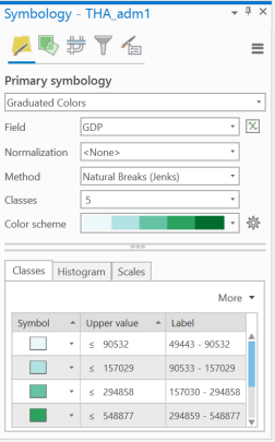
1. Right click your shapefile layer and goto
“Symbology” . A tab will appear on the right of your screen.
2. Select “Graduated Colors” from the top drop down menu.
3. Select either your GDP or population field from the “Field” dropdown menu.
4. You can play with the “Methods”, “Classes”, and “Color scheme” a bit to figure out what displays your data best.
**Note: Your values will be labeled as whatever name appears in the attribute table.
5. Once you have chosen a symbology, close the symbology tab.
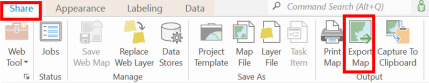
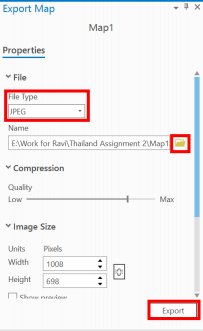
Finish: Once you are satisfied with how your map looks, export it to a jpeg.
1. Under the Share tab, select “Export Map”.
2. A tab will appear on the right of your screen again.
3. Select JPEG from the dropdown menu under “File Type”.
4. Use the folder icon next to “Name” to navigate to your
folder for this class and name your map appropriately.
5. Click “Export” .
Create the Other Map:
1. Repeat all steps from the Symbolize Data and Finish
sections above with your other data field.