关键词 > 115.109
115.109: Topic 2 Lab Worksheet
发布时间:2023-08-11
Hello, dear friend, you can consult us at any time if you have any questions, add WeChat: daixieit
115.109: Topic 2 Lab Worksheet
{This is a replica of the instructions in the Excel sheet – so you can track through the
instructions without having to jump around so much within Excel. Complete your answers within the Excel sheet, not here.}
Rationale Lab 2:
First, we look at dashboards, using the Warehouse Group's Income Statement for the
financial years (ending June) 2020-2022. This is a simple dashboard, but it gets across the idea of how we can use indicators to flag deviation from norms (eg budget or last year's
performance). {Have a look at how the lights are configured, by clicking on a cell with a traffic light, and selecting 'Conditional Formatting' and then Icon Sets > More Rules.}
Second, we analyse the knowledge questions (columns AI, AJ and AK of the
SustainabilityData- 10%sample file). {There is a simpler way to do all this, which we will learn in a later lab: PivotTables.}
Third, we construct a column chart of the subjective knowledge frequencies, and then a pie
chart of the gender frequencies from Lab 1. These are pretty simple charts, to practice your
graphing skills. It helps to label the axes and have legends and chart titles, particularly for the column chart. (We will do more of this in Lab 3.)
Task 1:
Locate the The Warehouse Group 2021 and 2022 Consolidated Income Statements: extracts available in Week 1 lecture notes (slide 50, for 2022 and 2021 data)
Links to financial statements [in spreadsheet]:
2022 Annual Report
2021 Annual Report
Complete the following table:
Financial Year ending July (showing $million)
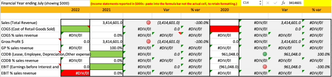
Interpret the table: what improved, and did not, between 2020-2021, and 2021-2022?
|
Answer: . |
Task 2: Analyse sustainability knowledge (SustainabilityData-10%sample)
1) The CountIf function used in Lab1 used a fixed criterion to determine what to count in a specified range of data (eg 2 or 3). The criterion can also refer to a cell, and so can vary.
Use the following table to determine the frequencies of each response option for the two 'Subjective Knowledge' questions (columns AI, AJ and AK in the SustainabilityData sheet)
2) In cell C38 of this sheet, enter the formula: =COUNTIF('SustainabilityData-
10%sample'AI$5:AI$108,$B38)
(We use a $ in front of the numbers so the specified range stays the same when you copy formula down the next six rows;
AND in front of the letter B so that the criterion stays the same when you copy across to columns D and E)
3) Now copy cell C38, and paste into C38:E42 (select the whole range, and paste once; or use the drag handle 
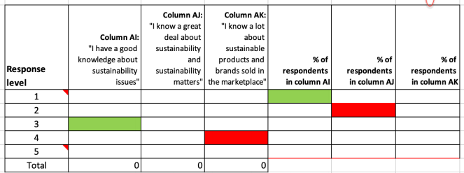
Task 3: Contrast subjective knowledge of sustainability
1) Calculate the % of total respondents in cells C38:C42 above. For cell F38, enter the formula =C38/C$43*100
2) What would happen if you copy that formula into cell E39 WITHOUT that dollar sign? (see hint in row 33 above)
3) Do the equivalent calculations for G38:H44
4) How knowledgeable do respondents claim to be?
|
Answer: |
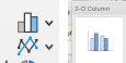
Task 4: Create a bar chart of the three % columns in Task 2 above
1) Select cells F37:H42 above, and Insert ribbon > insert Column > 2D Column.
2) Click on either of the bars, and inspect the formula bar.

This shows the information Excel uses to construct the chart
The first information (Lab2!$F$37) determines what goes into the legend.
The second bit is the X-axis info, and is currently missing (nothing shows between the commas)
The third bit is the data range (Lab2!$F$38:$F$42); and the fourth is the series order (change this number, and the series shift around in the legend, and may change colour)
3) In this case it doesn’t matter that there is nothing in the X-axis range, as the default (1-7) corresponds to our data anyway (scale levels)
If you want to fix it anyway, click between the commas in the formula bar, and select B38:B42 above. The result should look like this: (the chart won't change)

Do this to any one series, and it fixes it for all three. Magic!
Please note: Excel is really picky about what information it needs: the apostrophes ('Lab2'!), exclamation mark, and commas are vital!
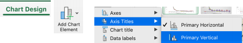
4) Give the Chart a better Title, and add X-axis and Y-axis labels: Chart Design ribbon > Add Chart Element > Axis Titles > turn on both
Place Chart here: Column ↓
Task 5: Create a Pie Chart of the Gender split of the sample % Male vs Female vs Diverse
We created the table in Lab 1 (Task 4 Step 6), so generate a Pie Chart from that table, and cut and paste below (to shift it to this sheet)
Something to think about: Does it matter whether you use the Frequency data or Percentage data?
Chart: Pie ↓