关键词 > Python代写
30 Year Inflation
发布时间:2021-06-28
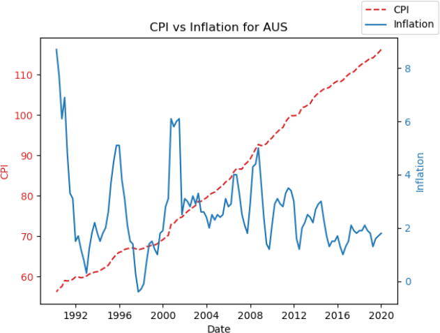
1. 30 Year Inflation
Generate a figure that shows both CPI (Consumer Price Index) and inflation for a given country over the past 30 years.
Program Requirements
● Use this free data source on Quandl https://www.quandl.com/data/RATEINF-Inflation-Rates
● Dates
o Start: 01/01/1990
o End: 01/01/2020
Usage Example
Country code: AUS
Wrote AUS_30year_inflation.png
Hints
1. Create a figure with two scales https://matplotlib.org/stable/gallery/subplots_axes_and_figures/two_scales.html
2. pyplot will accept a list of datetime objects for the x-axis coordinates and will format them automatically
3. Convert a Series of date strings to datetime objects https://pandas.pydata.org/pandas-docs/stable/reference/api/pandas.to_datetime.html
4. To display a legend when using multiple axes use fig.legend() instead of plt.legend()
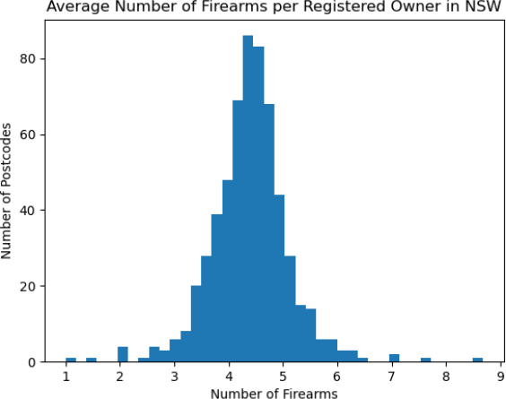
2. Average Number of Firearms
The NSW Greens published the toomanyguns.org website which lists information about firearm ownership in NSW.
Private firearms ownership data was obtained through a Freedom of Information application to the NSW Police. It shows the overall number of guns and gun owners in NSW overall and by postcode as of March 2017, 2018 and 2019.
The data from the website is summarised in a CSV file (firearms_2019.csv).
Write a Python script that generates a histogram of the "average number of firearms owned by registered owners".
Your plot must have:
● 40 bins
● x axis label: Number of Firearms
● y axis label: Number of Postcodes
● title: Average Number of Firearms per Registered Owner in NSW
Your plot should look like this:
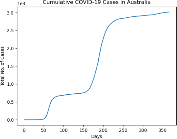
3. Australian cumulative COVID-19 cases
You have been given a dataset called covid_aus.csv from the ABC which contains data on the number of new COVID-19 cases Australia detected each day for a years starting from the 25th of January 2020 (first detection) to the 24th of January 2021.
Your program must generate a line plot with days on the x axis and total cases on the y axis.
Label your plot with the following:
● x axis label: Days
● y axis label: Total No. of Cases
● title: Cumulative COVID-19 Cases in Australia
Your plot should look like this:
Hints
● Cumulative sums can be computed using a DataFrame or Series method called cumsum
o https://pandas.pydata.org/pandas-docs/stable/reference/api/pandas.DataFrame.cumsum.html
o https://pandas.pydata.org/docs/reference/api/pandas.Series.cumsum.html
● Format your plot so that the y axis uses scientific notation by adding the line:
PYTHON
1
plt.ticklabel_format(axis='y', style='sci', scilimits=(0,0))