STAT 20 Spring 2022 Lab 4: Flights
Hello, dear friend, you can consult us at any time if you have any questions, add WeChat: daixieit
Lab 4: Flights
STAT 20 Spring 2022
Part I: Understanding the Context of the Data
1. What is the unit of observation in the data frame on the handout?
2. Which variables are categorical?
3. Which variables are numerical?
4. Do any of the variable have ambiguous data types to you?
5. Is there any discernible pattern to the manner in which the rows are ordered?
6. What is your guess for the units/format used to record the departure time? Said another way, what would a value of 1517 represent?
7. What filter would you use to extract the flights that left in the springtime?
Part II: Computing on the Data
1. filter(): Filter the data set to contain only the flights that went to Portland, Oregon and print the first few rows of the data frame. How many were there in 2020?
2. mutate(): Mutate a new variable called avg_speed that is the average speed of the plane during the flight, measured in miles per hour. (Look through the column names or the help file to find variables that can be used to calculate this.)
3. arrange(): Arrange the data set to figure out: which flight holds the record for longest departure delay (in hrs) and what was its destination? What was the destination and delay time (in hrs) for the flight that was least delayed, i.e. that left the most ahead of schedule?
4. summarize(): Confirm the records for departure delay from the question above by summarizing that variable by its maximum and its minimum value.
5. How many flights left SFO during March 2020?
6. How many flights left SFO during April 2020?
7. Create a bar chart that shows the distribution by month of all the flights leaving the Bay Area (SFO and OAK). Do you any sign of an effect of the pandemic?
8. Create a histogram showing the distribution of departure delays for all flights. Describe in words the shape and modality of the distribution and, using numerical summaries, (i.e. summary statistics) its center and spread. Be sure to use measures of center and spread that are most appropriate for this type of distribution. Also set the limits of the x-axis to focus on where most of the data lie.
9. Add a new column to your data frame called before_times that takes values of TRUE and FALSE indicating whether the flight took place up through the end of March or after April 1st, respectively. Remake the histograms above, but now separated into two subplots: one with the departure delays from the before times, the other with the flights from afterwards.
Can you visually detect any difference in the distribution of departure delays?
10. If you flew out of OAK or SFO during this time period, what is the tail number of the plane that you were on? If you did not fly in this period, find the tail number of the plane that flew JetBlue flight 40 to New York’s JFK Airport from SFO on May 1st.
11. What proportion of the flights left on or ahead of schedule?
12. Create a plot that captures the relationship of average speed vs. distance and describe the shape and structure that you see. What phenomena related to taking flights from the Bay Area might explain this structure?
13. For OAK and SFO separately, what proportion of the flights left on or ahead of schedule?
14. Create a data frame that contains the median and interquartile range for departure delays, grouped by carrier. Which carrier has the lowest typical departure delay? Which one has the least variable departure delays?
Part III: Extensions
1. For flights leaving SFO, which month has the highest average departure delay? What about the highest median departure delay? Which of these measures is more reliable for deciding which month(s) to avoid flying if you particularly dislike flights that are severely delayed
2. Each individual airplane can be uniquely identified by its tailnumber in the same way that US citizens can be by their social security numbers. Which airplane flew the farthest during this year for which we have data? How many times around the planet does that translate to?
3. What is the tailnumber of the fastest plane in the dataset? What type of plane is it (google it!)? Be sure to be clear how you’re defining fastest.
4. Using the airport nearest your hometown, which day of the week and which airline seems best for flying there from San Francisco (if you’re from near SFO or OAK or from abroad, use Chicago as your hometown)? Be clear on how you’re defining óegt. (note that there is no explicit weekday column in this data set, but there is sufficient information to piece it together. The following line of code can be added to your pipeline to create that new column. It uses functions in the lubridate package, so be sure to load it in at the start of this exercise).
mutate(day_of_week = wday(ymd(paste(year, month, day, set = "-")), label = T))
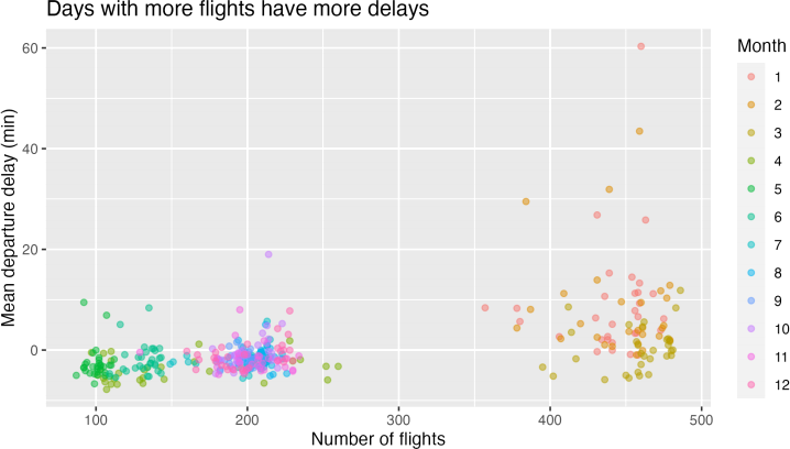
5. The plot below shows a relationship between the number of flights going out of SFO and the average departure delay. It illustrates the hypothesis that more flights on a given day would lead to a more congested airport which would lead to greater delays on average (mean is used here specifically to capture the impact of the outliers - very long delays). Each point represents single day in 2020; there are 366 of them on the plot. Please form a single chain that will create this plot, starting with the raw data set.
2022-02-11