STA238 - Winter 2022 R Lab #1 Solutions
Hello, dear friend, you can consult us at any time if you have any questions, add WeChat: daixieit
R Lab #1 Solutions
STA238 - Winter 2022
Exercises
library(tidyverse)
These exercises should take no longer than 1 hour to complete, barring typos or syntaxical errors!
Another common type of EDA is to examine the covariation of two variables within the data. In this exercise we will explore how the variable avg_relative_humidity covaries with the average daily temperature avg_temperature across the entire data set (not just 2021).
1.) Using the filter and select functions, write code that gives a data.frame containing date, avg_relative_humidity, and avg_temperature for observations in which either avg_relative_humidity or avg_temperature are missing. Provide a glimpse() of your data.frame and comment on any patterns that you see in date.
# Also accepted: two separate filters (one for each variable) and see # that this task is equivalent to just filtering for avg_relative_humidity # since there are no missing avg_temperature values
weather <- read.csv("weatherstats_vancouver_daily.csv")
filtered <- weather %>%
select(date, avg_relative_humidity, avg_temperature) %>%
filter(is.na (avg_relative_humidity) | is.na (avg_temperature))
glimpse(filtered)
## Rows: 10
## Columns: 3
## $ date <chr> "2022-01-16", "2022-01-05", "2020-12-08", "2020-~ ## $ avg_relative_humidity <dbl> NA, NA, NA, NA, NA, NA, NA, NA, NA, NA ## $ avg_temperature <dbl> 5.55, -1.29, 8.40, 9.30, 6.65, 5.35, 5.05, 3.34,~
There are no missing average temperature readings, but there are missing average relative humidity readings for the first week in December of 2020 and a couple of days this January (Jan. 5 and 16).
2.) As noted in the lab, a graphical summary is often more helpful than a numerical summary. To this end, create and label a scatter plot of avg_relative_humidity and avg_temperature to better examine their correlation. To make a scatter plot in ggplot, we use the geom_point function. Don’t forget to include the aesthetic arguments with aes()!
ggplot(weather)+
geom_point(aes (x=avg_temperature, y=avg_relative_humidity),
color= !blue ! ,
na.rm=T)+
labs(x= !Average Temperature ! ,
y=!Average Relative Humidity! ,
title= !Daily Vancouver Weather ! ,
subtitle= !Apr. 2019 - Jan. 2022 !)
Daily Vancouver Weather
Apr. 2019 − Jan. 2022
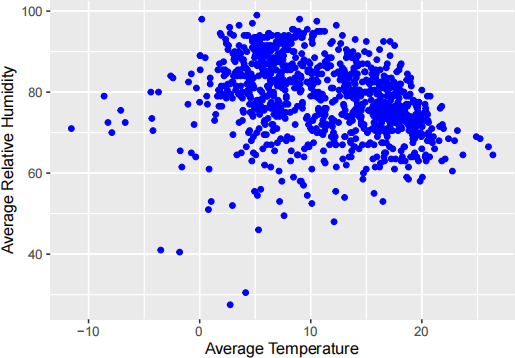
3.) Using the plot from the previous exercise, discuss any trends or interesting observations you notice.
● Unique Observations: Strength of association (if any), direction, trend (linear/non-linear), clustering effects, presence of outliers
● Sample Answer: Average daily temperature and relative humidity appear to be weakly negatively associated in a linear trend (students could argue non-linear as well, it’s just perception!).
● Interpretation: The scatterplot shows that generally, as the average daily temperature increases, the corresponding average daily relative humidity tends to decrease in a linear manner (optional estimate slope: 1.5
4.) Summer drought and heavy rainfalls seem to be getting worse over the years. You are interested in studying this potential trend. Briefly describe:
● What information would you extract from the weather data set to study, and what graphical comparisons would you use?
● How your data can be extracted using the R tools (Note: You do not need to implement this in R, only describe the general approach!)
Your response should include the data and format you would select, the graphical displays you would use, and the aesthetics you would include. A sample solution using the study question from this R Lab:
● Filtered the data by year (to year 2021)
● Selected the daily rainfall for the year
● Grouped daily rainfall by month and computed total daily rainfall
● Represented the data in a histogram with month on the x-axis to observe the distribution of rainfall in 2021
This is an open-ended response! There are definitely incorrect answers, but many possible correct answers. Some sample answers below:
● Separate the data by drought months and rainfall months (for example, summer vs fall):
– Create two data sets by filtering the weather data set by summer months and by fall months
– Select only relevant variables (e.g. humidity for drought, can also use rain or precipitation variables)
– Decide whether to use daily data, or
– Group by individual months for each year (use lubridate to extract month and date information)
– Plot a line graph with date on the x-axis (days of the year or month-date) with the corresponding measure variable (daily total or monthly total, as appropriate)
– Observe whether the quantitative measurement changes significantly when compared between similar seasons
● Plot annual data using four different broken line graphs on the same grid:
– Select variable to measure drought and rainfall (e.g. humidity for drought, can also use rain or precipitation variables)
– Group data by year (2019, 2020, 2021) OR create three smaller filtered data sets containing the annual data for each of the years
– Plot THREE ‘geom_line‘ layers, each graphing date on the x-axis (day and month, e.g. Jan. 1, Jan. 2,...) with the corresponding daily measurement on the y-axis to see how the readings change for the same date, year to year (students can also plot by grouping by month instead of by day)
● Students can also suggest side-by-side bar graphs for each year showing monthly precipita- tion/rain/relative humidity, but over three histograms this is not an effective (nor easy!) way to visually compare across bar graphs.
● Also acceptable and simpler answer: group data by month and find monthly totals for each year. Plot three scatterplot layers with month on x-axis and measurement on y axis, differentiating the points for each year. Easier comparison than side-by-side histograms, though requires aggregating data.
● Students may also note that such trends might not be detectable over a three year window, and it may be more appropriate to expand the data range to include decades long data for better longitudinal comparison
2022-02-11