PSYCH204-24A (HAM & TGA) The Psychology of Perception Practical 2: Distance Perception
Hello, dear friend, you can consult us at any time if you have any questions, add WeChat: daixieit
PSYCH204-24A (HAM & TGA) The Psychology of Perception
Practical 2: Distance Perception

Distance Estimation.
In the ‘ Perceiving Depth and Size’ lecture you will learn about some of the cues that we use to estimate the distance of objects from our eyes. This experiment will provide some practical experience related to the lecture. For many objects in the environment it does not matter much if we misperceive the distance. Unless you are walking towards it, the distance of a wall in a room is relatively unimportant. For some objects (e.g., the staircase step you are about to put your foot onto) it is critical that we make an accurate estimate of the distance.
Knowing the correct distance of the car in front of you while you are driving is also important. The actual distance of the car ahead determines how close you can follow and when it is safe to overtake. But how accurate are our estimates of the cars ahead of us? What visual cues help us to judge the distance? Practical 2’s experiment is a brief introduction to the type of research that perceptual psychologists carry out to answer these questions. You will get to judge the distance to a car ahead of you under a variety of stimulus conditions. The stimuli you will see are part of a larger study carried out in the School of Psychology in 2013 by Dr Fan Zhang (as part of their PhD thesis).
The experiment runs as a PowerPoint presentation and you simply press the spacebar on the keyboard or click the mouse to advance through the slides. To start the experiment, download the PowerPoint file from the ‘Lab Handouts’ folder in Moodle. You can do this experiment at home or using any computer in any lab that you can access (along with the normal computer lab rooms in HAM and TGA) since the only thing you need to run the experiment is the PowerPoint file, which is on Moodle. You do not need remote access if you are working from your home computer – simply download the PowerPoint file and follow the instructions. The instructions are provided in the first few slides. Everybody perceives scenes such as the ones you will see on the screen differently, so do not worry if you have difficulty making a judgment. Just guess if you are not sure. Record your estimates in Table 1 below – you need this data to complete Lab 2.
You will use this table to do the tasks at the end of the handout.
Table 1
|
Picture Number |
Your estimate (Meters) |
Picture Number |
Your estimate (Meters) |
|
1 |
|
11 |
|
|
2 |
|
12 |
|
|
3 |
|
13 |
|
|
4 |
|
14 |
|
|
5 |
|
15 |
|
|
6 |
|
16 |
|
|
7 |
|
17 |
|
|
8 |
|
18 |
|
|
9 |
|
19 |
|
|
10 |
|
20 |
|
![]()
PERCEPTION PRACTICAL 2 QUESTIONS AND TASKS.
You have until Friday 5th April, 11.59pm to complete this assignment. The completed assignment needs to be uploaded to Moodle (see Lab 2 assignment submission on Moodle). You will lose marks for every day late (see paper outline) so do not leave the completion of the assignment until the last moment. You will not be able to submit the assignment after it is 5 days late.
You will need to download the Excel template from Moodle (Practical 2 assignment template) in order to complete the assignment. You will need to have a copy of this handout handy with your filled in Table 1 and a computer that has Microsoft Excel on it. You will be uploading the completed Excel file to Moodle for submission.
DISTANCE ESTIMATION
1. Data analysis
Open the Excel Practical 2 template and check that you are in the correct Part A section (see Tabs at the bottom). You need to transfer values from Table 1 in your handout to the template.
The experimental stimuli were all mixed up in the experiment to counterbalance the effects of practice. If you started with near distances and ended with far distance estimates you may have improved your estimates of the far distances just because you have seen more cars before you made your far estimates. This is standard procedure in most experiments; the order of the stimuli are randomised to prevent these ‘practice effects’. In order to put the data back in the correct order, you need to enter them into the correct rows and columns of your Excel table.
Transfer your distance estimates from Table 1 (on p. 2 of this handout) into the ‘Estimate’ cells of the Road Data (see red outlines in the Excel template). Be sure to put the correct values into the correct cell number. For example, if the Excel picture number is ‘7’ then look through your Table 1 and find what estimate you put next to 7 on the table and insert it into the Excel sheet next to 7. Do this for all of the Picture numbers in the Road Data section. They are laid out in two columns because certain pictures were identical (e.g., 7 and 11) and you made two distance estimates for the same car picture. This provides a more reliable estimate of your perceived distance for that car. As you enter your estimates, Excel will take the mean of your two values and put them into the column marked ‘Mean Estimate (Perceived Distance) in Meters’. You will also see your estimates plotted in the graph to the right.
The Pictures you have selected and entered above all had a road in them and this is why they are all grouped under the ‘Road Data’ section. The remaining pictures in your Table 1 all had no roads in them. Continue transferring the data from your table into the ‘No Road section’ by finding ‘5’, ‘12’ etc., in your Table 1.
You have now sorted your data into two main sets: ‘Road Data’ applies to the stimuli that had a road and trees in them and the ‘No Road Data’ applies to the stimuli without a road or trees. These two sets of data will be plotted as two separate lines on the graph. The orange line is for the ‘with road’ condition and blue is for the ‘no road’ condition. Also included in the graph (yellow line) is the actual (true) distance of the car that was used to create the images you viewed during the experiment. This line is sometimes referred to as the ‘perfect performance’ or ‘veridical line’ because if your estimates exactly matched the true distances of the car they would fall on a line where Y = X. (4 marks)
2. Questions
A2. Where did your data for the Road Condition fall relative to the ‘perfect performance line (mainly above or mainly below the line)? Enter your answer into the Excel spreadsheet next to A2. (1 mark)
A3. Where did your data for the No Road Condition fall relative to the ‘perfect performance line’ (mainly above or mainly below the line)? (1 mark)
A4. Was there a tendency overall for you to underestimate or overestimate the distance of the car ahead? (1mark)
A5. Which condition produced the best overall distance estimates (road or no road)? (1 mark)
A6. For the road condition, were your estimates best (most accurate) for near or far actual distances of the car? (2 marks)
3. Editing Graph into APA 7th Edition Format
Now that you have sorted and plotted your data into a graph, and you have interpreted/analysed your data by answering questions A1-A6, the next step is to edit the presentation and formatting of your graph so that it is consistent with the guidelines for Figures in APA style 7th Edition.
Although you are not required to write a lab report for this assignment, Figures are an important aspect of presenting your work clearly, and Tables & Figures that are formatted in APA style enable writers to present large amounts of information efficiently in a way that is more comprehensible, and to enhance presentation and readability for the reader. As noted in APA, the goal of any Table or Figure is to help readers understand your work in a way that is also attractive and accessible to all users. The APA Style guidelines for Tables and Figures help ensure your visual displays are formatted clearly and consistently, thus contributing to the goal of effective communication.
In the Excel Practical 2 assignment template check that you are in the correct Part B section (see Tabs at the bottom). You will see that the graph you plotted in Part A also appears in Part B tab. This graph is an unformatted default version of a line graph produced within Excel (in this template we have used ‘insert line chart’ option in Excel). The task for Part B of Practical 2 is to edit the graph in the Part B tab of the Excel assignment template so that it is consistent with APA style for Figures. Tables and Figures are included with the intention to attract readers’ attention, and to draw attention to important aspects of your work (such as the results), Figures should not be used for decorative purposes in academic writing. It is an important part of writing for psychology to present graphs in APA style (see Chapter 7 of the APA manual for Tables and Figures (pp. 193-250).
If you are unfamiliar with the APA requirements for Figures, please see Chapter 7 of the APA Manual 7th Edition (available in hardcopy and online via the university library and on the APA website https://apastyle.apa.org/style-grammar-guidelines/tables-figures). Chapter 7 of the APA Manual 7th Edition, provides sample Figures (see Figures 7.1 & 7.3 specifically for sample Line Graphs). In Section 7.23, Figure 7.1 (p. 226) provides a sample Figure that covers the “Basic Figure Components”. Section 7.36 includes Figure 7.3 Sample Line Graph (p. 235). Both sample Figures are also available on the APA website.
HINT: APA 7th edition has changes to Figure formatting so please check new rules if you are only familiar with Figures in APA 6th Edition.
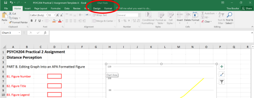
Using Excel to edit graphs is relatively user-friendly. Click on the entire graph and you will see the Chart Tools tabs ‘Design’ and ‘Format’ that provide various editing options (see screenshot below).
Alternatively, you can double click on the component of the graph you would like to edit, and the relevant ‘properties’ options box will appear. You can also right- click on the entire graph or a specific component of your graph, then select an editing option from the drop-down list that appears.
If you are unfamiliar with using Excel please see the university student services, learning facilitators, or library staff, your peers, or find a reliable Excel source on the internet for further assistance using Excel & the edit functions.
B1. Figure Number (1 Mark Total)
Add a Figure Number for your graph in the Excel template (Part B tab) following APA specifications for Figure Numbers covered in Section 7.24 (p. 227). HINT: This is the first and only Figure in this assignment.
Marks for each of the basic components of the Figure Number will be allocated as follows:
1. Position of Figure Number in relation to your graph and Figure Title (e.g. below, above, to the left or right of graph, within graph or outside of graph) (0.25 mark)
2. Text alignment of Figure Number. Text justification e.g. if centered, left-
aligned, right aligned, or justified fully in relation to graph position (0.25 mark)
3. Font style (e.g. whether or not Figure Number is bolded, italics, underlined etc.) (0.25 mark)
4. Use of Punctuation in Figure Number (inclusion/no inclusion of any punctuation such as a full stop or semicolon for example) (0.25 mark)
Note: Font type and size of Figure Number is also specified in APA but we have already selected Calibri (sans serif font type) using 11-pt font size in this Assignment Template, so font type and font size for the Figure Number do not have marks.
B2. Figure Title (2 Marks Total)
Add a Figure Title for your graph in Excel (Part B tab) following APA specifications for Figure Titles covered in Section 7.25 (p. 227).
Hint: Use the 'blank' cells above the graph area to insert your figure number and title.
Marks for each of the basic components of the Figure Title will be allocated as follows:
1. Position AND Alignment of Figure Title in relation to your graph and Figure Number (e.g. below, above, to the left or right of graph, within graph or outside of graph, left aligned, centered etc.) (0.25 mark)
2. Font Style of Figure Title (e.g. whether or not Figure Title is bolded, italics, underlined etc.) (0.25 mark)
3. Format of Figure Title Text (e.g. Sentence case, title case, use/not use capital letters) (0.25 mark)
4. Use of Punctuation in Figure Title (e.g. Inclusion/no inclusion of punctuation at the end of the caption/title, such as a full stop or semicolon for example) (0.25 mark)
5. Content of Figure Title Caption. Title caption should be brief, but explanatory, and in a full sentence. The caption must describe exactly what variables are plotted/presented in your graph and add a little context (1 mark)
HINT: To aid in writing a Figure Title caption that includes variables you can try using the sentence structure of “DV as a function of IV…” to create a full sentence Figure Title. Then add some additional information related to context (e.g. PSYCH204 Distance Estimation Experiment) to finish your figure title sentence.
B3. Figure Legend (1 Mark Total)
Edit the legend for your graph (sometimes referred to as a key) following APA specifications for Figure Legends covered in Section 7.27 (p. 229). The legend produced by default within Excel appears under the graph in Part B tab of your assignment template, edit this legend.
Marks for editing each of the basic components of the Figure Legend (created by default in Excel) will be allocated as follows:
1. Position of Legend (e.g. Legend is positioned/placed consistent with guidelines) (0.50 mark)
2. Font Colour of Text in Legend (e.g. Ensure the font colour of text in the
Legend is consistent with guidelines and/or the sample Figures provided by APA). Black and bolded font is very clear to the reader and you can use the ‘home’ tab in excel to edit the font. HINT: The font in template is set on a very dark grey (but not black) font colour. (0.25 mark)
3. Font Size of Text in Legend. Use font size for Calibri (the font we are using for this assignment) for text that appears within Legend (0.25 mark)
Please note: Font type is also specified in APA but we have selected Calibri (sans serif type) and used this font in your Practical 2 Assignment Template so font type does not require editing. APA also specifies use of Title Case in Legend text. Title case has already been used in your template so no editing is required. Whether you add a border to your Figure Legend is optional so no marks are allocated to Legend border/no border either.
B4. Figure Image/Line Graph Chart Area (2 Marks Total)
Edit the image/chart area of your graph (created for you in the Assignment Template using default settings in Excel under ‘Line Chart’ options) following
APA specifications for Figure Images covered in Section 7.26 (pp. 227-229) and displayed in the sample Figures provided by APA (see Figures 7.1 & 7.3 specifically for sample Line Graphs).
Marks for editing each of the basic components of the Figure Image/Chart Area will be allocated as follows:
1. Line Colour and/or Style of Plotted Data Lines. Data lines plotted in graph
should be edited consistent with guidelines related to use of colour, greyscale, and/or line dash styles for Figure Images (1 mark)
2. Data Point Markers Added. If using colour and/or greyscale solid data lines, all Data Lines should have data point Markers added that are consistent with APA guidelines and sample Figures. If dash-style data lines are used, do not add data point markers. Hint: The size of your data point markers can be adjusted so they all appear similar in size to your data line (0.50 mark)
3. Gridlines in Chart Area of Graph. See APA for inclusion/no inclusion of gridlines (horizontal lines) in chart area (0.25 mark)
4. Border/No Border around the entire Graph. See APA for inclusion or removal of border line around Graph Image (0.25 mark)
Please note: Weighting/width of data lines in Figures are also specified in APA but we have already set a Data Line weighting of 2-points in your Assignment Template, so no editing of line width is required for this assignment.
If you are unsure how to add and edit markers in Excel, see screen shot.
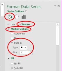
Alternatively, you can select a line/data point, then right click and choose ‘format data series’, and a properties box will appear in Excel. Click on the ‘paint tin’ icon (see screenshot above). To edit Markers, click on the ‘Marker’ option (circled in screen shot above) and to edit lines, click on the ‘line’ option. To add Data
Markers, expand the ‘Marker Options’ list (circled in screen shot above) by
clicking on the arrow to the left. As per screen shot above, select ‘Built-In’. The type and size are at your discretion to decide based on how they appear/look on your graph.
B5. Y Axis (2 Marks Total)
Add an Axis Label AND edit the Y axis of your graph following APA specifications for Figure Images covered in Section 7.26 (pp. 227-229) and displayed in the sample Figures provided by APA (see Figures 7.1 & 7.3 specifically for sample Line Graphs).
Marks for adding an Axis Label (1 Mark Total) to the Y Axis (primary vertical for Y Axis) will be allocated as follows:
1. Text of Axis Label. Axis label specifies name of variable plotted on Y Axis and font size is correct (0.25 mark)
2. Format of Axis Label Text (e.g. Sentence case, title case, use/not use capital letters) (0.25 mark)
3. Axis Label includes Detail about Data. Specify in Axis Label if data plotted on Y Axis are presented as raw numbers, means, percentages etc.) (0.25 mark)
4. Measurement included in Axis Label. Specify the unit of measurement used to collect data in the Axis Label (e.g. seconds, percent, number of, meters, kilometers per hour etc. and include these in APA format) (0.25 mark)
Marks for editing the Y Axis itself (1 Mark Total) will be allocated as follows:
1. Axis Line. Axis Line is edited to black colour and width of line is set at a width/weighting that is less than the data line setting (0.25 mark)
2. Colour of Axis Line Numbers/Text. Edit colour of Numbers/Text on Axis Line to black font (0.25 mark)
3. Size of Axis Line Numbers/Text. Edit size of Numbers/Text on Axis Line to between 8-14 points. Hint: Preferably the same sized font used in Figure Number and Title (Calibri 11-pt size is used in template) throughout this assignment (0.25 mark)
4. Tick Marks. Add Tick Marks, preferably Major only for the Y Axis and Minor only for the X Axis, and Tick Marks for both axes are placed on the outside of the Axis Line (0.25 mark)
B6. X Axis (2 Marks Total)
Add an Axis Label AND edit the X axis of your graph following APA specifications for Figure Images covered in Section 7.26 (pp. 227-229) and displayed in the sample Figures provided by APA (see Figures 7.1 & 7.3 specifically for sample Line Graphs).
Marks for adding an Axis Label (1 Mark Total) to the X Axis (primary horizontal for X Axis) and marks for Editing the X Axis will be allocated using the same marks and components as B5. Instructions for the Y Axis.
Note: Figures in APA style can include Notes. Notes are not required for the
Figure used in this assignment, so Figure Notes are not included in these Figure editing tasks.
HINT: Go through the Figure Checklist provided by APA in Section 7.35 (p. 232). The first 7 points in the checklist are not relevant for this assignment but points 8-14 are worth checking off against your graph before you submit Practical 2.
Congratulations, you have now completed Practical 2! To celebrate all the hard work completing the first two practical assignments in Psych204 there is a short break from assignments (and labs!) before Practical 3 and 4 begin in the second half of the Trimester. Enjoy your break from assignments and labs in Psych204.
2024-04-02