RStudio and lab reports
Hello, dear friend, you can consult us at any time if you have any questions, add WeChat: daixieit
RStudio and lab reports
This lab aims to introduce you to R and RStudio, which you’ll use throughout the module to explore statistical concepts, analyse real data, and draw informed conclusions. To clarify which is which: R is the name of the statistical programming language and RStudio is an application that provides a convenient interface for working with R.
As you progress through the labs, you are encouraged to explore beyond what the labs dictate; a willingness to experiment will make you a much better programmer! Before getting to that stage, you must build essential fluency in R. First, we will explore the fundamental building blocks of R and RStudio: the RStudio interface, reading in data, and basic commands for working with data in R.
RStudio interface
If you are already running this lab tutorial, you have successfully installed and launched RStudio. Well done! You should see a window that looks more or less like the image shown below (I’ve added a few comments).
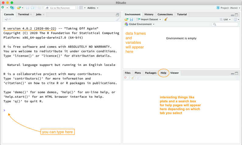
A fresh RStudio window. Please try to use R version 4.0.2 (2020-06-22) “Taking Off Again” or higher.
The RStudio window is divided into various panels.
The panel on the lower left is where the action happens. This panel is called the console. Every time you launch RStudio, it will have the same text at the top of the console telling you the version of R you are running. Below that information is the prompt, indicated by the > symbol. As its name suggests, this prompt is a request for a command. Initially, interacting with R involves typing commands and interpreting the output. These commands and their syntax have evolved over decades (literally). They now provide what many users feel is a reasonably natural way to access data and organise, describe, and invoke statistical computations.
The panel in the upper right contains your environment and a history of the commands you’ve previously entered.
The panel in the lower right contains tabs to browse the files in your project folder, access help files for R functions, install and manage R packages, and inspect visualisations or plots.
R Packages
R is an open-source programming language, meaning that users can contribute packages that make our lives easier, and we can use them for free. For this lab, and many others in the future, we will use the following:
The MA22004labs R package: for tutorials, templates, data sets and custom functions
The tidyverse “umbrella” package that houses a suite of many different R packages for data wrangling and data visualisation
The learnr R package: for running these interactive lab tutorials
The gradethis R package: to serve you answers to interactive tutorial exercises
In the lower right-hand panel of RStudio, select the Packages tab. Type the name of each package (e.g., tidyverse) into the search box that appears to see if a package has been installed. If the package does not appear when you type in the name, it can be installed using the install.packages command.
# If you installed the package "MA22004labs", then `tidyverse`
# will have already been installed as a dependency.
install.packages("tidyverse")
After pressing enter/return, a stream of text will begin, communicating the process R is going through to install the package. If you were not prompted to select a server for downloading packages when you installed R, RStudio may prompt you to choose a server from which to download; any of them will work.
Loading packages
You only need to install packages once, but you need to load them each time you relaunch RStudio. We load packages with the library function. For example, you would use the following code to load the tidyverse package into your working environment.
library(tidyverse)
The tidyverse package consists of a set of packages necessary for different aspects of working with data—anything from loading data to wrangling data to visualising data to analysing data. Additionally, these packages share common philosophies and are designed to work together. You can find more about the packages in the tidyverse at tidyverse.org.
Creating reproducible lab reports
As part of your grade for DI22013, you will need to submit lab reports. I have provided a template file that can be accessed through RStudio after you install and load the MA22004labs package (recall that the package can be loaded by typing library(MA22004labs) at the RStudio console prompt).
Access the template by selecting New File > R Markdown. You will then be greeted with a pop-up window. Choose From Template from the left-hand pane and then select DI22013 Lab Template. A new Untitled.Rmd file will open. Feel free to change the name to something sensible and save it where you like. The final PDF is created using the Knit shortcut from the menu bar (File > Knit Document if you cannot find the shortcut). Submit the lab report as a PDF but please also retain the lab report markdown file.
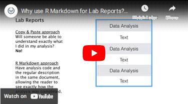
Why use R Markdown for Lab Reports?
Please watch this short video that summarises the benefits of using R Markdown.
Why use R Markdown for Lab Reports?
The template will allow you to easily combine data analysis (“R chunks”) with text in a portable and reproducible format. You can also easily include mathematical typesetting in your text content using LATEX syntax.
Template in detail
Let’s take a look at the anatomy of the template. The template is an R Markdown document, and the file name should end in .Rmd.
At the top, there is a section that looks like this:
---
title: "Lab NUMBER: TITLE"
author: "TEST STUDENT --- ID-NUMBER"
date: "'r Sys.Date()'"
output:
pdf_document: default
papersize: a4
---
You should update the lab title and author information (retaining the quotes) with your title, name, and student ID number. The date will automatically update when you Knit the document, but you can change that if you want.
The next part of the template contains an R chunk with some options that are loaded but will not be printed in the final report due to the option include = FALSE.
```{r setup, include = FALSE}
### Some formatting options
options(width = 80)
knitr::opts_chunk$set(fig.width = 6, fig.asp = 0.75, fig.align = "center")
### LOAD NECESSARY PACKAGES HERE
library(MA22004labs)
```
The Knit command will interpret the grey box as R code because it begins with three tick marks (```), followed by {r setup}. The name of this code chunk is setup; each code chunk in an R Markdown document must have a unique name. The command library(openintro) loads a package that contains data needed for your first lab assignment. You may add other commands to the setup chunk if you want — but remember you won’t see them in the final report.
The rest of the template contains prompts for text and R code. Update these with your text as appropriate. To produce the final document, you must “knit” the file into a Word Document or directly into a LaTeX PDF. You do this by selecting the appropriate option from the “Knit” menu in RStudio.
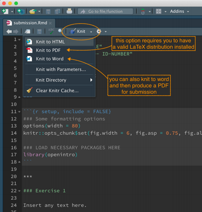
The Knit menu allows you to effortlessly produce a reproducible lab report combining data analysis and text. If there is a question about your analysis, you can follow up by sending the source code!
To produce your lab report, you should create an R Markdown document containing text and code associated with each problem. Place your code in R code chunks and ensure each chunk has a unique label. Suppose you want to test your code as you go. In that case, there are two ways to execute a line of R code within your R Markdown document: (1) place your cursor on the line of code and press Ctrl-Enter or Cmd-Enter (depending on your operating system), or (2) place your cursor on the line and press the “Run” button in the upper right-hand corner of the R Markdown file.
What happens when you knit an R Markdown File?
When you click the Knit button, a document that includes both text content and the output of any embedded R code chunks will be generated.
For example, you can write an R code chunk like this in your R Markdown document:
```{r cars, echo = TRUE, eval = TRUE}
summary(cars)
```
which will render as:
summary(cars)
speed dist
Min. : 4.0 Min. : 2.00
1st Qu.:12.0 1st Qu.: 26.00
Median :15.0 Median : 36.00
Mean :15.4 Mean : 42.98
3rd Qu.:19.0 3rd Qu.: 56.00
Max. :25.0 Max. :120.00
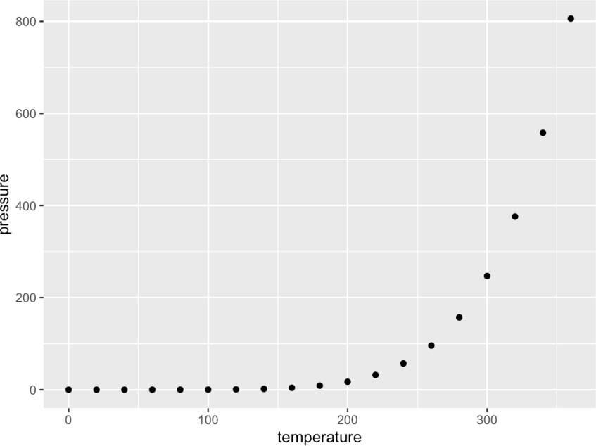
As another example, you can include a code chunk like this (note here we used the echo = FALSE option):
```{r pressure, echo = FALSE, eval = TRUE}
ggplot(data = pressure, aes(x = temperature, y = pressure)) +
geom_point()
```
which will render as:
ggplot(data = pressure, aes(x = temperature, y = pressure)) +
geom_point()
Text content can contain typeset mathematics expressions using standard syntax.
For example, $\alpha$ produces , $\beta$ produces , $\gamma$ produces , etc. The equation for a line can be included as $y = m x + b$ to produce . If you want the same to appear as a “displayed” equation (i.e., on its own line) then you type \[ y=mx+b \] or $$y=mx+b$$ to produce:
Please see the Math for Undergrads handout posted to the BlackboardVLE course page for commonly used mathematics symbols. Or, if you have a specific symbol in mind but don’t know what it is called, try Detexify.
Nuts and bolts
Entering input
At the most elementary level, R works as a fancy calculator. R will evaluate whatever you type at the prompt and return a result. For example, try evaluating . That is, fill in/replace the “blanks” and hit Run Code to evaluate your answer and/or Submit Answer (if the option is available) for instant feedback.
`___`
You can also use standard mathematical functions and operations.
sqrt(5) + 3 * sin(pi/2) + 1/4
A useful feature of R is its ability to create plots. These typically appear in RStudio on the lower right-hand panel in the Plots tab. Fill in the blank below to generate a scatter plot of 100 random numbers drawn from a Uniform distribution between 0.0 and 5.0:
plot(runif(`___`, 0.0, 5.0))
plot(runif(100, 0.0, 5.0))
The standard plot command is quite restrictive. We will use a very modern data visualisation package called ggplot2 from the tidyverse in the module.
Working with arrays
The R language is based on objects you can create, manipulate, and delete. The most fundamental object for holding data is an array and is just an ordered list of things. These are created using the function c. Often these things are numbers. Fill in the blanks to create an array (with the suggested variable name alvin) containing just three numbers.
alvin <- c(`___`, `___`, `___`)
You can also see the object by typing its name. Try running the code below.
bob <- c("a", "b", "c")
bob
You can also output just one element of the array via indexing: bob[index]. Try retrieving the second element of bob by filling in the blanks.
bob[`___`]
bob[2]
You can use R to generate sequences of numbers. See what the following commands do by running the code. Note that for long-ish output, the bracketed numbers at the left correspond to the index of the element that follows.
c(0:100)
seq(0, 100, by=5)
Use the rm() command to remove objects from your environment.
Handling data
To illustrate the power of R at handling larger data sets, let’s examine some data on birth records collected by Dr John Arbuthnot, an 18th century physician, writer, and mathematician.
The Arbuthnot Baptism Data is a collection of baptism records for children born in London every year from 1629 to 1710. Dr Arbuthnot was interested in the ratio of newborn boys to newborn girls. This data can be accessed using the command arbuthnot after loading the MA22004labs package (library(MA22004labs)).
Arbuthnot Baptism Data
We can look at the Arbuthnot Baptism Data by simply running the following code.
arbuthnot
Be careful of spelling and capitalisation! R is case sensitive, so if you accidentally type Arbuthnot, then R will tell you that object cannot be found.
What you should see are three columns of numbers. Each row represents a different record that includes the year, the number of boys baptised, and the number of girls baptised.
If you load this dataset in the R console, note that there will also be row numbers in the first column that are not part of Arbuthnot’s data. R adds them as part of its printout to help you make visual comparisons. You can think of them as the index you see on the left side of a spreadsheet. R has stored Arbuthnot’s data in a spreadsheet or table called a data frame.
You can see the dimensions of this data frame as well as the names of the variables and the first few observations by inserting the name of the dataset into the glimpse() function, as seen below:
glimpse(arbuthnot)
We can see that there are 82 observations and three variables in this dataset. The variable names are year, boys, and girls.
As the first step in any data exploration, it is good practice to use the glimpse command to get a feel for the data. Although we previously said that it is best practice to type all of your R code into the code chunk of your lab, it is better to type the glimpse command into your console.
Generally, you should type all the code necessary for your solution into the code chunk. Because the glimpse command provides a very rudimentary exploration, it is unnecessary for your lab report and should not be included in your solution file.
You can access the dimensions of this data frame alone using the dim function.
dim(arbuthnot)
This command should output [1] 82 3, indicating that there are 82 rows and three columns. Using the names function, you can see the names of these columns (or variables) alone.
names(arbuthnot)
At this point, you might notice that many of the commands in R look a lot like functions from math class; invoking R commands means supplying a function with some number of arguments. For example, the dim and names commands took a single argument, the name of a data frame.
Some exploration
Let’s start to examine the data a little more closely. We can access the data in a single column of a data frame by extracting the column with a $. For example, the code below extracts the boys column from the arbuthnot data frame.
arbuthnot$boys
This command will only show the number of boys baptised each year. R interprets the $ as “go to the data frame that comes before $, and select the variable that comes after $.”
Notice that the way R has printed these data is different. When we looked at the complete data frame, we saw 82 rows, one on each line of the display. These data have been extracted from the data frame, so they are no longer structured in a table with other variables. Instead, these data are displayed one right after another. Objects that print out in this way are called vectors; similar to the vectors you have seen in mathematics courses, vectors represent a list of numbers. R has added numbers displayed in [brackets] along the left side of the printout to indicate each entry’s location within the vector. For example, 5218 follows [1], indicating that 5218 is the first entry in the vector. If [43] was displayed at the beginning of a line, that indicates that the first number displayed on that line would correspond to the 43rd entry in that vector.
Data visualization
R has some powerful functions for making graphics.
We can create a simple plot of the number of girls baptised per year with the following code:
ggplot(data = arbuthnot, aes(x = year, y = girls)) +
geom_point()
We use the ggplot() function in this code to build a plot. If you run this code chunk, a plot will appear below the code chunk. The R Markdown document displays the plot below the code used to generate it, giving you an idea of what the plot would look like in a final report.
The command above also looks like a mathematical function. This time, however, the function requires multiple inputs (arguments) separated by commas.
With ggplot():
The first argument is always the name of the dataset you wish to use for plotting.
Next, you provide the variables from the dataset to be assigned to different aesthetic elements of the plot, such as the x and the y axes.
These commands will build a blank plot with the variables you assigned to the x and y axes. Next, you need to tell ggplot() what type of visualisation you would like to add to the blank template. You add another layer to the ggplot() by:
adding a + at the end of the line to indicate that you are adding a layer
then specify the geometric object to create the plot.
Since we want a scatterplot, we use geom_point(). This tells ggplot() that each data point should be represented by one point on the plot. If you wanted to visualise the above plot using a line graph instead of a scatterplot, you would replace geom_point() with geom_line(). This tells ggplot() to draw a line from each observation with the next observation (sequentially).
Create a line plot of female baptisms by year from the Arbuthnot Baptism Data by completing the code below.
ggplot(data = arbuthnot, aes(x = year, y = girls)) +
`___`
ggplot(data = arbuthnot, aes(x = year, y = girls)) +
geom_line()
Using the Arbuthnot Data Set, generate a line plot of female baptisms by year using ggplot. Is there an apparent trend in the number of girls baptised over the years? How would you describe it? (To ensure that your lab report is comprehensive, please include the code needed to make the plot and your written interpretation.)
ggplot(data = `___`, aes(`___`)) + `___`
You might wonder how you are supposed to know the syntax for the ggplot() function. Thankfully, R documents all of its functions extensively. To learn what a function does and how to use it (e.g. the function’s arguments), just type in a question mark followed by the name of the function that you are interested in into the console. Type the following in your console:
?ggplot
If you are using RStudio, notice that the help file comes to the forefront in the lower-right panel. You can toggle between the Files, Plots, Packages, Help, etc. tabs by clicking on their names.
Some further exploration
Now, suppose we want to plot the total number of baptisms. To compute this, we could use the fact that R is just a giant calculator. We can type in mathematical expressions like
5218 + 4683
This calculation would provide us with the total number of baptisms in 1629. We could then repeat this calculation once for each year. This would probably take us a while, but luckily there is a faster way! If we add the vector for baptisms for boys to that of girls, R can compute each of these sums simultaneously. Try it now.
arbuthnot$boys + `___`
What you will see is a list of 82 numbers. These numbers appear as a list because we are working with vectors rather than a data frame. Each number represents the sum of how many boys and girls were baptised that year. You can look at the first few rows of the boys and girls columns to see if the calculation is correct.
Adding a new variable to the data frame
We are interested in using this new vector of the total number of baptisms to generate some plots, so we’ll want to save it as a permanent column in our data frame. We can do this using the following code:
arbuthnot <- arbuthnot %>%
mutate(total = boys + girls)
glimpse(arbuthnot)
This code has a lot of new pieces to it, so let’s break it down. In the first line, we are doing two things, (1) adding a new total column to this updated data frame and (2) overwriting the existing arbutnot data frame with an updated data frame that includes the new total column. We can chain these two processes together using the piping (%>%) operator. The piping operator takes the output of the previous expression and “pipes it” into the first argument of the following expression.
To continue our analogy with mathematical functions, x %>% f(y) is equivalent to f(x, y). Connecting arbuthnot and mutate(total = boys + girls) with the pipe operator is the same as typing mutate(arbuthnot, total = boys + girls), where arbuthnot becomes the first argument included in the mutate() function.
A note on piping: Note that we can read these two lines of code as the following:
“Take the arbuthnot dataset and pipe it into the mutate function. Mutate the arbuthnot data set by creating a new variable called total, the sum of the variables called boys and girls. Then assign the resulting dataset to the object called arbuthnot, i.e. overwrite the old arbuthnot dataset with the new one containing the new variable.”
This is equivalent to going through each row, adding up the boys and girls counts for that year, and recording that value in a new column called total.
A new column called total has now been tacked onto the data frame. The special symbol <- performs an assignment, taking the output of the piping operations and saving it into an object in your environment. In this case, you already have an object called arbuthnot in your environment, so this command updates that data set with the new mutated column.
Therefore, make a plot of the total number of baptisms per year.
ggplot(arbuthnot, aes(x = year, y = `___`)) +
geom_line()
This time, note that we left out the first argument’s name (i.e., data =). We can do this because the help file shows that the default for ggplot is for the first argument to be the data and that this item is necessary.
Similarly, once you know the total number of baptisms for boys and girls in 1629, you can compute the ratio of the number of boys to the number of girls baptised with the following code:
5218 / 4683
[1] 1.114243
Alternatively, you could calculate this ratio for every year by acting on the complete boys and girls columns and then save those calculations into a new variable named boy_to_girl_ratio:
arbuthnot <- arbuthnot %>%
mutate(boy_to_girl_ratio = boys / girls)
glimpse(arbuthnot)
You can also compute the proportion of newborns that are boys in 1629 with the following code:
5218 / (5218 + 4683)
[1] 0.5270175
Note that you must be conscious of the order of operations with R as with your calculator. Here, we want to divide the number of boys by the total number of newborns, so we have to use parentheses. Without them, R will first divide, then add, giving you something that is not a proportion.
Compute the proportion of newborns that are boys for all years simultaneously and add it as a new variable named boy_ratio to the dataset.
arbuthnot <- arbuthnot %>%
mutate(boy_ratio = boys / total)
glimpse(arbuthnot)
Notice that rather than dividing by boys + girls, we are using the total variable we created earlier in our calculations!
Using the Arbuthnot Data Set, plot the proportion of boys over time using ggplot and mutate. Comment on the qualitative nature of the plot that you made.
ggplot(`___`)
Finally, in addition to simple mathematical operators like subtraction and division, you can ask R to make comparisons like greater than, >, less than, <, and equality, ==. For example, we can create a new variable called more_boys that tells us whether the number of births of boys outnumbered that of girls each year with the following code.
arbuthnot <- arbuthnot %>%
mutate(more_boys = boys > girls)
glimpse(`___`)
arbuthnot <- arbuthnot %>%
mutate(more_boys = boys > girls)
glimpse(arbuthnot)
This command adds a new variable to the arbuthnot data frame containing the values of either TRUE if that year had more boys than girls, or FALSE if that year did not (the answer may surprise you). This variable contains a different kind of data than we have encountered. All other columns in the arbuthnot data frame have numerical values (the year, the number of boys and girls). Here, we’ve asked R to create logical data, where the values are either TRUE or FALSE. In general, data analysis will involve many different kinds of data types. One reason for using R is that it can represent and compute with many of them.
Exercises
The following exercises refer to variables found in or derived from the UK Household Income Data. These include frs_income_21, frs_bracket1_wide, and frs_bracket1_long which are packaged with MA22004labs.
The UK Household Income Data is a subset of data extracted from the Family Resources Survey (FRS) published by the Department for Work and Pensions. The FRS is an annual, representative survey used to develop, monitor, and evaluate social welfare policy. The subset presented in this lab records average weekly household before-tax income by ethnicity in data sets frs_income_21, frs_bracket1_wide, and frs_bracket1_long, which can be accessed after loading the MA22004labs package by library(MA22004labs). Further documentation about each data set can be found in the help menu.
Exercise 1
Compare the data sets frs_bracket1_wide and frs_bracket1_long and note for each (i) the number of observations, (ii) the number, names, and types of variables, and (iii) describe what each variable measures. Briefly comment on whether the data sets contain the same information and comment on how the data sets are different. Demonstrate or describe any R commands used in your analysis. [5 marks]
Exercise 2
Using either frs_bracket1_wide or frs_bracket1_long, produce a ggplot scatter plot or series of ggplot scatter plots demonstrating how the average weekly household before-tax income in the first income bracket (weekly before tax income “up to £200”) has changed over reporting periods. Describe any general trends. Hint: you should add title(s) to your plot(s) and may wish to investigate the addition of colour or shape aesthetics if producing a single plot. [5 marks]
Exercise 3
Consider the average weekly before-tax income for the three years ending in March 2021 in frs_income_21. Produce histograms of the percent of households in each income bracket by ethnic group using ggplot. Demonstrate and describe any new variables you create to produce your plot. Describe the resulting distributions you plot by identifying, e.g., shape or skew and important features. Hints: understand the use of stat = "identity" in the histogram geometry and investigate the command facet_grid. [5 marks]
Exercise 4
Consider the average weekly before-tax income for the three years ending in March 2021 in frs_income_21. Write a headline summary describing the income distributions by ethnic group; you may find it helpful to refer to the plot from question 3. Hint: your headline summary should start by describing the data and its source. It might include answers to the following questions as bulleted statements: (i) What percentage of all households in the UK had an average weekly before-tax income of below £600? (ii) What percentage of all households in the UK had an average weekly before-tax income of £1000 or more? (iii) Households from which ethnic group shown were most likely to have a weekly income of under £600? (iv) Households from which ethnic group shown were most likely to have a weekly income of both £1000 or more and £2000 or more? [5 marks]
2024-03-16