MDS 6112 Assignment 2
Hello, dear friend, you can consult us at any time if you have any questions, add WeChat: daixieit
MDS 6112 Assignment 2
Start: Feb. 26
End: Mar. 15
There are two parts in this assignment: multiple answer questions (50 points) and one programming question (100 points). The covered lectures are from Lecture 7 to Lecture 14.
1 Answer question
1. Answer the following questions on graph visualization.
• Describe what force-directed layout algorithm is. (5 pts)
• Read the paper “Time-Varying Data Visualization Using Infor-mation Flocking Boids” and describe the general idea of Moere’s algorithm for visualizing time-varying graphs. (10 pts)
• Read the paper “DeepDrawing: A Deep Learning Approach to Graph Drawing” and describe the process of the proposed ap-proach for graph drawing. (10 pts)
2. Answer the following questions on tree visualization.
• Given a tree shown in (a), compute the 5 tuple of each node i using leveled-based layout with non-overlapping rectangle approach. (5 pts)
• Given a tree shown in (b), use hw-drawing with a balanced layout to compute the following tuple (Wu, Hu, su) for each node u. (5 pts)
• Analyze the time complexity of hw-drawing with a balanced lay-out. (6 pts)
• Read the paper “GoTreeScape: Navigate and Explore the Tree Vi-sualization Design Space” and describe the pipeline for visualizing tree structure (9 pts).

2 Programming
2.1 Description
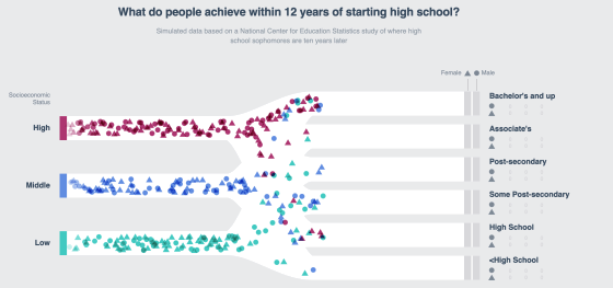
Figure 1: The visual result of programing assignment.
This programming assignment aims to help students get familiar with animated visualization using D3.
In this assignment, you are asked to produce the following visualization results.
• Given a high-dimensional data set in a .json file, visualize the data using a Sankey diagram, as shown in Figure 1.
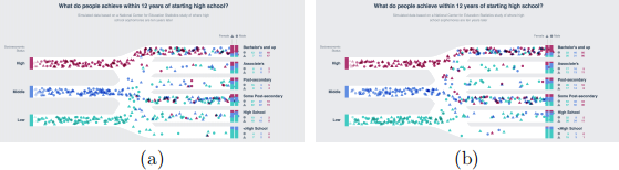
Figure 2: Animation of high-dimensional data visualization.
• Visualize two categories into different shapes.
• Using stacked bar charts to visualize and show the statics, as shown in Figure 1 at the right part.
• Create an animation. Two frames are shown in Figure 2
For the complete animation, please refer to the provided video.
2.2 Requirement
• Access data.
• Stack probabilities.
• Create person.
• Visualize paths.
• Visualize persons.
• Add color and filter.
• Visualize bars.
• Update numbers.
Online Resources The following online resources will be helpful in fin-ishing this assignment.
• SVG in D3
• Scale in D3
• Selection in D3
• Timer in D3
2.3 Evaluation
In total, there are 100 points in this assignment. A detailed evaluation is provided here.
1. Access education attributes and socioeconomic status. (5 pts)
2. Stack probabilities. (10 pts)
3. Create person. (5 pts)
4. Visualize path. (15 pts)
5. Visualize persons. (20 pts)
6. Add color and filter. (20 pts)
7. Visualize bars. (10 pts)
8. Update numbers (10 pts)
9. Submission (5pts). Please compress your code and a readme file (op-tional) into a zip file and submit the zip file to Black Board. The readme file can include descriptions that help the grader run the inter-face successfully.
Note that a penalty of 10 pts will be given to those students who submit the assignment one day after the deadline. A penalty of 20 pts will be given to those students who submit the assignment two days after the deadline. Submissions three days after the deadline will not be graded.
3 Instructions
3.1 Stack probabilities
Since we need to create several people per second, we want our generatePer-son() function to be as simple as possible. Given their sex and socioeconomic status, we know the probability of a person falling into one of our education “buckets”. Since these probabilities sum up to 100%, we can stack these probabilities and use a random number to assign a person to a bucket. Here we take the probabilities for females who grew up in a low-income household as an example.
We can take these probabilities and stack them on top of each other so that each level instead represents the probability that a person achieves that level or lower. The highest level (Bachelor’s and up), will get the number 1 because there is a 100% chance that a person achieved that level or lower.
When we have these stacked probabilities, we can choose a random num-ber between 0 and 1, which we will locate on the number line. For example, if we choose the number 0.32, this person will be placed in the Some Post-secondary education bucket, sketched in Figure 3(a).
In this part, you need to generate an empty stackedProbabilities object to populate. You will loop over each of the starting points in the data set, generating the status key and instantiating a stackedProbability number. Next, you loop over each of the education buckets (in order), adding the current probability to the stacked probability, then returning the current sum. Note that you need to add an additional check – if we are looking at the last education bucket, we will return 1 instead of the running sum. This will help account for rounding errors, where the sum is 0.99 and does not completely add up to 1. The output of stackedProbabilities is shown in Figure 3(b).
3.2 Draw path
First of all, you need to create some scales in the Create scales step. Create an x scale that converts a person’s progress (from left to right) into an x-position and represents this progress with a number from 0 (not started yet) to 1 (has reached the right side). Since we do not want the markers moving beyond the left or right side of the paths, so you can use .clamp() this scale. This way, the smallest number our scale will return is 0 and the largest

Figure 3: Illustration of stacking probabilities.
number is 1, even if we give it a progress of 10.
Next, you will create a scale that will convert from a socioeconomic id to a y-position. We want these paths to be evenly spaced between the bounds, but to still fit inside. You can achieve this by padding the scale’s domain, making it span [−1, 3] instead of [0, 2]. This way, the real socioeconomic status ids will fit inside the bounds.
You will also want the scale’s domain to be backwards: [3, −1] instead of [−1, 3] because we want the highest y position (closer to the bottom) to correspond to the lowest id. An example is shown in Figure 4.
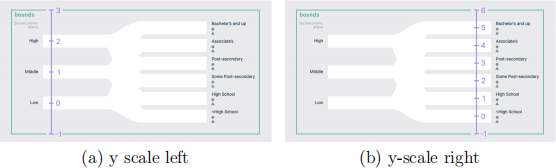
Figure 4: Y scale diagram.
Next, you will use the scales to draw some paths. The goal is to draw a path between each of the starting points and each of the ending points, shown in Figure 5 (a). Since these shapes are not linear, we will draw them using path by using d3.line() to create a string attribute generator. The line generator will take an array of six identical arrays. The first item in each of these arrays (0) is the socioeconomic status id (starting point) and the second item (5) is the education id (ending point). The link generator will return the starting y position for the first 3 arrays, and the ending position for the last 3 arrays. The reason we want to repeat this array 6 times is to devote one-fifth of the horizontal space to the y-position transition. If we only had four identical arrays, we would be devoting half of the horizontal space to the transition, which would make the final chart way more chaotic. The markers would spend one third of their time moving up and down. An example is shown in Figure 5(b).
You will need to create that six-item array for each permutation of start-ing and ending ids. Map over each of the starting ids and also each of the ending ids, creating that six-item array for each loop. Pass the result to LinkOptions (using d3.merge()), which will flatten these into one array.
Finally, the output of linkOptions is shown in Figure 6. Note that you need to add an interpolator function to line generator to smooth the paths. (i.e., .curve(d3.curveMonotonX)).
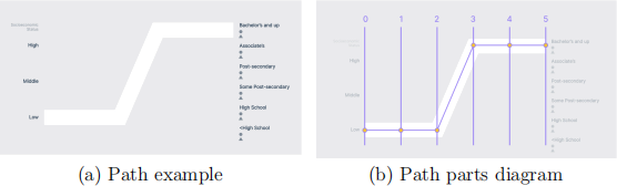
Figure 5: Example path.
3.3 Visualize persons
In this part, you need to create a function called updateMarkers() that will draw people. You will use d3.timer() to update the position of peo-ple. d3.timer()’s first parameter is a callback function that it will call until the timer is stopped (which we can do the timer’s .stop() method). The callback function will have access to one parameter: how many milliseconds have elapsed since the timer started. Then you need to add a new person to the people array every time updateMarkers() runs.
Then, starting with females, you can draw a triangle for every person in the array. You can isolate these people by .filter() the people array with a sex
Figure 6: Output of linkOptions.
of 0. Similarly, you can draw male markers, then update all of the markers’ positions at once. Note that the generatePerson() function needs to record when that person was created beside the regular information.
3.4 Add color and filter
Once the simulation has been running for a while, we will have a lot of elements on the screen at once, which can get expensive. So you need clean up markers that have finished their journey by adding another filter rule when you create the female and male markers. To achieve that, you need to remove any markers that have completed their journey.
Once the markers make it to the right side, their sex is still clear (based on their shape), but it’s not clear what socioeconomic status they started in. So you need to add a color scheme that helps distinguish the markers. You need to create a color scale at the end of Create scales step. You can use a linear scale that interpolates between two colors – by setting the domain to an array of the sesIds, then you will get three unique, equally-spaced colors. One interpolator that can be used is d3.interpolateHcl.
You may notice how the markers overlap the start bars, once the markers reach the right side? This is because the existing people are being recycled and already have an opacity of 0.
To address this, you need to give each person a unique id when we create them. Each time we call generatePerson(), we will increment the current-PersonId variable that we’ll use as an id. This way, each person’s id will be distinct.
When you create the female and male markers in the updateMarkers() function, you can tell D3 how to distinguish people from one another. D3 selection objects’ .data() method takes a second parameter: a key accessor. This key accessor defaults to the element’s index – this explains why the markers were being recycled: items in the filtered array are removed once they reach the end of their journey, and new elements end up in the same position in the filtered list. Instead, you can set the key accessor functions to return a person’s id, guaranteeing they are not recycled.
3.5 Visualize bars
In this part, you are asked to draw the ending bars. At the end of up-dateMarkers() function, you need to create an array of people who have finished their journey and fit inside of that education bucket. We will want to draw one bar per path: each permutation of sex, socioeconomic status, and educational attainment. To achieve this, you need to create a flattened array, with one object per permutation that contains the starting and ending positions, the count, the percentage above, and the total count in the bar. Now that you have an array for each of the ending bars, you can create one rect per bar. Now once the markers finish their journey, you will see their colors populate the bars on the right. After the simulation has been running for a while, the stacked bars should start to level out, approximating the percentages in the data set.
3.6 Update numbers
Show the exact counts underneath the labels for each of our path endings, next to the female and male markers.
2024-03-14
data visualization