PSYCH204-24A (HAM & TGA). Behavioural Psychology and Perception
Hello, dear friend, you can consult us at any time if you have any questions, add WeChat: daixieit
PSYCH204-24A (HAM & TGA). Behavioural Psychology and Perception
Practical 1: Psychophysical Methods.
Psychophysics is the study of the relationship between the physical stimulus and the observer's response to that stimulus. Several standard methods have been developed for determining the relationship between the stimulus and perception. These methods are used by experimental psychologists to study a wide range of perceptual phenomena in humans and animals. Today you will run two simple versions of perceptual experiments in order to introduce you to two basic psychophysical techniques (Method of Constant Stimuli and the Method of Adjustment).
First you need to be reminded of some terminology introduced in the introductory (PSYCH100) lectures and in PSYCH204 lecture 1. When researchers ask questions such as: “How dim a light can a human see?”; “What is the faintest sound one can hear?”; “How faint can a smell be before a dog can no longer detect it?”, they are concerned with absolute thresholds-the smallest amount of energy needed to detect a stimulus. There are also many research questions to do with relative thresholds., e.g. How much more intense must one patch of light be than another before an observer notices the difference? When we measure such a difference threshold we are interested in determining the minimum difference between the two stimuli that can be detected (just noticeable difference or JND).
Besides measuring thresholds of different sorts, psychophysicists also often try to determine the point at which two stimuli appear the same. This is referred to as the point of subjective equality (PSE). This psychophysical measure has a wide range of applications, especially in research involving illusions and it is the measure that you will be using in the experiment today.2
PART A. The Ponzo Illusion.
The following is a copy of the information presented on the computer. You can use it as a reference during the write-up stage.
In the Ponzo illusion (or railroad track illusion), converging lines give the impression of depth to a two-dimensional picture on the page. Two horizontal lines of equal physical length on the page appear to be at different ‘distances’ from the eye and consequently are perceived as being of different lengths. By changing the length of one of the lines until they appear equal again, it is possible to measure the ‘strength’ of the illusion. The purpose of the experiment is to gain experience with psychophysical techniques rather than study the illusion itself but you can find some more information about the illusion in the recommended textbook (Goldstein) or on the web.
In order to determine the PSE using the method of constant stimuli, it is first necessary to pick the stimuli to be presented to the observer. This is normally a critical and challenging part of the procedure, but in order to speed things up it has already been done for you. Because people experience illusions differently, the range we selected may not be suitable for everybody in the class. We will explore this issue in more detail in the assignment questions for Part A.
Instructions:
1. Go to the K1.07 lab (School of Psychology in K block on the 1st floor) anytime during the week the lab starts. The lab should be open from 9am to 5pm, otherwise ask one of the administrators in the Psychology Office to let you in. If you are doing the experiment from home, make sure to read the instructions on how to remotely access the lab. The experiment will only take around 30 minutes to collect the data and there are 12 or so computers available so there should be no problems finding a spare computer sometime during the week. The computer and screen should already be turned on, but if not, just power it up. Log onto any computer using your student login name and password (you will have to switch user at the start to log in under your name). For Tauranga students, go to either TCBD.2.11 or TCBD.3.04 anytime during the week of the first lab. The lab classrooms should be open from 9am to 5pm. You can also use the 24-hour computer lab (TCBD.1.03). Please note that for after-hours access you will need your student ID card and PIN (contact security on Level 1 for assistance with access). There are 40 or so computers available so there should be no problems finding a spare computer sometime during the week. The computer and screen should already be turned on, but if not, just power it up. Log onto any computer using your student login name and password (you may have to switch user at the start to log in under your name).
2) Start up the first experiment by going to the Windows icon  at the bottom left of the screen and then scroll down to the letter ‘P’ programme’s list (alphabetical index) -> click on the ‘Psychology’ folder and select ‘PSYCH204 Expt1A’. Ensure your screen is full sized while running the experiment.
A window will appear asking for your name. Put your name in here. This will end up on your data sheet and will be used to verify that you have run the experiment.
3). Follow the instructions on the screen. The experiment is presented as a series of web pages and should be easy to operate. You generally only need to click once on anything to activate it with the mouse. If you have any problems running the practical, please contact us via Moodle.
4). When you have finished running the Ponzo experiment (60 trials in total) a results page will appear. This will have your name at the top along with the day and time you collected your data. Ignore any reference to PSYC226 on the results page. This is the name of the Perception part of the PSYCH204 paper before it joined with the Behavioural Psychology part. Before closing your browser window, you need to save it as a pdf file to your H drive student account. Scroll down to the bottom of your data sheet and click on the ‘Press once to print’ button. If it is not already selected, select the ‘print to pdf’ destination option and navigate to your H drive and save the results data sheet there. There may be a glitch where your data never saves, so to be safe, take a screenshot or picture of the data on the screen (You can just submit the picture if you don’t have the saved data file).
That is all you have to do with Part A while in the laboratory. The rest of the Part A assignment involves graphing the data and answering some questions which you can do either in the lab or at home. Move onto Part B (below) to complete the data collection part of Practical 1.
PART B. Visual Acuity and Contrast Sensitivity
Instructions:
1) Follow the instructions for Expt1a but select ‘Expt1b’ from the Psychology folder this time to start the experiment for Part B.
Read the instructions on screen before beginning the experiment.
Make sure you sit at the correct distance (about your arm’s length away/approx. 57cm) from the screen. If you get too close to the screen you will not be seeing the correct spatial frequencies required for the experiment.
The background and terminology you need for the experiment will be provided on the computer screen once you start. A summary of the screen material has been included in this handout in case you need to consult it during the write-up stage.
If you wanted to know how well you can see, you would probably consider using an eye-chart of some sort with different sized letters (e.g., Snellen letter charts as shown in Figure 1).
Figure 1
Eye-Chart Examples
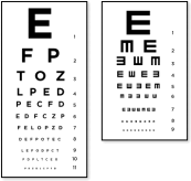
This is one way of measuring the resolving power or acuity of your eyes. However, it measures acuity only for high contrast situations and for very fine detail (high spatial frequencies). It ignores important aspects of vision such as how well you can see large objects (low spatial frequencies) under dim lighting conditions (low contrast). In order to better understand how well we can see under the wide range of lighting conditions we normally encounter, we need a more sophisticated means of measuring acuity. This involves measuring the contrast sensitivity function (CSF) of an observer. The CSF can also tell us a lot about the cortical neurons that are analyzing the visual scene. We will be discussing this in one of the lectures.
An actual experiment testing an observer's CSF would usually be done under controlled lighting conditions using many trials and a full psychophysical procedure. We do not have the time or appropriate equipment to do a full experiment and so the purpose of today's exercise is to introduce you to some of the ideas behind the CSF and to demonstrate another Psychophysical procedure (The Method of Adjustment).
This is a brief review of some of the terminology used in this experiment.
A sinusoidal grating is a grating pattern in which the intensity of darker and lighter bars varies sinusoidally over space. This means that if you were to measure how much light is reaching your eyes from different parts of the grating (e.g., using a light meter) you would find that as you moved from left to right across the image, the intensity would follow a pattern similar to that shown in Figure 2.
Figure 2
Sine Wave Example
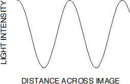
This is known as a sine wave and is the reason why the gratings are referred to as sinusoidal gratings.
You will see several examples of such gratings today. The spatial frequency of the grating refers to the frequency with which the grating repeats itself per degree of visual angle. The contrast of the grating refers to the difference in light intensity between adjacent bars in the grating. More specifically, the contrast is the amplitude of the grating divided by the mean intensity.
Results.
Record the contrast values that appear in the ‘Alert’ window into the Expt 1b Data Table1 in the table below. Once you have written down the value, click the ‘OK’ button in the window. (Note: if you forget to write down the value, you will have to repeat that grating setting).
Experiment 1b Data Table 1.
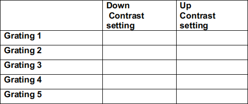
You have used the Method of Adjustment psychophysical procedure to set the contrast of each grating to the point where the vertical bars first appeared or disappeared. It is called the Method of Adjustment because you (the participant) changed (adjusted) the contrast levels yourself using the up and down arrows. In the psychophysical method your used for Part A (Method of Constant Stimuli) the computer software determined the size of the lines.
PERCEPTION PRACTICAL 1 QUESTIONS AND TASKS.
You have until Friday 15th March, 11.59pm to complete this assignment. The completed assignments need to be uploaded to Moodle (see Practical 1 assignment submission folder). You will lose marks for every day late (see paper outline) so do not leave the completion of the assignment until the last moment. You will not be able to submit the assignment after it is 5 days late.
You will need to download the Excel template from Moodle (Practical 1 template) in order to complete the assignment. You will need to have a copy of your data sheet handy and a computer that has Microsoft Excel on it. You will be uploading the completed Excel file AND a copy of your data sheet to Moodle.
PART A. The Ponzo Illusion.
1. Data Analysis.
a) Description of the data sheet.
The length of the standard line (top) always remained constant throughout the experiment. It was set to 42 mm but this may vary slightly from computer to computer. The comparison lines (bottom) ranged from 42 mm up to 57 mm in length. There were 6 comparison lines in total:
1 = 42 mm 2 = 45 mm 3 = 48 mm 4 = 51 mm 5 = 54 mm 6 = 57 mm
Each one was presented 10 times, giving a total of 60 trials.
The different comparison lines are marked as ‘42’, ‘48’, etc., in the second column of your data file. (The first column is a number corresponding to the trial on which the particular comparison line was presented). Notice that you were not just presented with ‘42’ on the first trial and ‘45’ on the second trial etc. The method of constant stimuli presents the different comparison stimuli in random order.
The 3rd column contains the ‘yes’ and ‘no’ responses you made to the different stimuli.
b) Tallying the results.
Open up the Practical 1 Assignment Template Excel spreadsheet you downloaded from Moodle. Make sure you are on the PartA sheet (see tabs at bottom of spreadsheet). From your data sheet, add up the number of ‘Yes’ responses for the 42mm comparison stimulus and enter the total into the ‘Tally (total ‘Yes’) column’ next to 42. Repeat for the other comparison line lengths (45mm, 48mm, .... 57mm).
For each comparison test line, Excel will convert the tally of Yes’s into percentages and put the values into the column marked ‘% ‘Yes’ Responses’. What is being calculated here is the percentage of times you responded ‘Yes’ (“the bottom line is longer than the top one”) for each value of the comparison lines (42 mm, 45 mm etc.,). You were shown each comparison line length 10 times. If you said ‘Yes’ zero times for a particular line length, the percentage would be 0% (0 divided by 10 multiplied by 100). If you said ‘Yes’ 5 times, the percentage of Yes responses would be 5/10 x 100 = 50%.
2. Results.
A1. Plotting the data (2 marks). The Ponzo Illusion experiment you ran had a fixed top line (the standard line) that was 42mm in length. The experiment also showed a range of ‘comparison lines’ which were on the bottom of the Ponzo figure. The bottom comparison line lengths (42mm, 45mm, etc.,) will be used as the X values for your graph. These have been put into a column on the left of the sheet. The Y values in the graph are taken from the percentage of Yes responses column and these are copied by Excel into a column marked ‘Y values’. As you enter the different totals you will see a graph being plotted on the right of the tables. This curve is referred to as a psychometric function. It is normally ‘S’ shaped and reflects the gradual transition between not perceiving something (e.g., a difference in line lengths) and perceiving something. When the percentage value (Y axis) is low, it means you hardly ever thought the bottom line was longer than the top line. When the value is high (e.g., 100% for the 57mm line) it means you definitely saw the bottom line as being larger than the top line and it looked that way on every trial that the bottom line was 57mm long.
What we are interested in is the values for the line length where you sometimes thought the comparison line was longer than the top one and sometimes you thought it was shorter. This is the region where your visual system and brain is having trouble deciding between (shorter and longer or ‘No’ and ‘Yes’). Psychophysical measures such as absolute threshold or the PSE lie somewhere between these two perceptual states.
A2. The point of subjective equality (PSE) is defined as the magnitude of a comparison stimulus that is equally likely to be judged greater or less than the magnitude of a standard stimulus. For the Ponzo illusion experiment the PSE. corresponds to the point at which the two lines appear equal in length. At this point the observer (you) can only guess which line is the longest. If your guessing is truly random you should respond ‘Yes’ on 50% of the trials and ‘No’ on the other half. Find your PSE by following the horizontal line out from the 50% point on the Y axis and seeing where it meets the psychometric curve you plotted in A1. What is the value on the X axis that corresponds to where the 50% line meets your graph? This could fall between two values marked on the graph (e.g., between 45 and 48). If so, just estimate as best you can what the value along the X axis would be down from your 50% point. The gap between the X axis values is 3mm in all cases. If your PSE value falls halfway between 48 and 51 for example, your PSE value would be 48 + 3/2 = 48 + 1.5 = 49.5mm. Enter the value you obtained into the red box in your spread sheet next to ‘PSE =’ under Qu. A2. (2 marks)
Note 1: For some students the selected range of the comparison line lengths may not have included a sufficiently long line for you to always report it as being longer than the comparison. If your highest tally was less than 5, your percentages will not reach 50% and so you will not be able to determine a PSE value. Instead just enter the comparison line length corresponding to the highest value on your graph in the red box and put an * next to it to indicate that it is an approximate estimate of your true PSE only.
Note 2: Your graph may also go up and down so that you have two (or more) possible places where the 50% horizontal line meets the graph. Just select the point of intersection corresponding to the highest line length value for your PSE.
A3. The actual length of the standard line was 42mm. Your PSE value indicates how long the comparison line had to be before it appeared to be the same size as the standard line. If your PSE value is greater than 42mm then the bottom line had to be set longer than the top line in order for it to appear the same size. This means that the converging railway track lines made the bottom line appear shorter than the top line. In other words, you experienced the Ponzo illusion. You can estimate the strength of the illusion (as a percentage) by dividing your PSE value by 42mm and multiplying by 100, i.e., PSE/42 x 100. Put your answer into the Excel sheet next to A3. (2 marks)
A4. In the Method of Constant Stimuli, it is important to select a range of comparison stimuli which spans the expected value of the PSE. The smallest value should ideally always produce 0% ‘Yes’ responses and the largest value should produce 100% ‘Yes’ responses. Values in the middle should produce percentages close to 50%. Was the range of comparison test lines suitable for you (Yes/No)? Put your answer into the A4 box. (1 mark)
A5. If you had ignored the instructions for the experiment and had closed your eyes, not looked at the lines and just responded ‘Yes’ or ‘No’ on a random basis, what do you think your data graph would have come out like?
(a). The graph line would have been almost flat and would fall along a horizontal line close to the 0% mark.
(b) The graph line would have been almost flat and would fall along a horizontal line at the 50% mark.
(c) The graph line would have been almost flat and would fall along a horizontal line at the 100% mark.
(Pick one and put the answer into the A5 box). (1 Mark)
A6. Why did you select the answer you gave in A5? Your explanation only needs to be a sentence or two and write it into the cell next to A6. (1 Mark)
If you have trouble answering questions A5 & A6, try tossing a coin 10 times for each line length and recording how many ‘Heads’ you get. This is equivalent to the ‘Yes’ tallies you found for A1 but instead of paying attention to the lines, you are just guessing randomly. What would your graph look like of you plotted these ‘Heads’ totals instead of your ‘Yes’ totals?
Summary of PART A.
You have used a particular psychophysical technique (Method of Constant Stimuli) to derive a psychometric curve from which you were able to estimate the PSE. You should be aware that there are several other psychophysical techniques (e.g., the staircase method) which have advantages (and disadvantages) over the Method of Constant Stimuli. They also generate psychometric functions, from which one is able to estimate thresholds, difference thresholds or PSE's.
Reference (if you want more background to this topic):
1) Recommended textbook: Goldstein, E.B. Sensation and Perception.
PART B: Visual Acuity and Contrast Sensitivity
Switch to the PartB section of the Excel spreadsheet you downloaded for Practical 1 (see tab at bottom).
Data Analysis and plotting:
The spatial frequencies of the different stimuli you viewed are provided below. The spatial frequency of a grating is the number of cycles per degree of visual angle. The size of gratings 1-4 on the screen was 5cm across and you sat approximately 57cm from the screen. It is possible to calculate the visual angle (in degrees) using these numbers and some basic trigonometry. This reveals that the gratings subtended an angle of 5 degrees at your eyes (i.e., the grating had a visual angle of 5 degrees). Grating 5 was only 2.5 cm across and had a visual angle of 2.5 degrees.
The gratings contained the following number of cycles across the whole grating:
Grating1 2.5 cycles.
Grating2 5 cycles.
Grating3 10 cycles.
Grating4 40 cycles.
Grating5 40 cycles.
Therefore the spatial frequency for each grating can be found by dividing the number of cycles by the visual angle:
Grating1 spatial frequency ( = 2.5/5) = 0.5 cycles/degree.
Grating2 spatial frequency (= 5/5) = 1 cycle/degree.
Grating3 spatial frequency (= 10/5) = 2 cycles/degree.
Grating4 spatial frequency (= 40/5) = 8 cycles/degree.
Grating5 spatial frequency (40/2.5) 16 cycles/degree.
Enter the contrast threshold setting values you put into the data table on P. 5 into the two columns of the spreadsheet marked in red (Down contrast setting and Up contrast setting. The average of these two settings is calculated for you and should show up under the column marked ‘Mean contrast threshold setting’. This is the average setting where you first saw the grating pattern disappear (down trials) or appear (up trials) and it looked gray to you. This is an indication of how well your visual system could detect the bars (vertical lines) in the different gratings.
B1. Interpreting and plotting your contrast settings.
(2 marks)
The contrast settings you recorded (e.g., .008) indicate what the difference between the bright and dark parts of the grating was when you were first able to detect the bars. The number you obtained for the contrast setting is an indication of your contrast threshold for the grating (i.e., the smallest intensity difference you were able to detect). The smaller the number, the better you were at detecting intensity differences (contrast). However, it is counterintuitive to have a value that is small indicate that you are performing well, so these thresholds are normally converted into contrast sensitivity which is equal to 1/threshold. Sensitivity measures are more intuitive than contrast thresholds because small numbers correspond to low sensitivity and big numbers correspond to high sensitivity. The Excel spreadsheet has converted your contrast values into contrast sensitivity and you will see these in the column on the far right.
You will notice that your contrast sensitivity values span quite a wide range of values. When this happens with data, it is often the practice to take logarithms of the numbers to squash the range down so that they fit on one graph better. The grating spatial frequency values were also selected so that they covered a wide range (.5 to 16) and they increase in unequal steps. In order to plot these on a compressed scale using Excel, a column has been created under X values that just go from 1 to 5 corresponding to the grating numbers you looked at but another scale has been added below the graph to show you the spatial frequency of each grating.
This graph represents your ability to detect the contrast of gratings with different spatial frequencies and it is referred to as a ‘Contrast sensitivity function’ or CSF.
You should be able to see that you are better at detecting some spatial frequencies compared to others. The conditions in which you ran the experiment were not ideal (too much stray light in the laboratory, reflections on the screen etc., etc.) and so this is just an approximation of your CSF. If you carried out a full test with many more gratings and under more controlled conditions you would get a function something like the one shown in Figure 3 (Adult curve).
Figure 3
Contrast Sensitivity Functions for an Adult and Infants tested at 1, 2, and 3 Months of age
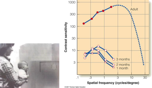
Note. From Figure 16.6, Goldstein text book, Sensation and Perception, 7th Edition. Note that the Y axis scale is different from your graph and does not show the logarithm value (for reference, 3 on your scale corresponds to 1000 on this graph).
The other CSF curves are from infants of different ages. These are data collected using infants looking at grating patterns (left part of figure).
Figure 4
Contrast Sensitivity Functions for a cat Compared to a Human.
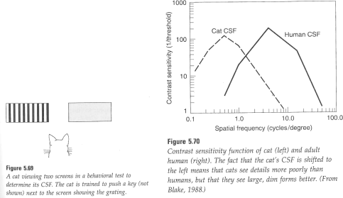
Note. From early edition of Goldstein textbook.
The type of contrast sensitivity experiment you carried out on yourself has also been carried out using a variety of different animals. Figure 4 shows the data for a cat.
B2. Based on your data graph, which grating(s) were you most sensitive to? You may have been equally sensitive to several gratings so enter the number or numbers of the grating into the cell next to B2. (1 mark)
B3. Which grating(s) were you least sensitive to? Enter the numbers in the cell next to B3. (1 mark)
B4. Using the peak of your curve as an indication of your ability to detect contrast at high spatial frequencies are you better or worse than cats (their peak = 0.4 cycles per degree). Put ‘Better’ or ‘Worse’ into the cell next to B4. (2 marks)
B5. The Cats vs Humans graph in Figure 4 also tells us something else about ability to detect contrast. Pick one of the following options and put the answer into the cell next to B5 (2 marks):
(a) Cats can see the same range of spatial frequencies that humans can.
(b) Cats can see very fine (high spatial frequency) detail (e.g., whiskers) better than humans.
(c) Cats can see very low spatial frequencies (e.g., shadows) better than humans.
B6. Based on the graph in Figure 4, we would expect the threshold for cats to be (lower/higher) than humans at 10 cycles per degree? Put your choice (lower or higher) into the cell next to B5. (2 marks)
Summary of PART B.
You used a psychophysical technique called the Method of Adjustment to derive your contrast sensitivity function (CSF). This gives a measure as to how sensitive you are to contrast (difference between light and dark regions in an image) over a range of spatial frequencies. It would normally be a useful indication of your visual abilities for a range of object sizes and contrast levels. However, the testing conditions you used were far from optimal and so the CSF you obtained is only a rough estimate of your true contrast sensitivity.
Reference for more information on the topic:
1) Goldstein, E.B. Sensation and Perception Recommended Text Book. 7th Edition, pp 355-356. 8th Edition, pp 383-384. 9th Edition. p. 67 (note this edition does not have as much on contrast sensitivity as the earlier editions).13
Uploading your Practical 1 assignment.
Once you have completed filling in the Excel Template for Practical 1, upload the completed Excel template AND the pdf of your results sheet to Moodle. Further instructions are provided on Moodle. Check the due dates and leave plenty of time to get the assignment submitted so that you do not lose marks for lateness (see Paper outline).
If you have any additional questions that were not covered during your lab sessions, please post your query on the Moodle Lab Discussion Forum.
2024-03-11