Stat 133 Warmup 2: Data Visualization
Hello, dear friend, you can consult us at any time if you have any questions, add WeChat: daixieit
Warmup 2: Data Visualization
Stat 133, Fall 2021
Visualizations of your data
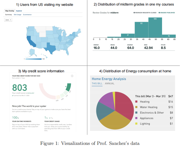
The purpose of this assignment is to look for graphics and visualizations about your own personal data or data directly related to you. As an example, the figure below depicts four graphics of Prof. Sanchez’s data (graphics obtained from the products/services used such as Google Analytics, Gradescope, Mint, and PG&E).
You will have to search for graphics around the products and services you use, for example:
● Utilities provider (e.g. water, gas, electricity)
● Internet and/or cable-TV provider
● Cellphone provider
● Financial services (e.g. savings acct, retirement acct, debit card, credit card, credit score, loans, mortgages, etc)
● Your health care provider
● Your wearable devices (e.g. to track your steps, burned calories, GPS locations, sleep time, etc)
● Your social media analytics & statistics (e.g. instagram, linkedin, twitter, youtube, etc)
While you may not have all of the services listed above, we are sure you will have access to some of them, and will be able to find charts and graphics of your data.
Associated readings
We are assuming that you have read the papers listed below. These are part of the reading materials for weeks 5 and 6. The corresponding pdf files are in bCourses, section Files, inside folder readings:
● Effectively Communicating Numbers, by Stephen Few.
● How to Display Data Badly, by Howard Wainer.
General Instructions
● Write your narrative and code in an Rmd (R markdown) file.
● Name this file as hw02-first-last.Rmd, where first and last are your first and last names (e.g. hw02-gaston-sanchez.Rmd).
● Please do not use code chunk options such as: echo = FALSE, eval = FALSE, results = 'hide'. All chunks must be visible and evaluated.
1) Describe four graphics
From all the graphics that you found displaying your personal data, choose 4 and include screenshots of them in your report.
● To include screenshots in your report, we suggest using the function include_graphics() from "knitr". This function gives you more control on the appearance of the graphics in your html document. See figure below with a hypothetical example with the following code-chunk options:
– out.width='85%' allows you to control the width of the figure with respect to the html output. There’s also out.height
– fig.align allows you to control the figure alignment (left, right, etc)
– fig.cap lets you include captions

● For each graph, provide a description/explanation of its context
– Where does it come from?
– What is the data—individuals & variable(s)—behind the graph?
– Is there a time period associated to it?
– What is the type of graphic (e.g. barchart, piechart, timeline, histogram, map, heatmap, etc)?
● Describe what color scheme (if any) is being used
● Taking into account the so-called “data ink ratio” concept, explain whether each graphic seems to be maximizing this ratio or not.
● Describe the things that you find interesting about your graphs.
– Is it the colors?
– Is it the visual appearance?
– Is it the way in which data has been encoded graphically?
– Is there anything that catches your attention?
● Which graph is the one you find the most interesting? And why?
2) Replicate a Graph
Pick one of the graphics from the previous section, and try to replicate with "ggplot2" functions. This very likely means that will also have to “manually” create the data to produce the graphic, or have access to the data source.
Your replication doesn’t have to be exact, but try to approximate the plot as much as possible. For instance, if you cannot get the same colors, try to get as close as possible to the displayed color hue(s). Likewise, try to match the color background (if any), or the grid lines, the legends, annotations, etc. If you find yourself having a hard time reproducing a given graphic, then look for another graphic that is less difficult to replicate.
3) Find a bad plot
In addition to the graphics described in section 1, include one more graphic that can be considered to be a bad plot. To be clear, this “bad” plot cannot be one of the four graphics described in part 1).
● What makes this graph “bad”? Is it bad because it is misleading, or because it is unclear (or both)? Explain.
● What rules (from Wainer’s paper) does it follow?
4) Improving the bad plot
Create an alternative graphic that produces an improved display of the bad graphic described in section 3. In other words, don’t produce a chart that is less effective than the original one. In addition, provide a description/explanation for the reasons to choose the type of alternative chart.
2021-10-23