ARCH2181 - Developing Archaeological Research 2023/24
Hello, dear friend, you can consult us at any time if you have any questions, add WeChat: daixieit
ARCH2181 - Developing Archaeological Research
Working with Quantitative Data
2023/24
1. Introduction
This is a practical class. If you need help please ask, but you are also encouraged to discuss things with those around you. You may get quicker (and sometimes better!) answers.
The data we will use is on a series of spreadsheets available on Blackboard. We will use Excel to manipulate quantitative data, but you will find much the same functionality in OpenOffice,
LibreOffice and other spreadsheet programs.
The statistical analyses towards the end of this worksheet are also done in Excel for consistency in
this practical, but if you are doing much statistical analysis you may want to use specialist statistical software, such as:
• SPSS is an enormously powerful and complex statistical package available on University PCs orappsanywhere.durham.ac.uk.
• PAST is the PAlaeontological Statistics package, which is free and does most of what archaeologists are likely to want, but has limited output
(https://www.nhm.uio.no/english/research/resources/past/).
• R isa free package. This is the professional statistician’s option, which can do anything
statistical. Seehttps://sites.google.com/a/tamu.edu/dlcarlson/home/r-project-for- statistical-computingfor advice on using it for archaeology.
These instructions have a lot of material in them. In the two hours available most people will not be able work through everything here. If you have much previous experience you may find the early sections easy. If you are familiar with creating charts and using simple formulae in Excel, you may want to start at section 4 or 5. It does not really matter how far you get, as the aim is to improve your knowledge and skills in handling quantitative data.
Hint: you may want to have this file and Excel open at the sametime on your screen. On Windows by pressing the ![]() key and the left or right arrow key together, you can move the pdf to one side and Excel to the other.
key and the left or right arrow key together, you can move the pdf to one side and Excel to the other.
Saving your work. As you work, do remember to save what you are doing periodically so that if Excel crashes you can recover most of what you have done.
2. Summarising data using functions
Download the spreadsheet metacarpals.xls from Blackboard and save it.
This spreadsheet contains measurements of the dimensions of the medial and lateral condyles of some sheep and goat metacarpals.

Diagram of sheep and goat metacarpals showing the differences in shape and the measurements used.
Excel can do a wide range of calculations automatically without you having to know complicated formulae. Already on the sheet at the bottom of the data is an automatic calculation of the sum of all the data. This is not very interesting, but shows you how it works.
To calculate the mean value of one of the measurements of the metacarpals,
• select an empty cell (the one beneath the total will do) and type the following into it:
=average(
• then use the mouse to select the column of data and
• add a closing ) before pressing enter.
You might like to label this value by typing mean in column A.
Hint: if you have typed a formula in Excel you can copy it horizontally or vertically by clicking on the little square toggle in the bottom right of the cell and dragging it. Excel will automatically adjust the formula to match the new column or row.

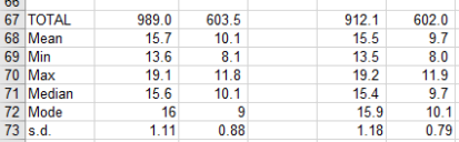
The functions mode, median, min, max, stdev.s work in exactly the same way as average to give you the mode, median, minimum, maximum and standard deviation of the data, respectively.
Create a list of these values for each of the four columns of data in the spreadsheet.
Values which summarise your data in some way like this are called statistics. Can you tell from these calculations which measurement is most variable?
For the medial condyle missing values have been entered as zero.
What problem does this cause in applying these functions to these data?
Delete the zeroes to improve the summary of the data.
You may need to consider how you represent missing values in any datasets that you create yourself.
The results of your calculations should look something like this:
Save the metacarpal data.
3. Scatterplots
The most common use of Excel is for drawing various graphs and charts, and these can be very useful for exploring data.
• In the metacarpals data drag the cursor to select rows 2 to 65 in columns B and C.
• click on the Insert menu
• in the Charts section click on Scatter
• choose the first option.
You should get a chart like this:

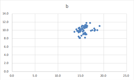
Excel will automatically choose from its range of options for plotting the scatterplot, but as you can see this is not very well laid out or helpfully labelled. You can change almost everything about the formatting of this chart.
There are multiple ways to access the formatting options. Every possible option is available via the Chart Tools Layout ribbon, but many can be more easily accessed by clicking or right-clicking.
Formatting charts
The default title is not helpful.
Click on the bat the top of the chart and you can replace it with something more informative like Condyle measurements.
You can also choose font and colour.

Adjust the axes, as the data is all clumped together in the top right corner of the chart.
• Right click on the numbers of the vertical axis and choose Format axis.
• From your previous calculations you know that the range of b values is 8.1 to 11.8, so a sensible range for this axis might be 8 to 12.
• Set these values using the first two options in the right hand panel.

Do the same with the horizontal axis to set its range as 10 to 20.
From the right-click menu you can also change the font for the axis.
Change the font to something other than the default 9 point Calibri.
Spend a few minutes exploring the options for axes.
You can also format the chart area (right click in the white margins of the chart) and the plotarea (right click somewhere white in the area defined by the axes).
Change the colour scheme to something more interesting.
The default insertion of gridlines in Excel is contrary to usual practice in the academic literature.
If you click on one and hit the delete button you can get rid of them.
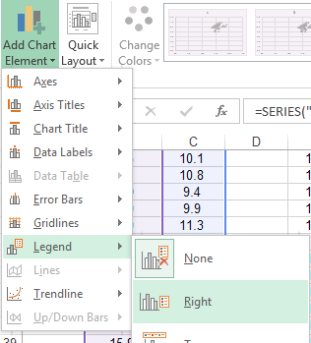
Your chart should be looking better now, but it needs a legend.
In the Chart tools Design ribbon use the Add Chart Element drop down menu to insert a legend.
The labelling comes from the title above your data, and in this case is not very useful.
Click on one of the data points and a formula will appear in the bar above the sheet.
Highlight the first part inside the brackets like this:

and replace it with "Medial" (include the quotation marks).
If you didn’t follow the instructions exactly you may see a formula beginning
SERIES(,Sheet1!$B$3… with a bracket followed by a comma, and no Sheet1!$C$2. If this is the case insert “Medial” between the bracket and comma.
By now you should have a chart something like this, where the sheep and goats are clearly separated into two linear groups:

Adding more data
We can add the lateral condyle data to this chart in order to compare the two sets of measurements.
Select the data in rows 2 to 65 in columns E and F.
Press ctrl-C to copy it.
Then click once on the chart.
On the Home menu choose the drop-down menu for Paste, and then Paste Special.

A dialogue box will appear and you need to check the options are set as shown here, before clicking OK.
The new data should be added to the chart.
The legend entry is unhelpful, so change it to “Lateral” by selecting the data series and editing the formula in the same way as before.
The two data series have symbol shapes and colours chosen by
Excel.
You can change them to something more helpful.
Do remember though that it is good practice to use a different colour and a different shape for each series.

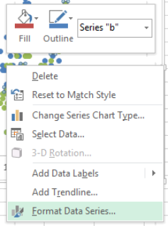
For each data series, right click on a symbol and choose Format Data Series.
In the next dialogue box the options beginning with Marker can be used to set the colours, shape and outlines of the symbols.
Explore the possibilities and create a more beautiful (or possibly more garish) chart.
By now you should have a chart along the lines of this one, but with all your own choices of colours, symbols and fonts.

Save the metacarpal data. (You were remembering to save it as you went along weren’tyou?)
You may not be working with animal bone data in your dissertation, but if you have any sort of quantitative data that comes as two (or more) numbers for each individual item, scatter plots are a very effective way to illustrate and explore your data.
4. Bar charts and pie charts
When the data area series of categories with counts or measurements for each category, then bar charts and pie charts area more appropriate method of display.
In this section we will create several charts to compare their utility in displaying data.
Below are some data of sherd counts for different pottery types excavated at a Neolithic site at Mount Pleasant, Dorset.

Create anew spreadsheet and enter these data.
Select the data and then use the Insert menu Charts sections to create a Bar chart (not a Column chart), using the first option in the third row 2-D Bar.
The formatting will be the default, so you need to tidy up the title, etc.
Can you see the Peterborough ware on this chart?

Repeat the process to create a second bar chart for these data.
Now:
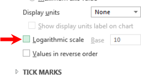
• right click on the x-axis,
• use Format Axis and
• select Logarithmic scale.
A logarithmic scale can be helpful when you have data that ranges over several orders of magnitude.
Select the data again, but this time create a pie chart using the first option.
Again, do some basic tidying up if you need to.
Can you see the Peterborough ware on this chart?
Repeat the process to create a second pie chart but now
• click on the pie and
• in the Format Data Series panel use the series options to explode the pie
This should make the Peterborough ware visible.
If the border colour has defaulted to white, you may still not see the Peterborough ware. You need to right click, choose Format
Data Series and change the colour of the border.

By now you should have the same data displayed four ways. Something like this:

Which is the best way to display these data?
If you wanted to make a point about the rarity of Peterborough Ware, then the exploded pie would be quite effective.
If you wanted to make a comparison to another site, then the bar charts are more use, as you could add a second data series as bars in another colour.
The means of displaying data can be important in making an argument about those data.
Save the spreadsheet. (You were remembering to save it as you went along weren’tyou?)
2024-02-02
Working with Quantitative Data