Project 3 ALY 6000
Hello, dear friend, you can consult us at any time if you have any questions, add WeChat: daixieit
Project 3 ALY 6000
Project Instructions
In this project, you will examine data collected from the websitewww.goodreads.com, archived onwww.kaggle.com, and modified for this project. Specifically, you will create different forms of informative and compelling visualizations in R. You will also draw conclusions from the data and report on them in written form, exploring the statistical ideas of samples and populations and the measures of dispersion and central tendency.
The plots displayed in the instructions were created with the function ggplot that comes from the ggplot2 library and is apart of the tidyverse. You may choose to create these visuals using ggplot or may use the core R functions plot, hist, barplot, and boxplot. Visuals may vary in their look and feel based on the functions that you use.
When completed you will submit your work as Lastname_Project3.R and Lastname_Project3_Report.pdf. For example, if your name is Sally Smith, then your files would be titled Smith_Project3
Project Setup
By now, you should be familiar with basic project setup.
1. Create a new project called "Lastname-Project3".
2. Create an R script file within your project called "Lastname-Project3.R".
3. Include your name, the date, and the class in a comment as the first line of the script.
4. Load any standard packages you might need.
Project 3 Instructions
1. Download the file books.csv from Canvas and read the dataset into R store it in a variable called books.
Cleaning the data set
In each cleaning problem below, store the resulting data.frame back into the books variable.
1. The janitor package contains helpful functions that perform basic maintenance of your data frame. Use the clean_names function to standardize the names in your data frame.
2. The lubridate package contains helpful functions to convert dates represented as strings to dates represented as dates. Convert the first_publish_date column to a type date using themdy function.
3. Using the year function in lubridate, extract the year from the first_publish_date column place it in a new column named year.
4. Filter your dataset to onlyinclude books published between 1990 and 2020 (inclusive).
5. Remove the following columns from the data set: publish_date, edition, characters, price, genres, setting, and isbn.
6. Keep only books that are fewer than 1200 pages.
7. Remove any rows that contains NAs.
Data Analysis
8. Use the glimpse function to produce a longview of the dataset.
9. Use the summary function to produce a breakdown of the statistics of the dataset.
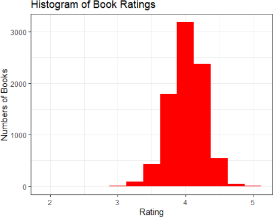
10. Create arating histogram with the following criteria.
– They-axis is labeled “Number of Books.”
– The x-axis is labeled “Rating.”
– The title of the graph “Histogram of Book Ratings.”
– The graph is filled with the color “red.”
– Make the width of the bins .25.
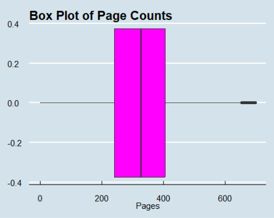
11. Create a boxplot of the number pages per book in the dataset with the following requirements.
– The boxplot is horizontal.
– The x-axis is labeled “Pages.”
– The title is “Box Plot of Page Counts.”
– Fill the boxplot with the color red.
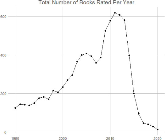
12. Create a data frame from the books data frame that contains a count of the number of books by year in a column called total_books. Store this data frame in a variable named by_year.
13. Create a line plot with points from the by_year data frame with points representing the counts per year from 1990 - 2020.
– The graph is titled “Total Number of Books Rated Per Year.”
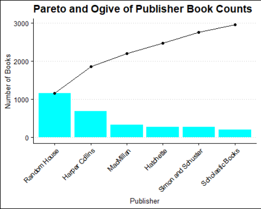
14. Create a new data frame named book_publisher. This data frame should have a column named publisher with the names of each unique publisher and a column named book_count that contains the number of titles in the books data frame for each publisher.
For problems 15 - 22, use the book_publisher data frame and store any changes back into the book_publisher variable.
15. Remove any publisher with fewer than 125 books.
16. Order book_publisher by the total number of books in descending order.
17. Add a column to the book_publisher data frame named cum_counts with the cumulative sum of the book_count column.
18. Add a column to the book_publisher data frame named rel_freq with the relative frequency of the values in the book_count column.
19. Add a column to the book_publisher data frame name cum_freq with the cumulative sum of therel_freq column.
20. Make the publisher column into a factor with the levels defined by the current ordering of the publisher column.
21. Using the data frame constructed in the prior problem, create a Pareto Chart with an ogive of cumulative counts formatted with the following additional criteria:
– The bars are filled with the color cyan.
– The x-axis label is “Publisher.”
– They-axis label is “Number of Books.”
– The title is “Book Counts (1990 - 2020).”
– Rotate the x-axis labels by 45.
22. Create one or more additional visualizations based on the existing data or additional analysis that you perform.
23. Write an executive summary report that contains an overview of your analysis, the visualizations you created with textual descriptions of key takeaways, and any key statistics that were computed in your analysis.
Submitting to Canvas
When you are satisfied with your solution.
1. Remove any lines in your code that have “install.packages.”
2. Remove any lines in your code that use the view function.
3. Submit 2 files under the assignment in Canvas.
1. Your R script named Lastname_Project3.R file.
2. A pdf of your report titled Lastname_Project3_Report.pdf.
Your report should contain the following information formatted as specified:
1. Title Page
Include your name, assignment title, and submission date.
Introduction and Key Findings
Include an overview of the assignment and any findings.
Conclusion/Recommendations
Include evidence-based recommendations and visualizations or direct presentation of tabular data.
Works Cited
Include all sources, including YouTube videos, instruction materials, Google search results, and texts that informed your study of statistics and R
Your report should be as concise as possible while maintaining fluency. Your key findings will be strongest if supported by visualizations or direct presentation of tabular data.
Your summary must adhere to APA guidelines, including page numbers on each
page (including the title page) in the upper right corner. See the following examples for pages, citations, andgeneral APA formatting.
Congratulations on completing Project 3!
2024-01-31