INFO180 Problem Set: Categorical variables and confidence intervals
Hello, dear friend, you can consult us at any time if you have any questions, add WeChat: daixieit
INFO180 Problem Set: Categorical variables and confidence intervals
(200pt)
November 20, 2023
Instructions
This assignment asks you to analyze relationship between variables. It asks you to present both plots, correlation and regression results. These topics are broadly coverd in info180 notes Ch 10 (plotting) and in Ch 11 (trend lines, correlation, regression). This time you have two structured questions (Q1 and Q2) where you have little choice what to do, and in addition a free-form Q3. The 200 “grading points” of this PS are equal to 20 points on your final grade scale.
• Each group only needs a single submission, but ensure all the group members’ names are on the final document.
• Write your answers and analysis. Include the results (also plots) into the main text of your solution. You can copy-paste R plots with right-clicking on the plot window and selecting “copy image”, a screenshot will also do.
• Include the code you do in the text (screenshot is a good way of doing it).
• Remember: unlike in the lab, we are evaluating your writing. Just one-worded answer like “yes” or “no” will not count. Please explain what you do and what you get–you have to convince us that you know what you are doing.
• If you compute averages, or make tables, ensure that the results are also visible in the main text. You may either copy those over (but ensure the result is readable), or just re-write manually, e.g. something as
We computed mean age for females (28.7 years) and males (30.6 years).
• Compile all your text, results, code, and plots into a single report. Submit your report as pdf, submit the dataset (or the link to it).
1 Income and height (85pt)
This question uses income-height. csv data. This is a subset of NLSY (national logitudinal survey of youth), and contains
income yearly income (USD)
height inches
weight lb
age
marital marital status
sex male, female
education in years
afqt Armed Forces Qualification test, score percentile (0-worst, 100-best, 50 means average).
1.1 Load and analyze data (10pt)
1. (2pt) Load data. How many observations does it contain? Print a small sample of the observations. Does it look reasonable?
2. (4pt) What does each row of data represent?
3. (4pt) Do we have any missing values in the relevant variables? How many? Do you think it is a problem for the analysis below?
Hint: check out the function summary()
1.2 Income and gender (40pt)
Here we analyze the relationship between income and gender. But here let’s focus our analysis to those who work, i.e. to those who earn positive income.
1. (5pt) First, let’s create a dummy variable for males, so that
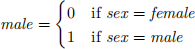
(see the lecture slides and Info180 notes 5.3.4 Compute with mutate .
2. (5pt) Now make a plot of income versus gender (use the “male” variable), but retain only those who earn positive income. Add the trend line to this plot?
Hint: you can use geom_jitter() to avoid piling all dots to the same location. You can also take a subset, and make dots semi-transparent, to make the figure better.
3. (5pt) Comment the plot: what does it tell about the average income of males versus females?
4. (5pt) Compute the average income for men and women.
5. (5pt) Now do linear regression where you estimate the income as a function of sex:
incomei = β0 + β1 · sex i + ϵi
6. (3pt) Which category is the reference category for sex?
7. (6pt) Interpret: what does the intercept mean? What does the slope mean?
8. (6pt) Can you confidently say that the slope is positive?
1.3 Income and marriage (35pt)
Now let’s look at the relationship between income and marriage.
1. (5pt) In order to interpret the results, first tell what is the age range of persons in this dataset.
2. (5pt) Next, let’s only look at those who are married versus single. Remove all other marital statuses from the dataset.
3. (6pt) Make a boxplot where you compare compare the income for married/single. Do it separately for men and women.
What does the boxplot tell you?
4. (5pt) Do two linear regression models of the form:
income i = β0 + β1 · marital i + ϵi
One for men, one for women.
5. (7pt) Interpret the intercepts and slopes.
What does it tell about average single male versus single female income?
6. (7pt) What do these results tell you about male and female role in marriage? Does it say anything about the importance of marriage for men and women?
Hint: you should see numbers approximately -6,000 and -43,000. What do these numbers mean? What do they tell about the effect size for men, women? Also: remember the age group here! It may not be relevant for you (at least not for now 。)!
2 Logistic Regression (35pt)
In this question we use iris data. This is a built-in dataset it R, so you do not need to do anything to load it, you can access it just with iris. Below, we try to see how sepal length is associated with the species, in particular with setosa and virginica.
1. (6pt) Make a subset of iris data that only contains setosa and virginica species. Make sure you only have 100 observations!
2. (6pt) Make a violin plot of sepal length where you separate the distributions for setosa and virginica. Hint: See info180 notes, 10.2 Basic plot types
3. (8pt) What does the plot suggest: will longer sepals make you believe that it is more likely or less likely a virginica flower?
4. (7pt) Now perform a logistic regression where you estimate the flower being virginica as a function of sepal length:
Pr(virginica) = Λ(β0 + β1 · sepal length)
5. (8pt) Interpret the marginal effect of sepal length. What does 1cm longer sepal tell you about the probability of the flower being virgnica?
3 Your turn (80pt)
Finally, it is your turn to come up with a similar exercise:
1. (10pt) Find a dataset that can be used to answer at least two questions with linear regression using binary categorical variables (dummies) and two questions with logistic regression. If you cannot find a single dataset where you can do all the plots/regressions, then you can also use several datasets.
Do not use datasets we have used in class, such as UAH temperature or Titanic!
2. (10pt) Discuss data integrity: explain where did you get the dataset, who collected it, and how is it collected. (See Info 180 notes 3.4 Data integrity: how is data collected.) Provide a link to data if approriate. It is OK if you cannot answer all the questions, but you should try, and explain why you could not figure it out.
3. (10pt) List your four questions. These should target relevant social or other issues, not some sort of random nonsense. The questions should be something that you can address with linear/logistic regression. Most likely it means relationship between certain kind of numerical and categorical variables. For instance:
(a) How is income related to college degree?
(b) How is team’s probablity to win a game related to whether they play at home or not?
4. (10pt) Do any data preparation you need. In particular you should address:
(a) (2pt) How many observations does the dataset contain? What do the observations represent? See Info180 notes, 3.6 Data frame.
(b) (3pt) What are the relevant variables you want to use? How are they coded?
(c) (3pt) Does the dataset contain missing values in relevant variables? Remember: not all missings are coded as NA!
(d) (2pt) Are all the values in a reasonable range?
For each of these tasks, write briefly what did you find, and what does this tell you about the suitability of the dataset for your analysis.
5. (25pt) Answer the questions. A good answer includes both plot (with a trend line), a correlation, and regression. Show your results.
The results must be part of the text, not a separate appendix! If you did any code, show it!
6. (15pt) Discuss your findings. What do the results tell? What does the regression coefficient (slope) tell? Do these align well with the plots? How big are logit marginal effects and what do they mean?
Before you submit
• Ensure all group member names are there–this helps to avid confusion later.
• Add the original data, a link to the data source, or otherwise a description where did you get the data.
• Submit it on canvas, as pdf if possible.
How much time did you spend?
How much time (how many hours) did you spend on this PS!
2023-11-24