INFO201 Problem Set: rmarkdown and plotting
Hello, dear friend, you can consult us at any time if you have any questions, add WeChat: daixieit
INFO201 Problem Set: rmarkdown and plotting
November 12, 2023
Instructions
You should answer the questions below in that file, knit it, and submit both the compiled html and link to your repo on canvas.
• This problem sets asks you to write extensively when commenting your results. Please write clearly! Answer questions in a way that if the code chunks are hidden then the result is still readable!
– All substantial questions need explanations. You do not have to explain the simple things like “how many rows are there in data”, but if you make a plot of life expectancy, then you should explain what does the plot tell you.
– Write explanations as markdown and use the styles like bold and italic as appropriate.
• Do not print too many results. It is all well to print a few lines of data for evaluaton/demon- stration purposes. But do not print dozens (or thousands!) of lines–no one bothers to look at that many numbers. Here you may lose points for annoying your graders, but one day you may lose your job for annoying your boss.
• Do not make code lines too long. 80-100 characters is a good choice. Your grader may not be able to follow all the code if the line is too long–most of us are using small laptop screens! (And again–you want to keep your graders happy!)
1 Flights (again)
The first question asks you to work with the same flights data you used in the lab. For a refresher, here are the variables:
year, month, day : Date of departure.
dep__time, arr__time : Actual departure and arrival times (format HHMM or HMM), local tz.
sched__dep__time, sched__arr__time : Scheduled departure and arrival times (format HHMM or HMM), local tz.
dep__delay, arr__delay : Departure and arrival delays, in minutes. Negative times represent early departures/arrivals.
carrier : Two letter carrier abbreviation. See airlines to get name.
flight : Flight number.
tailnum : Plane tail number. See planes dataset for additional information.
origin, dest : Origin and destination. See the airports dataset for additional information.
air__time : time spent in the air, in minutes.
distance : Distance between airports, in miles.
hour, minute : Time of scheduled departure broken into hour and minutes.
time__hour : Scheduled date and hour of the flight as a POSIXct date. Along with origin, can be used to join flights data to weather data.
1.1 Delays... again...
1. Load the dataset and check that it looks good.
Hint: check out info201 book Working with CSV data.
2. Next two questions are about the destination airport codes (dest):
(a) Are there any airport codes that are not three characters long?
(b) Are there any airport codes that contain digits?
3. Flight delays are annoying. Below, we work with arrival delays only.
How many missing arrival delay variables are there in data? Do you think this is a problem for these data?
4. Are there any implausible values in the delay variable?
5. Compute average delay by destinations. Which ones are the worst three destinations in terms
of the longest average delay? Print the airport code and the average delay.
6. Compute and print the average delay by month.
7. Now make a barplot of the monthly delays. Make each bar of different color. Do you see any clear pattern?
The colors should not be shades of blue or other gradient, but of different hue!
8. Now let’s repeat this for every single day of 2013. But you cannot easily do a barplot of 365 figures, do it as a scatterplot instead.
Hint: you may want to put day-of-year on the horizontal axis, as it is hard to put months and days on the plot in a nice way. It is your task to figure out how to do this!
Explain what you see. Are delays more common in summer or winter, spring or fall?
1.2 Chicago, here we come!
1. Now let’s look at flights to Chicago (airport code “ORD”). How many flights were there to Chicago?
2. Which was the fastest flight to Chicago (shortest airtime)? Print the date, departure time, air time, carrier and the original airport.
3. Look up flight time from NYC to ORD (on expedia or a similar website). What are the typical flight times for direct flights? Does the fastest time you computed look realistic?
4. Now find the slowest flight to Chicago (longest airtime)? Print the date, departure time, air time, carrier and the original airport. Does the result make sense?
5. Compute the flight speed (using air time and distance), in mph (not in miles per minute) for all flights to Chicago. How fast where the three fastest and the three slowest flights? Print the date and time, carrier, departure delay, and speed (no other variables). Print them in the order of increasing speed.
Can you do it in a single pipeline that selects both fastest and slowest flights in one go?
6. Are the flight speed and departure delay somehow related? Make a plot of delay versus speed for all flights to Chicago. Try to make the relationship as well visible as you can, using various plotting tools and tricks.
Explain what kind of plots did you try, and why did you pick the version you show here. Comment what you see on the plot.
Hint: check out info201 book Most imporant plot types.
2 The next questions use Gapminder data
Gapminder data is downloaded from https://www.gapminder.org/data/. However, the data structure there is quire complex, please use the dataset provided on canvas (in files/data).
The variables are:
name country name
iso3 3-letter country code
iso2 2-letter country code
region broad geographic region
sub-region more precise region
intermediate-region
time year
totalPopulation total population
GDP__PC GDP per capita (constant 2010 US$)
accessElectricity Access to electricity (% of population)
agriculturalLand Agricultural land (sq. km)
agricultureTractors Agricultural machinery, tractors (count)
cerealProduction Cereal production (metric tons)
feritilizerHa Fertilizer consumption (kilograms per hectare of arable land)
fertilityRate total fertility rate (births per woman)
lifeExpectancy Life expectancy at birth, total (years)
childMortality Mortality rate, under-5 (per 1,000 live births)
youthFemaleLiteracy Literacy rate, youth female (% of females ages 15-24)
youthMaleLiteracy Literacy rate, youth male (% of males ages 15-24)
adultLiteracy Literacy rate, adult total (% of people ages 15 and above)
co2 CO2 emissions (kt)
greenhouseGases Total greenhouse gas emissions (kt of CO2 equivalent)
co2__PC CO2 emissions (metric tons per capita)
pm2.5__35 PM2.5 pollution, population exposed to levels exceeding WHO Interim Target-1 value 36µg/m3 (% of total)
battleDeaths Battle-related deaths (number of people)
2.1 Descriptive statistics
1. Load data. How many rows/columns do we have?
2. Print a small sample of data. Does it look OK?
3. How many countries are there in the dataset? Analyze all three: iso3, iso2 and name.
4. If you did this correctly, you saw that there are more names than iso-2 codes, and there are
even more iso3-codes than iso2-codes. What is going on? Can you find it out? Hint: you may want to group by iso or by name and count.
(a) Find how many names are there for each iso-2 code. Are there any iso-2 codes that correspond to more than one name? What are these countries?
(b) Now repeat the same for name and iso3-code. Are there country names that have more than one iso3-code? What are these countries?
Hint: two of these entitites are CHANISL and NLD CURACAO.
2.2 CO2 emissions
Next, let’s analyze CO2 emissions.
1. Make a plot how total CO2 emissions has changed over time for U.S, China, and India. Add
a few more countries of your choice. Explain what do you see.
Hint: see info201 book Most imporant plot types.
2. Make a similar plot of the same countries, but now use CO2 per capita, not the total emissions. What does this figure suggest?
3. Compute average CO2 emissions per capita across the continents (assume region is the same as continent). Comment what do you see.
Note: just compute averages over countries and ignore the fact that countries are of different size.
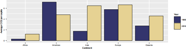
Hint: Americas 2016 should be 4.80.
4. Make a barplot where you show the previous results–average CO2 emissions per capita across continents in 1960 and 2016.
Hint: it should look something along these lines:
See info201 book Tuning your plots.
2.3 Life expectancy and total fertility
Now let’s analyze total fertility and life expectancy.
1. Make a scatterplot of total fertility versus life expectancy by country, using data for 1960. Make the point size dependent on the country size, and color countries according to the
continent (region). Feel free to adjust the plot in other ways to make it better. Comment what do you see there.
2. Make a similar plot, but this time use 2019 data only.
3. Compare these two plots and comment what do you see. How has world developed through the last 60 years?
4. Compute the average life expectancy for each continent in 1960 and 2019. Do the results fit with what do you see on the figures?
Note: here as average I mean just average over countries, ignore the fact that countries are of different size.
Hint: Oceania 1960 is 56.4
5. Compute the average LE growth from 1960-2019 across the continents. Show the results in the order of growth. Explain what do you see.
Hint: these data (data in long form) is not the simplest to compute growth. But you may want to check out the lag() function. And do not forget to group data by continent when using lag(), otherwise your results will be messed up! See https://faculty.washington. edu/otoomet/info201-book/dplyr.html#dplyr-helpers-compute.
6. Show the movement of countries on the total fertility–life expectancy space. Pick countries:
a) US; b) Sweden; c) China; and a few more countries of your choice.
The result should look something along these lines:

Hint: check out info201 book More geoms and plot types.
7. What was the ranking of US in terms of life expectancy in 1960 and in 2019? (When counting from top.)
Hint: check out the function rank()!
Hint2: 17 for 1960.
Finally tell us how many hours did you spend on this PS.
2023-11-21