MMPA 513 Accounting Systems Trimester 2, 2023
Hello, dear friend, you can consult us at any time if you have any questions, add WeChat: daixieit
MMPA 513 Accounting Systems
Trimester 2, 2023
Data Analytics Lab 2 and Assessment
Objective of this cyber lab assessment:
At the end of this lab, students will:
1. Demonstrate high-level knowledge of data visualisation techniques in Tableau software that will facilitate their further analysis; and
2. Demonstrate an ability to analyse accounting and related data from a Tableau file to facilitate recommendations to management.
We expect that before the cyber lab students will have:
i. Accessed the student account for MMPA513 on Tableau.com (see below); and
ii. Downloaded the Vistabeans file (CoffeeChain.accdb) from Nuku.
We expect that during the cyber lab:
1. The tutor will provide a brief demonstration of the software; and
2. Students will follow the guide to analyse the data for Vistabeans.
Note: Reports from this cyber lab and subsequent analysis are to be submitted online via Nuku as part of the individual lab assessment (Due 11:59 pm Monday 18 September 2023 (10%)). Marks will be given for satisfactory completion of the individual lab assessment.
Page 2 (and Appendix 1) explains further details about the assessment.
Pages 3-11 provide details about the lab exercise that will inform both your lab time and your assessment.
The assessment requires you to use Tableau to analyse Vistabeans profitability. You must prepare a brief with recommendations as to how the company can maximise profit. Your brief should include at least 3 unique visualisations from Tableau to support your recommendations. (That is, the visualisations should not be the ones identified in this exercise.)
This assessment is worth 10% towards your final grade. Here is the grading rubric:
|
Requirement |
Point allocation |
|
Prepare a brief with at least three unique recommendations as to how the company can maximize profit. Your brief should include at least three unique visualisations from Tableau to support the recommendations. Your brief should be grammatically correct and communicate well with the business owners. Points Possible = 10 |
Brief is grammatically correct and contains at least three unique recommendations supported by at least three unique visualisations (different from those directed in the cyber lab below) (max 10 points). Brief is grammatically correct and contains two recommendations supported by at least three unique visualisations (max 7 points). Brief contains two recommendations (max 3 points, even if supported by at least three unique visualizations). Brief not grammatically correct and contains fewer than two recommendations (0 points, even if supported by data visualisations).
|
Hints: Consider how best to visualise data to communicate your findings. You might analyse profit or sales by region and city and make recommendations about certain stores or markets, certain product lines and their profit or sales. What other data might Vistabeans need to make informed decisions? How reliable is this information? How might executives gain access to useful information?
Appendix 1 provides notes about preparing a Brief.
Scenario
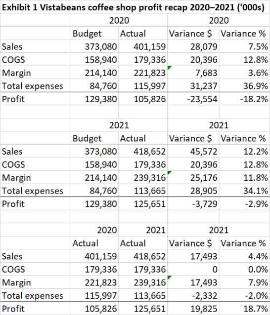
Vistabeans was formed in 2015 when Eli Smith graduated with a degree in business and decided to use his passion for good coffee to open a coffee shop in his hometown. After a few years, Sarah Jones joined Vistabeans as a part-owner and marketing director. Sarah took Vistabeans to the next level by expanding Vistabeans into new markets. With Eli focusing on products and Sarah focusing on marketing, Vistabeans grew to 150 stores throughout the Unites States. The mission of each store is to sell the best cup of coffee and other beverages in the area. Eli and Sarah were happy that their company was growing but they wondered if they were applying their resources in the most profitable manner. Accordingly, they asked you, to analyse the company’s profitability and prepare a brief with recommendations as to how the company can maximize profit. You have available the company’s accounting information system and have undertaken a two-year profit analysis (Exhibit 1). After reviewing this, you have concluded that you need a deeper understanding of the company’s profitability and want to use data analytics to help prepare a brief with recommendations as to how the company can maximize profit.
While software solutions range in functionality, ease of use and price, this case will use Tableau, a data visualisation software package which is selected for its ease of use for non-technical users. Below and in the lab are instructions regarding access to the software. In addition, Tableau provides free Internet-based training videos on their website (www.tableau.com) to help you learn how to use the software using sample data if you need more help.
A: Before starting this assignment exercise you will need to:
1. Register and open Tableau.
a. Download the latest version of Tableau Desktop and Tableau Prep Builder here
b. Click on the link above and select “Download Tableau Desktop” and “Download Tableau Prep Builder”. On the form, enter your school email address for Business E-mail and enter the name of your school for Organization.
c. Activate with your product key: TCCY-4C66-91B0-6677-DAE1
Already have a copy of Tableau Desktop installed? Update your license in the application: Help menu → Manage Product Keys
(There is a free Student Resource Page and you may continue using Tableau after the class is over by individually requesting your own one-year license through Tableau for Students.)
2. Upload the data for use in the software. (The CoffeeChain database includes detailed sales, profit, and financial planning data for a 24-month period from January 2020 through December 2021. This Microsoft Access database that you should use to complete the case requirements can be accessed in the same folder you downloaded these instructions from.)
B: To become familiar with Tabelau for this assignment exercise you will need to:
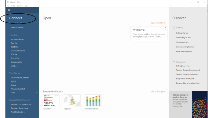
1. Upload the data for analysis (see Figure 1 over the page):
a. Click on “Connect to data” (under Data in the upper left-hand corner of the window). A number of options will get you there, but the easiest is to click on Files/ and Upload the “CoffeeChain.accdb” file you have just downloaded.
b. If you are having difficulties accessing this, then you may instead select “Microsoft Access.” And open the “CoffeeChain.accdb” file. This file contains the data for the Vistabeans Coffee shop.
2. Understand the ‘shape’ of the data:
a. Drag the factTable, Location, and Product tables onto the “Drag sheets here” window. You will be able to see the relationships between these tables – i.e. factTable shares Area Code with Location and Product ID with Product. Hence, we can query the data about product and where it has been sold and when. (Note that these relationships can be edited by clicking on the line – noodle – if needed and the file can be renamed if you wish)
b. Now click on ‘Sheet 1’ at the bottom of the screen and the ‘File/SaveAs’ using the title ‘Executive Overview’.
Figure 1: Uploading the data into Tableau
3. Understand the basic layout of Tableau:
a. On the left-hand side are the three tables in this dataset and the fields within each table.
i. Within each tables are fields that either are called a ‘dimension’ or a ‘measure’. The difference is that a ‘dimension’ is text (e.g. the date or geographic locality) and a ‘measure’ is quantitative data that we can manipulated numerically.
ii. By clicking on each of the fields you can re-order or group certain fields or hide their display; you can also group into different folders (I do not suggest you do this in our exercise, but you may wish to do so with other datasets).
b. Next to the right is the ‘shelves’ and ‘cards’. To build your visualisations you will need to drag fields into this area.
c. ![]()
![]() In the centre is a large white space – this ‘view’ is for your data visualisation. You will build one visualisation per sheet and you can add extra sheets by clicking on the + button. These can be combined to create dashboards and stories.
In the centre is a large white space – this ‘view’ is for your data visualisation. You will build one visualisation per sheet and you can add extra sheets by clicking on the + button. These can be combined to create dashboards and stories.
 C: Use Tableau to answer four questions and gain competency at this software

1. Hold down your control key and click on Date in the Dimensions section and Sales in the Measures section. Select the suggested graph type (has a red border) (See Figure 2).
a. What is the suggested graph type?
b. What is the aggregation level of Sales?
2. Although Date is at the month level in the dataset, the data view automatically shows it at the year level. Click the + (plus) sign immediately before the Year (Date) pill on the columns shelf. Then click the + (plus) sign before Quarter (Date). Month should now appear on the columns shelf and in the data view.
3. Quarter makes the view too busy. Remove it.
4. Drag Year from the columns shelf and drop it on top of the Colour button on the Marks card. You should have a single graph with two lines.
a. What were the sales For January 2020?
b. What were the sales For January 2021?
c. What were the sales For July 2020?
d. What were the sales For July 2021?

|
Note that you can change the data format to give you $ rather than the raw number, change the colours, etc. You can also change the axis display on the graph by right clicking and selecting Edit Axis and adjust the range, scale, title etc.

1. Drag Profit from Measures to Rows (top middle – see Figure 3) so the graph for Sales for 2020–2021 appears above the graph for Profit for 2020–2021. Rename the worksheet Sales vs. Profit by right-clicking on the ‘Sheet 1’ and selecting ‘rename’.
2. If you examine the Measures in the Data Window, note that there is no data item that compares actual profit with planned (i.e., budgeted) profit. However, there are items called Profit and Budgeted Profit that can be used to create a calculated field that does compare actual vs. planned profits.
3. To gain some more practice, duplicate this worksheet to keep your old data and analyse profit vs. plan on a new worksheet by right clicking the worksheet name (“Sales vs. Profit”) select “Duplicate” then click on that new worksheet and select “Rename”. Change to “Profit vs. Plan”.
a. Now create your new calculated field by clicking on Profit in the Data window under Dimensions. Click on the caret at the right-hand side of this field to open the drop-down menu and select Create Calculated Field. Now type “-“ and drag across Budget Profit (see Figure 4). (The field should be calculated as Profit – Budget Profit.)
b. Name the calculated field Profit vs. Plan instead of Calculation1. Click “Apply” and then “OK”.
c. Drag the calculated field (measure) Profit vs. Plan to the rows shelf to the right of (SUM) Profit.
4. Analyse the information supplied by this view:
a. What does the Sales graph show about sales in 2020 vs. 2021?
b. What does the Sales graph show about sales in each quarter?
c. What does the Profit graph show about profit in 2020 vs. 2021?
d. Explain the y-axis scale of the Profit vs. Plan graph to the CFO. Are there problems in budget planning? Why or why not? Is there any instance where there was no difference between planned and projected profits? (You might like to drag Budget Profit into the Rows to create a further graph to give you more detail.)
e. Does the Profit vs. Plan graph provide any good news?
Figure 3: Adding Profit to your graph of Sales

Figure 4: Create Calculated Field


1. Select a New Worksheet (named sheet 2 by default).
2. Double click on the Product table to reveal the available dimensions, if they are not already showing.
3. While holding down the
4. If no suggested graph is on the right-hand side of your screen, click on the Show Me dialog box (at the top right of the screen) to unhide it. Click on the suggested graph to select it.
5. To highlight the most profitable products, sort the bars by Profit in descending order. You can do this by right clicking on Product in the Rows section and select “Sort by/Field/Descending” (see Figure 5)
6. Since the regional managers will be interested in the performance of their respective markets, add the Market Dimension to the view. NOTE: The sorting is based on the overall profit across all four regions, not a specific region.
7. To highlight profitability levels, add Profit directly from the Measures section in the Data window to the Colour button of the Marks Card. Tableau will automatically allocate a colour range, but you can click on colour to create a red–green contrast to show negative profitability as red and positive profitability as green. This uses the intensity of the two colours to show lower or higher values. Profit is now “colour-encoded.”
8. Format Profit as Currency, with no decimal places (see Figure 6- use the Currency (Custom) option in the Format SUM (Profit) dialog box).
9. Rename the Sheet Profit by Product and Market.
10. Analyse the information:
a. Which products have negative profits, and in which markets?
b. Which product has the highest profit, and in which market?
 Figure 5: Profit by product analysis – sorting graph
Figure 6: Format x-axis for currency


1. Right-click on the Profit by Product and Market tab. Select Duplicate Sheet from the shortcut menu.
2. Rename the duplicate sheet Profit by Product-Profit vs. Plan.
3. Replace Profit by dragging and dropping Profit vs. Plan from Measures in the Data window on top of the Colour button. (Delete Profit)
4. Analyse the information:
a. How does the overall shape of profitability vary across regions? Is there a clear pattern?
b. Also, some of the highest profit items in the regions are often the worst performing products relative to the plan. Describe what the graph indicates about Caffe Mocha in the Central Region. Recognise that the colours and bars tell you two different things.
c. Based on this information, should future product line strategy should be managed at the regional level. Why or why not?
Appendix 1: Preparing a Brief
In this assessment we have asked for a Brief, otherwise known as a ‘briefing note’.
As the name says, a brief is a succinct way to provide data and recommendations about a particular issue to a named set of readers. They are not long treatises and should be written concisely in professional language and be useful to the reader/s.
It is likely to have the following headings:
1. Author name/address (if from a Company/Department this would be a logo)
2. ‘Briefing Note for [reader/s]’ (use this heading with the title of the reader/s)
3. Subject: a title for your brief
4. Summary: 2-3 bullet points to summarise the brief – sometimes called the ‘elevator position’ as it is a succinct summary to get the reader/s’ attention
5. Issue: This will entice the reader to continue – what requires the reader’s attention?
6. Background: A short history/setting the stage for the decision/s your reader needs to make. Think about who, what, why in relation to this topic.
7. Considerations: This is where you present your data in a way that recognises the reader/s’ knowledge – what are the strategic issues, what options exist (if any)? You are welcome to use sub-headings to help your reader/s navigate your data.
8. Recommendation/s: What do you want the reader/s to do next to resolve the issue?
This brief has no word limit, but it should be concise while communicating answers to the question ‘how can the business maximise profit?’.
2023-09-16