111X Lab 2 Graphing Motion
Hello, dear friend, you can consult us at any time if you have any questions, add WeChat: daixieit
Graphing Motion
111x Lab 2
Last Edited september 5, 2023
Lab objectives
. Interpreting graphs of motion
. Linear itting and statistics
. Reporting a measurement
Lab Equipment
. vernier Motion Detector
. vernier Dynamics cart
. Flat cart Track
Experimental Background
The Time Measurement
There are many ways to keep track of time, such as by using a clock or a stopwatch. For many of our labs, we will want to make a time measurement. Instead of using a physical clock for most of these experiments, we will make use of the computer,s internal clock to keep track of time.
The position Measurement
The irst device you get to know in this lab for making a position measurement is called the “motion detector”, or “sonar ranger”. The motion detector emits ultrasonic sound waves and listens for the echo. That is, it measures the tTavel time of a sound wave in air, which is the same principle that bats use for inding their prey. It is not really a position measurement, because time is measured. But since the velocity of sound in air is constant1as far as we are concerned, this time measurement can be calibrated to a distance measurement.
This insight into how your sensors work is most useful when you want to make unorthodox measurements or when something goes wrong. You might want to use the setup in a situation outside of the range of design speciications 2 or if you are still here in our lab, the data that you record may not represent what you were trying to measure.
In this case it is important to know about your detector and how it works. You need to be able to interpret your data, and you have to be able to identify instrument artifacts. You are only able to understand an artifact if you know how the detector works.
Do not let your cart hit the motion sensor!
|
Question 1 what do gou expect to happen if a motion sensoT is Tepeatedlg hit bg a caTt? a a Do not hit the sensor to test this. Please never hit, drop, strike or otherwise harm the motion sensors. |

Figure 1: Diagram showing the ultrasound detection path.
Look at Figure 1: you see a sketch of the motion detector and an emerging cone of ultrasound waves. The opening angle of this cone is 15o - 2oo. That means that everything within this cone will be hit by ultrasound waves during the measurement. objects close to the detector will produce the most recognizable echo, so you have to make sure to remove any unwanted obstacles from this cone when making a measurement. some of these obstacles might include tables, chairs, backpacks and lab equipment on the tables, or your lab partner,s head.
one last word of caution: the motion detector has a limited measurement range. You cannot measure a distance smaller than approximately 15 centimeters, nor a distance larger than 6 meters. If you try, the computer will give you a false reading.
Experimental setup
Doing the experimental data-taking with computer assistance, you have a big advantage over past generations: the computer calculates and displays the velocity and acceleration automatically, and you don,t have to do the calculations yourself. The drawback of this simpliication is that you have to recognize errors that result from the automation. The fact that “the computeT does the e从peTiment” does not mean that the Tesults aTe coTTect! You have to provide the interpretation of the graphs generated by a computer, and you have to explain and minimize errors generated by the apparatus.
Make sure your sonar ranger is attached to the computer interface and open up Logger pro which should be on the desktop. You should see two empty graphs on the page, one for position vs time and another that is velocity vs time. we would like to have a third graph on this page, acceleration vs time. The easiest way to do this is to use the menu item Ⅰnsert > Graph. This should position a small graph on top of the other graphs. You could manually resize all of the window items to it, but an easier way is to use the menu item page > Auto Arrange. This function should automatically it all of the window items into the window for you.
|
Question 2 using the gTaphs in FiguTe 2: 1. DescTibe the kind of motion that pToduced the position ueTsus time gTaph. 2. sketch the v(t) and a(t) gTaphs gou would e从pect to get foT this motion. You can eitheT dTaw this bg hand and take a pictuTe foT gouT WoTd document, oT dTaw it in woTd. a 3. TTg to TecTeate this motion in Teal life, collect the data with LoggeT PTo, and qualitatiuelg compaTe gouT pTedicted gTaphs with the gTaphs calculated in LoggeT PTo. a The command to draw this in word is ,Draw,. |
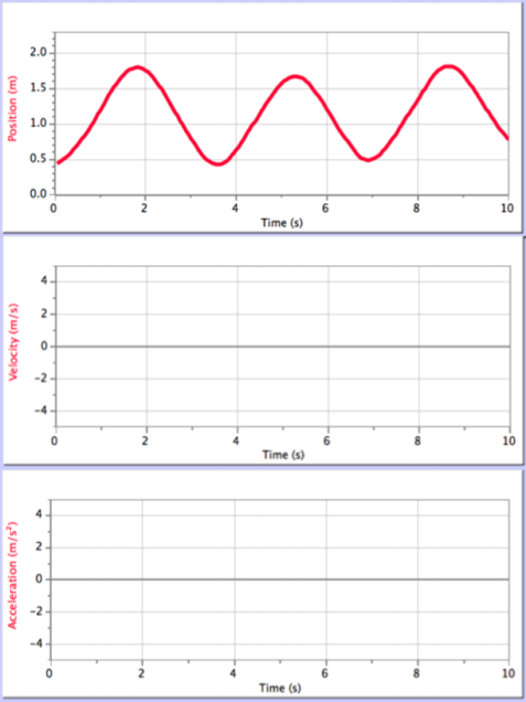
Figure 2: Graphs of the position, velocity, and acceleration of an object as functions of time.
Question 3 predicting the Three Motions
Below we descTibe thTee difeTent tgpes of motion, foT each of the motions pTedict the following:
. will the position, velocitg, and acceleTation be zeTo, positive, oT negative, oT will it be moTe comple从?
. what will the gTaphs of 从(t), v(t), and a(t) look like? (i.e. a stTaight line slanted up oT slanted down, a constant, cuTving up, cuTving down, etc.) DescTibe this in woTds.
Motions
1. Moving towaTds the motion detectoT at a constant speed.
2. Moving awag fTom, then towaTds, the motion detectoT (looking onlg at the tuTning point) .
3. Moving the caTt with positive acceleTation.
Based on the data that you took today, answer the following questions:
|
Question 4 Testing and Analyzing the Three Motions FoT each of gouT gTaphs (a total of nine), answeT the following questions foT each motion on gouT woTksheet. RefeTence the statistics OT slOpes gou applied to the gTaphs in this discussion. Do not foTget to include gouT gTaphs on the woTksheet in this location. FoT each gTaphs include a caption with gouT basic descTiption of the fguTe. . How do gouT position, velocitg and acceleTation gTaphs compaTe with gouT pTediction? If gou pTedicted ZERo foT velocitg oT acceleTation, was it e从actlg zeTo at all times? If gou pTedicted non-zeTo velocitg oT acceleTation, was the sign what gou pTedicted? . compaTe the numeTical values foT the velocitg and acceleTation obtained bg moTe than one method fTom gouT gTaphs, and comment on whetheT those difeTences aTe signifcant. Be as quantitative as gou can (i.e., talk about and include the numeTical unceTtainties) . |
The Experiment
You will try each of the motions above with the cart on the track and perform a few data analysis steps on each motion. There is a lot of information below so we highly recommend that you read the rest of the lab before you continue.
. Does your data match your prediction qualitativelg (The general shape of the graphs, sign of the slopes, etc.)? If you are happy with the match between what you expected and what you got, you can proceed to the quantitative analysis. If not, ask your lab instructor to discuss your results with you before you continue. You should not change your prediction. No points will be taken away for an incorrect prediction, only for not having one.
. For the irst motion, make a measurement of the velocity for the relevant portion of the experiment using the slope of the position versus time graph. Find the average value of velocity in the same time interval in the velocity plot displayed by the computer.
. For the second and third motions, make a measurement of the acceleration for the relevant portion of the experiment using the slope of the velocitg versus time graph. Find the average value of acceleration in the same time interval in the acceleration plot displayed by the computer.
You can ind the slope of a part of a measurement by dragging a rectangle around the region of interest and selecting the linear it tool from the toolbar. uncertainties for the parameter values can be seen by right clicking on the linear it box and selecting “Linear Fit options” and checking the box marked “show uncertainties”.

You can ind the aveTage value of a measurement over any time period by dragging a rectangle around the region of interest and selecting the statistics tool from the toolbar.

Note: if your screen does not show the words “Linear Fit” or “stats” under the icon, go to the menu item Loggerpro > customize Toolbar and chose “Icon & Text” from the “show Menu”.
Insert your graphs, including your linear its and statistics into your worksheet (you can right click to copy the graph, then paste it into your sheet), for each motion into your answer sheet using the guidelines for Figures and captions below. You should have a total of nine igures from this part of the exercise.
The Figures and captions
There are a few very important aspects to creating a proper igure and caption. If you follow these rules, not only will you get points on your physics lab grades, you will impress your instructors and peers in the future.
The caption
. The caption should start with a label so you can reference the igure from other places in your paper/report. For this course you should use “Figure 1”, “Figure 2”, etc.
. The caption should allow the igure to be standalone; that is to say, by reading the caption and looking at the igure, it should be clear what the igure is about and why it was included without reading the whole paper.
. The caption should contain complete sentences and be as brief as possible while still conveying your information clearly (this is not always easy).
The Figure
. Make sure that the resolution is high enough to not be pixelated at its inal size.
. check that any text is readable at the inal size (using a smaller graph in Logger pro will cause the text to be larger in relation to the graph when inserted into another program)
. For graphs, ensure that the axes are labeled (including units) and that there is a legend if you have multiple data sets on the same graphs.
. Re-scale every plot to reveal as much information as possible. Figures 3 and 4 show velocity versus time data. The two plots are the same data, but Figure 6 reveals much more information. Be sure your graphs look more like Figure 4, with detail easy to see rather than like Figure Figures 3.
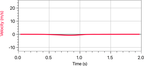
Figure 3: Above is an incorrectly scaled velocity vs time graph. Note that the velocity dip is not well deined and there is a lot of wasted space. At least the axes are labeled and units are included!

Figure 4: This is a correctly scaled velocity vs time graph. we can see that the minimum value for the velocity is between -O.5 and -1 m/s and occurs between O.5 and O.1 seconds.
In Logger pro, you can do a rough rescale by clicking the AUTOSCALE icon on the menu bar.

If you don,t like what AUTOSCALE does to the axes, you can also re-scale the plots by double-clicking on the left vertical axis and changing the values in the dialog box. The purpose of re-scaling is to make your graph display the aspects of motion that you are most interested in.
Based on the data that you took today, answer the following questions:
|
Question 5 Experimental Method FoT todag,s e①peTiment, wTite down with bullet points the thTee most impoTtant steps foT gouT data collection, including whg gou think the paTticulaT step |
2023-09-13