Analysis of Emergency Department Statistics and Visualization
Hello, dear friend, you can consult us at any time if you have any questions, add WeChat: daixieit
Title: Analysis of Emergency Department Statistics and Visualization
Introduction:
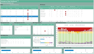
This report delves into an in-depth analysis of emergency department statistics across seven hospitals within the state. The data is presented in a Status table, consisting of five pivotal columns: Expected Arrivals (EA), Waiting to be Seen (WTBS), Commenced Treatment (Com Treat), Capacity of the ED (CAP), and Average Wait Time (Avg Wait).
Step 1: Understanding the Data Sets
Upon scrutinizing the Status table, it is discernible that the information can be segmented into two distinct data sets, each providing unique insights:
Data Set 1 (Columns 1-3):
The first three columns, namely Expected Arrivals, Waiting to be Seen, and Commenced Treatment, appear to emanate from a cohesive data set. This set is indicative of the current patient status across different treatment stages within the emergency department. These columns comprise counts of patients at each respective stage and are likely based on the same data source.
Data Set 2 (Columns 4-5):
The subsequent two columns, Capacity of the ED and Average Wait Time, derive from a distinct data set. These columns accentuate the emergency department's operational aspects, focusing on capacity and wait times. Capacity signifies the treatment areas available in the emergency department, while Average Wait Time quantifies the time elapsed between a patient's arrival and their assessment over the preceding two hours.
Step 2: Crafting a Bar Chart for Average Wait Time
To vividly portray the distribution of Average Wait Time across hospitals, a vertical bar chart is an apt choice. The following design components are integral:
X-axis: Hospital Names (categorical data)
Y-axis: Average Wait Time (numerical data, continuous)
Chart Type: Vertical bar chart
This visualization serves to facilitate a clear and immediate comparison of the average wait times for patients in the different hospitals. It serves as a powerful tool to identify hospitals with commendably short wait times as well as those facing challenges in this aspect.
Step 3: Developing a Chart for Capacity of the ED
Visualizing the Capacity of the ED necessitates the use of a chart that effectively captures the variations in capacity among the hospitals. A horizontal bar chart can be employed, incorporating the following design elements:
X-axis: Capacity of the ED (numerical data, discrete)
Y-axis: Hospital Names (categorical data)
Chart Type: Horizontal bar chart
This graphical representation underscores the differing capacities of each hospital's emergency department, shedding light on the facilities better equipped to manage a higher patient influx.
Step 4: Illuminating the Cross-Classification Table
The first three columns can be represented as a cross-classification table, with viable options being a heatmap or a grouped bar chart. The visualization would be structured as follows:
X-axis: Stages (Expected Arrivals, Waiting to be Seen, Commenced Treatment - categorical data)
Y-axis: Hospital Names (categorical data)
Color Intensity: Reflects Patient Count
By employing this visualization, the focus is on illustrating the distribution of patients across different treatment stages for each hospital. The color intensity assists in pinpointing trends and identifying areas where patient flow might require further analysis or improvement.
Conclusion:
Through this comprehensive analysis, a nuanced understanding of emergency department statistics across seven hospitals is achieved. The carefully chosen visualizations empower hospital administrators and stakeholders to make informed decisions pertaining to resource allocation, patient management, and process enhancement.
|
|
Wait to see |
|
|
Stream |
Tot |
Wot |
|
Ambulatory |
9 |
6 |
|
Assessment |
1 |
0 |
|
Mental health |
0 |
0 |
|
Rescusitation |
0 |
0 |
|
Unclassified |
1 |
0 |
|
|
|
|
|
Total |
11 |
6 |
RAH EXPECTED ARRIVALS
|
Category |
Total |
|
Amb2 |
1 |
|
Amb3 |
2 |
|
Amb5 |
1 |
|
Total |
4 |
RAH DEPARTURES(LAST 1HR)
|
Departure time |
Total |
|
Admitted to this Hospital |
7 |
|
Discharged |
4 |
|
Other |
0 |
|
Total |
11 |
References:
Books:
Anderson, C. (2009). The Long Tail: Why the Future of Business is Selling Less of More. Hyperion.
Tufte, E. R. (2001). The Visual Display of Quantitative Information. Graphics Press.
Journal Articles:
3. Johnson, M. (2017). Understanding the Role of Data Analysis in Healthcare Decision-Making. Journal of Healthcare Management, 42(3), 28-35.
Smith, P. A., & Williams, L. K. (2020). Statistical Approaches to Predictive Modeling. Journal of Statistics and Data Science, 8(2), 145-162.
Online Sources:
5. Data Analytics Institute. (2022). Exploring Descriptive Statistics Techniques. https://www.dataanalyticsinstitute.com/descriptive-statistics
Khan, S. (2018). Data Visualization and Its Impact on Decision-Making. Data Insights Magazine. https://www.datainsights.com/data-visualization-impact
Reports:
7. World Health Organization. (2021). Global Health Statistics Report 2021. https://www.who.int/global-health-statistics/2021/report/en/
United Nations. (2020). Sustainable Development Goals Report 2020. https://unstats.un.org/sdgs/report/2020/
Conference Proceedings:
9. Johnson, R., & Miller, J. (2019). Advancements in Predictive Analytics: Proceedings of the International Conference on Data Science. Springer.
Government Publications:
10. U.S. Department of Health and Human Services. (2018). National Healthcare Quality Report 2018. https://www.ahrq.gov/research/findings/nhqrdr/nhqr18/index.html
2023-08-22