COMP7507 Visualization and Visual Analytics
Hello, dear friend, you can consult us at any time if you have any questions, add WeChat: daixieit
FACULTY OF ENGINEERING
DEPARTMENT OF COMPUTER SCIENCE
COMP7507 Visualization and Visual Analytics
Date: Dec 14, 2020
Time: 6:30pm - 8:30pm
Instructions
Answer ALL questions.
This is an open book examination.
Only approved calculators as announced by the Examinations Secretary can be used in this examination. It is candidates’ responsibility to ensure that their calculator operates satisfactorily, and candidates must record the name and type of the calculator used on the front page of the examination script.
Write your university number on the first page of your answer script.
Scan your finished scripts as a single PDF file and submit it to OLEX.
1. (a) (5%) Is it true that a visualization should always be as intuitive (i.e., easy to understand by a
user) as possible? Give an example to support your answer.
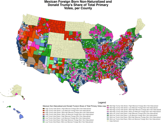
(b) (5%) State ONE visualization issue in the following visualization which is NOT related to the use of color, and suggest a solution to the problems.

|
Issue |
|
|
Solution |
|
(c) (10%) State TWO visualization issues in the following visualization which is NOT related to the use of color, and suggest a solution to each of the problem.
|
Issue 1 |
|
|
Solution 1 |
|
|
Issue 2 |
|
|
Solution 2 |
|
2. (a) (10%) Suppose a user needs to prepare a parallel coordinates (PC) plot for a dataset with 20 variables and use it to determine if two given variables are negatively correlated.
Explain how the user can accomplish the task in terms of:
(i) how the PC plot should be prepared;
(ii) how negative correlation can be determined.
(b) (5%) What visualization would you suggest if the user now needs to show the pairwise correlation of every two variables in the dataset? Describe (by words and/or with an illustration) how the visualization should look like.
(c) (5%) Consider the following dataset for the specifications of several iPhone models.
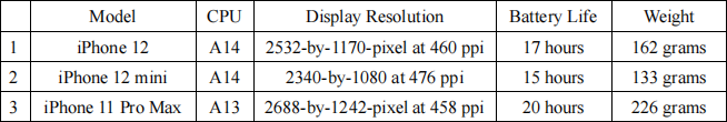
Sketch the parallel coordinates plot for the above dataset.
3. (a) (5%) Draw the treemap in the square region T for the following hierarchical structure, assuming that the first level subdivision is done vertically. The number inside the bracket of each node corresponds to the data attribute that is to be represented in the treemap.

T
(b) (5%) Assuming that there is no enhancement of hierarchical structure (e.g., using techniques of framing/padding/shading) in a treemap. Describe the kind of hierarchical data whose treemap representation gives a worst-case scenario in which the hierarchical structure of the data is most difficult to perceive? (Hint: think about the special properties of the tree structure of the dataset.)
(c) (5%) Given a dataset of a file system (with folder/subfolder/file sizes), explain how Centroidal Voronoi Tessellation (CVT) can be used for generating a Voronoi treemap of a particular subfolder of the file system.
4. Consider the network:
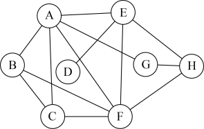
(a) (2%) What is the maximum geodesic distance of the network?
(b) (2%) Which node(s) has/have the highest clustering centrality?
(c) (3%) Which node has a higher betweenness centrality, E or H?
Explain why.
(d) (3%) Which node has a higher eigenvector centrality, B or H?
Explain why.
(e) (5%) Suppose we define an attractive force fa (x) = C . d2 and a repulsive force
fr = 一d3/ C, where C is a constant and d is the distance between two nodes, in a forced directed layout algorithm for network visualization. State a problem of this formulation and give a solution to it.
|
Problem |
|
|
Solution |
|
5. (a) (5%) Consider a query Q: “work from home” and two documents
D1: “you don’t need a home office to work from home” and
D2: “my office is far away from home and it takes an hour to commute daily” .
Which document will give the best matching score to Q if we use
(i) term frequency; or
(ii) term frequency inverse document frequency (tf-idf) as the term weighting to calculate the matching score?
Explain briefly your answer in each of the cases (i) and (ii) above.
|
(i) gives the best matching score if we use term frequency as the term weighting. Reason: |
|
(ii) gives the best matching score if we use tf-idf as the term weighting. Reason: |
(b) (4%) Name ONE visualization for displaying EACH of the following document information graphically.
(i) term frequency inverse document frequencies (tf-idf) of all words in a document
(ii) pairwise similarities of all documents in a corpus
(c) (6%) For each of the following three uses of interactions in visualization, explain when a visualization will need such interactions:
(i) for modifying data transformation
(ii) for modifying visual mappings
(iii) for modifying view transformation
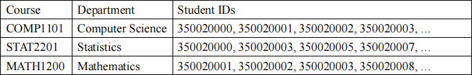
6. (15%) Suppose you are given a dataset of over 1,000 undergraduate courses offered by HKU. Each course record composes of a course code, the offering department, and a list of students enrolled in the course in a certain semester.
You are asked to design a visualization in form of a node-link network diagram that facilitates users in performing the following tasks visually:
i) to identify the offering departments of courses;
ii) to compare the numbers of enrolled students in courses;
iii) to compare the numbers of students in common for any two courses;
iv) to identify some approximate grouping of courses which students tend to choose in combination. For example, students tend to choose COMP1101, STAT1203, COMP2100 together, and COMP1102, STAT2201, MATH1200 together.
(a) Describe your node-link network diagram design for visualizing this dataset:
State what the nodes and links in the diagram represent:
|
Anode represents: |
|
|
Alink represents: |
|
State how each data attribute is mapped to some visual attributes.
List as many mappings as you see appropriate (you do not have to fill up the entire table).
|
|
Data attribute (e.g., department) |
Visual attribute (e.g., node size) |
|
1 |
|
|
|
2 |
|
|
|
3 |
|
|
|
4 |
|
|
|
5 |
|
|
(b) For each of the user tasks (i), (ii), (iii) & (iv) above, explain how the user may make use of your visualization to accomplish the task. Interactions are allowed.
|
(i) to identify the offering departments of courses |
|
|
|
(ii) to compare the numbers of enrolled students in courses |
|
|
|
(iii) to compare the numbers of students in common for any two courses |
|
|
|
(iv) to identify some approximate grouping of courses which students tend to choose in combination |
|
|
2023-07-27