report
Hello, dear friend, you can consult us at any time if you have any questions, add WeChat: daixieit
I. Introduction
Background on Automated Market Makers (AMM) and their significance in the crypto trading world.
What is Dex and how does Uniswap V3 work (difference with V2).
Research scope: Importance of understanding trader behavior in AMM to aid in decision making. The specific part that we are going to deep dive, and the reason to do it. The method that we use to analyze it (just show the framework of our work).
II. Research Objectives
1. identify key trading patterns: understand the time and size of most transcations to reveal trading at the pool level. This can provide insights into trader behavior in different regions and domination of retail or institutional trading.
2. Analyze Market sentiment
3. profile trader behavior
4. Analyze response to market changes
5. visualize Data insights
6. inform trading and investment strategies
Analyze transaction patterns at the pool level.
Understand user behaviors by analyzing transaction frequency, size, timing, and reactions to market changes.
III. Methodology
A. Data Collection
Where did we get the data and why did we choose this data (and pros and cons of this data?)
B. Data Preprocessing
Grouping information by user interacting with the pool using pandas' groupby method.
Clarifying column descriptions and ensuring data quality.
C. Analysis
Pool-Level Analysis
Time of Most Transactions: Determine periods with high trading activity.
When analyzing the time of most transactions, we used the following variables:
• token_bought_amount: the amount of tokens that got bought
• token_sold_amount: the amount of tokens that got sold
• times_counts: the amount of transactions that occurred during a timeframe
By comparing the value of these variables in each hour, we plotted the bar graph for the two pools in Figure 1&2:
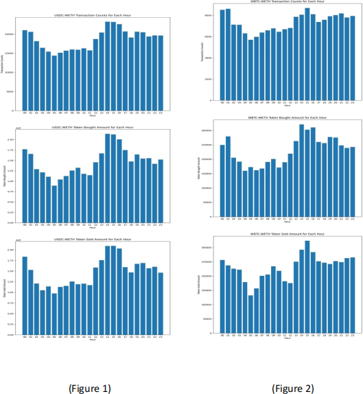
From the graph, we observed the number of transactions, bought amount, and sold amount of both USDC-WETH and WBTC-WETH. The trends of the 3 variables transactions, bought amount, and sold amount follow a similar trend by reaching peak and trough at similar times. For example, they all reach the lowest value around 4:00-5:00 am EST each day and reach the highest value around 2:00-3:00 pm EST each day. This trend of being active in the afternoon and inactive during late midnight Eastern US
time indicates that most participants of these two pools are in the US timezone. The bought & sold activities are also relatively high during 0:00- 1:00 am EST, which suggests the possible involvement of participants from other timezones such as Asia or US participants who stay up late to engage in trading.
We further explored the time pattern of most transactions occurring by grouping and plotting the transactions, bought amount, and sold amount by weekday for each pool. The graph for USDC-WETH and WBTC-WETH pools can be seen in Figure 3&4:
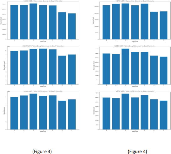
We can see that most transactions occur in the middle of the week, especially on Wednesday. And the trading activities are least active during the weekend on Saturday and Sunday. Such a pattern combining with the hourly trading pattern can suggest that the participants of these pools usually trade during working hours on weekdays. This may indicate that the participants are professionals and conduct transactions at work.
Transaction Size: Compute average transaction size to understand market domination.
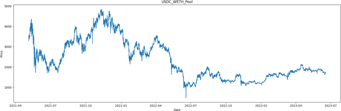
Transactions and Price Changes Correlation: Investigate the relationship between transaction patterns and price movements.
User-Level Analysis
Followed by our Pool-Level Analysis, we wanted to dive deep into the user’s level to analyze how users behave in the liquidity pool. In our analysis, we especially focused on four aspects that we think can highly describe this liquidity pool. The four aspects are:
1) Frequency of Transactions, which can be a good starting point for discovering trading behavior at the user’s level. Some traders might make numerous transactions in a day, while others may only make a few transactions in quite a long time. As a result, traders could be categorized based on how often they engage in transactions.
2) Size of Transactions, which can give usan idea of how big the transaction is for each user. Just like the frequency of transactions, the size of transactions for different users can be very different. We are typically interested in traders that make large transactions since these transactions can cause price slippages, which may have a significant impact on the liquidity pool.
3) Trading Times,
4) Reaction to Market Changes,
Since the data is at the pool level, we aggregated the transaction data of the liquidity pool by users to transform them into user’slevel.
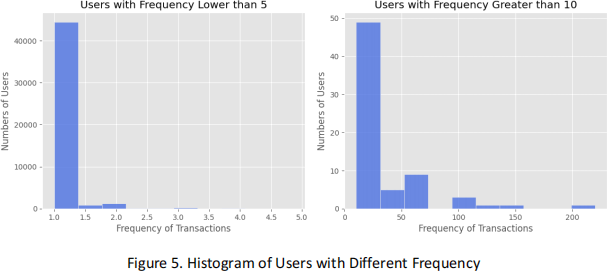
In general, there are different ways to calculate the frequency of transactions based on different definitions. For example, the frequency of transactions can be defined as the total number of transactions of each user divided by the total number of days since the pool was built. However, the result would have some biases since some users only participated in the transaction activity in a relatively short period of time. If we use the total number of days since the pool was built as denominator (which is the same for all users in the pool), we are actually calculating the total number of transactions instead of frequency. Therefore, we simply use the total number of days divided by the number of active days for each user in the pool to be the frequency of transactions. In this way, we can eliminate the biases.
The two tables below show the top 10 most transactions users and top 10 most frequently traded users in USDC_WETH pool. We can see that 6 users appear in both tables, which means that the correlation between the number of transactions and the frequency is high.
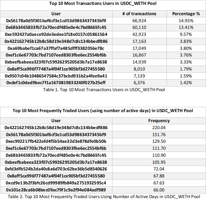
For the table of top 10 most transactions users, we can see that the top 3 users take up almost 40% of the total volumes in the pool, and over half of the total volumes are contributed by these 10 users. From the frequency we calculated and the histogram below, we found that most of the users (nearly 92% of the total users) in the pool only have one transaction per active day, and the users with frequency greater than 10 only take up 0.15% of the total users, meaning that most users are low frequency traders in this pool.
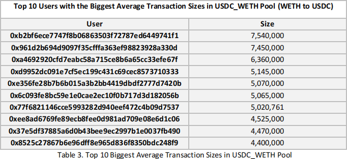
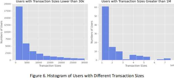
Just like the frequency of transactions, there is also a great disparity between users with large size of transactions and users with small size. For the top 10 users with the biggest average transactions sizes (WETH to USDC), the average size is over 5 million USDC. However, the average size for all users is only 30 thousand USDC. The figure below (Figure 6) shows the distribution of users with different transaction sizes. We can see that over 50% of the total users traded for USDC with amount less than 5000, which is 1000 times smaller when compared with the top 10 users.
In addition to the average sizes, we wanted to analyze the top 10 biggest sizes in a single transaction, which can give us some insights into the price slippage caused by the large transactions.
First, we filtered out the top 10 biggest transaction sizes in the USDC_WETH pool. We can see that the top 3 transactions are contributed by a single user (For simplicity, we call this user ‘User A’). Therefore, we decided to study the biggest transaction for User A. Surprisingly, we found that the top 2 biggest transactions basically happened at the sametime. Therefore, we extracted the transactions records where these two transactions happened, the transaction details are listed below (Table 5). Besides, we also visualize the price movement before and after these two transactions (Figure 7).
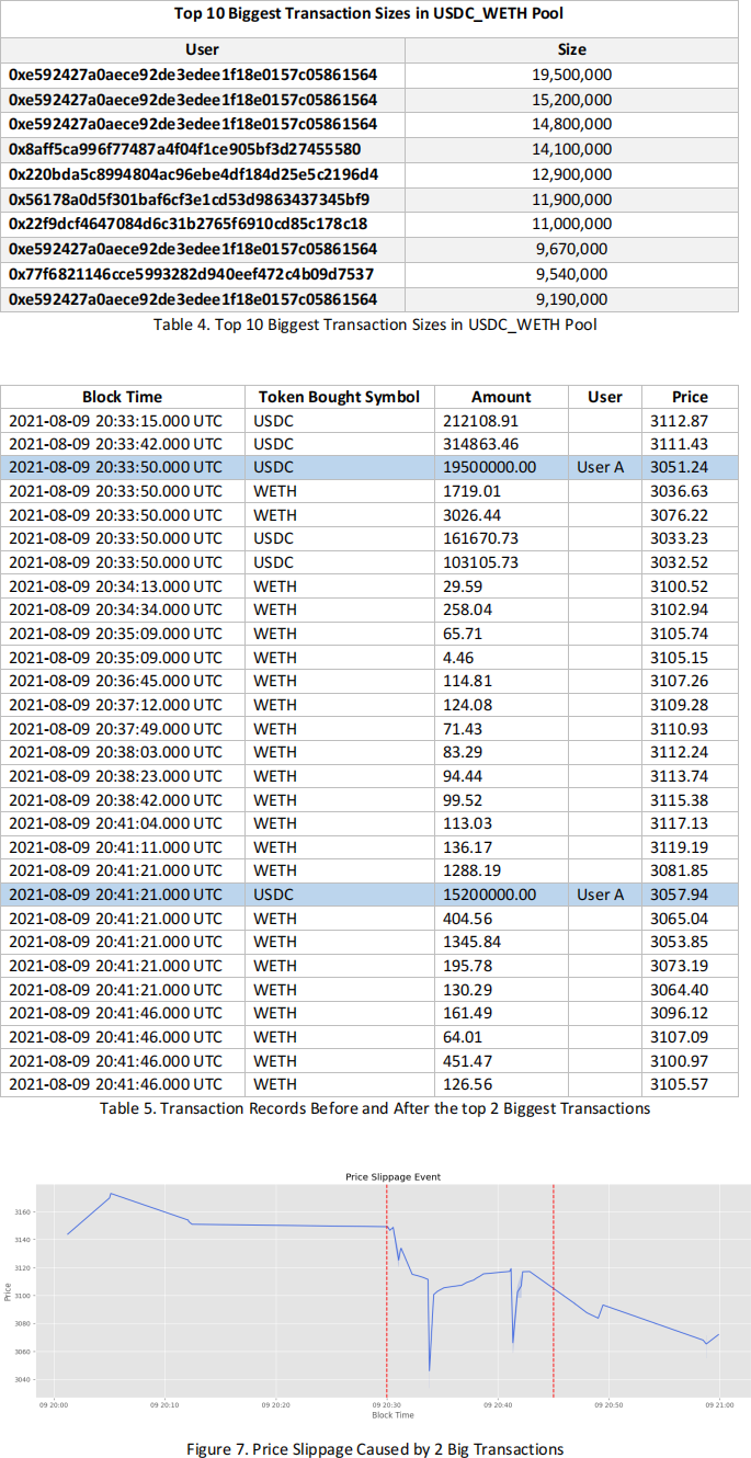
As we can see from the price movement, these two transactions had caused significant price slippage in the USDC_WETH pool. It’s also interesting that some users made a series of transactions right after these two big transactions seemed to rectify the impact of the price slippage. This phenomenon probably indicates that these users are taking advantage of the arbitrage opportunities caused by the price slippage.
Trading Times: Categorize traders based on their active trading periods.
Reaction to Market Changes: Analyze traders' reactions to market fluctuations.
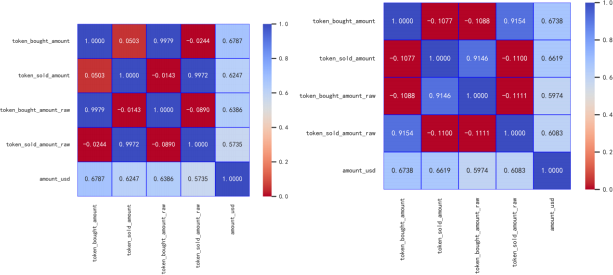
Correlation:
As we can see in the graph, the dark red block indicates that the two items are strongly not correlated; the light red block indicates that they’re basically not correlated; the light blue block indicates that they’re weakly correlated; and the dark blue block indicates that they’re strongly correlated.
Strongly correlated:
Weakly correlated:
normally not correlated:
Strongly not correlated:
Wbtc and usdc are different in some blocks.
IV. Expected Outcomes
Data Visualization of Top 5 Users with Most Transactions Using PaCMAP
In addition to the descriptive research of the top users with most transactions, we were also interested in analyzing the difference in transaction behavior between these top users. Therefore, we decided to analyze the behavior differences between the top 5 users in the USDC_WETH Pool by doing the visualization. Doing visualization is the most straightforward way given the fact that it can show some patterns caused by different users’ behaviors.
However, it is hard to visualize this USDC_WETH dataset since the dimension in this dataset is high. Therefore, we need to project the data into 2 dimensions by using some dimension reduction techniques. In this analysis, we used PaCMAP (Pairwise Controlled Manifold Approximation) as our dimension reduction algorithm given that it has some advantages over other algorithms like t-SNE and UMAP. For example, it is designed to preserve both global and local structure of the data. It also utilizes pairwise control, which helps to prevent the crowding problem.
We typically selected ‘ block_date’, ‘token_bought_symbol’, ‘token_sold_symbol’, ‘token_bought_amount’, ‘token_sold_amount’, ‘amount_usd’, ‘ price’, ‘tx_from’ and ‘tx_to’ (in total 9 dimensions) as the input variables. Before applying PaCMAP, we preprocessed the categorical data in the dataset (e.g., ‘block_date’, ‘token symbol’, etc.) to make the selected variables available for the algorithm. We also filtered out all the records of the top 5 users with the most transactions. After applying the PaCMAP, we used 2D scatter plot to visualize data that has been dimensionally reduced.
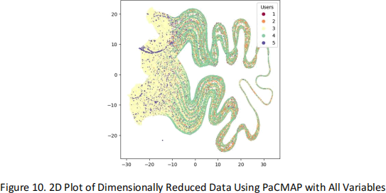
The figure above (Figure 10) is the 2D scatter plot of dimensionally reduced data using PaCMAP with all variables. For simplicity, we named the top 5 users with most transactions from 1 to 5. In this plot, we did not see a very clear pattern which suggests different behaviors from different users. We thought that the problem was caused by the inclusion of too many variables. For example, ‘token_bought_symbol’ and ‘token_sold_symbol’ are somewhat correlated. Also, the ‘token_sold_amount’ can be calculated using ‘token_bought_amount’ and the related price, so there is no need to include ‘token_sold_amount’ . In addition, ‘amount usd’ is highly correlated with ‘token_bought_amount’, which should be excluded as well.
Therefore, we only used four variables in the next plot, which are ‘ block_date', 'token_bought_symbol', 'token_bought_amount', 'price'. This time, the plot (Figure 11) shows a clearer pattern. We can see that the behavior of User 2 is very different from that of User 4. In addition, we can also see that there are two pairs in this plot, which are User 1/2 and User 3/4. It seems that User 2 dominated the upper left part of this plot, while User 1 overlaps User 2 a little bit. For User 3, it seems to be faraway from the pair of User ½ and occupies the lower left part. Besides, the behavior of User 4 shows some similarity to User 3. Other than that, User 4 has some unique behaviors given that the curved line shown on the right side of the plot.
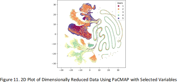
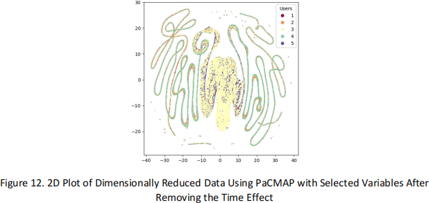
However, since all the users are extremely active in making transactions (since they are the top 5 users with the most transactions), including ‘block_date’ in the input data to do the dimension reduction does not help given that their ‘block_date’ overlaps a lot. As a result, the pattern could be indistinguishable. Therefore, we excluded the effect of time in our next plot, which is Figure 12.
The patterns in this plot are completely different from the previous plot. In this plot, we can see that the difference between User 3 and 4 is obvious. Again, the pattern of User 4 is a curved line. However, unlike the previous plot which may suggest similar behavior between User 3 and 4, this plot suggests an opposite conclusion since there is not much overlapping between these two users. Therefore, the similar behavior of these users interpreted from the previous plot may only contributed by the ‘block_date’ .
The patterns we identified from these plots are very interesting, it gives some insights of the similarities and differences of user’s behavior for further studies.
Discuss potential findings and their implications for understanding AMM trader behavior.
V. Future Work
Highlight areas for future research and potential improvements in methodology.
2023-07-25