COM1008: Web and Internet Technology
RESIT Summer 2021
COM1008: Web and Internet Technology
Lecturers: Steve Maddock and Andrew Stratton
The assignment is split into three parts:
● Part 1: Planning & Design document (15%)
● Part 2: The Website (70%)
● Part 3: Development & Testing document (15%)
Deadline: 3pm, Friday 6 August, 2021 Handin: zip file of all your documents via Blackboard.
1. Introduction
This assignment will test your ability to create a website using Mobile First Responsive Web Design. It will test your understanding of stages of creating a website, as well as your coding skills in HTML5, CSS, JavaScript and the Canvas.
This is an individual project. The work you submit must be your own work and not plagiarised.
2. The Website
You will develop a website for your own fictitious web design company. The following is a list of the requirements for this web site:
● It should have a home page that welcomes people to the website. This page should serve as what is commonly called the ‘splash page’ for the website and should say something positive about the company. This page should load quickly, and should be immediately intuitive, as well as being attractive. Invent a logo for your fictitious company. (Hint: This logo should appear on every page of your website.) It is your choice what to put on the home page, but whatever decision you make it should be part of your planning document.
● A page with details of the founders of the fictitious company. This should include photographs and short biographies for each person. Three people, including yourself, will suffice. All the information can be fictitious, so as to match the fictitious company you are creating. Consider carefully how you lay out images (photographs) in relation to surrounding text. (Note: You should make it clear that the profile information is fictitious by including a note to this effect on the page.)
● A news page about the fictitious company. This should have at least three fictitious news items. Each fictitious news item should be accompanied by a photograph. You should use CSS for typographic effects for the news stories. Be adventurous. Pay careful attention to which HTML5 semantic element it would be appropriate to use for news items.
● A separate page that demonstrates the JavaScript and Canvas work you do for com1008. The following interactive experience should be produced: a match-the-pairs game. Multiple copies of the same image (e.g. the company logo) should be displayed on the canvas as a 2D grid of images – a 4x4 grid of images, giving a total of 16 images, will suffice (see Figure 1 for an example). The images that are displayed can be image files (e.g. jpg or png) drawn using the Canvas command to draw an image or they can be drawn using any Canvas drawing commands that draw a line or a circle or a rectangle – a combination of these could make a simple logo. When the user clicks on an image in the grid of images (or clicks on the relevant grid tile containing the image), it is replaced by a phrase (e.g. ‘HTML5 compliant’, or ‘Promoting Responsive Web Design’) that describes some positive aspect of your fictitious company. The user then clicks on another image (grid tile) and it is also replaced by a phrase. If the two phrases match, then the phrases stay displayed on screen (see Figure 2). If the phrases do not match, then the images are redisplayed after a
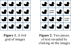
short delay. The game finishes when all the pairs of phrases are matched, so that no images are displayed. This page serves to demonstrate your fictitious company’s ability to create interactive graphical experiences on a web page. Through the text that is displayed they will also learn a little about the positive attributes of your fictitious company.
● A contact page, which includes the fictitious contact details of the company (e.g. address) and a form for users to send comments to you via your e-mail address. A user should input their e-mail address in a text box in the form and input their comments in another text area on the form. The form should also include a button, which, when clicked by the user, sends the contents of the two text areas to your company’s e-mail address. (Note: Since the contact details for the company are fictitious, the form should be sent to your University e-mail address.) Make sure the form is stylish – you are again demonstrating that your company can make a form look good.
● An accessibility page. On this page you should give the accessibility statement for your web site. (You may have addressed accessibility in a number of ways on your website and if so you should state that on this page.)
You must satisfy the following when constructing your website:
● The overall website design must be consistent.
● The website must be legible, e.g. is there good contrast between text and background?
● The website must take into account accessibility issues.
● The <head> element must include an element identifying the author(s).
● You must use the HTML5 semantic elements when structuring each webpage. These must then be styled in the relevant stylesheet(s).
● A responsive navigation area must be included for the Web site. What will be the words or phrases used as the links to each page? How will you deal with both a small mobile screen and a large desktop?
● Appearance must be controlled by the linked stylesheet(s), not by inline styles.
● Use of @media queries – are these used in a structured and controlled way?
● Economic use of properties in a stylesheet, where appropriate, e.g. margin a b c d, rather than setting the top, right, bottom and left margin separately
● Note: For the JavaScript Canvas demo page, you may need an extra stylesheet for any specific layouts you use on that page. You should consider these points as part of your design document.
● All source code should be well organised and neatly laid out, e.g. using indentation.
● You must include appropriate comments in your source code. As an example, a comment might describe the purpose and reasons for using a particular CSS rule or use of a particular HTML element rather than a different element. We will look at these comments carefully since the comment text will be unique to you and reflect your understanding. However, do not comment on simple pieces of source code where the meaning is obvious – use your common sense here. For the HTML file, remember to include a meta tag in the <head> element that states that you are the author. Also include comments to this effect in other files.
● Note: If you want to use videos on your website, then put them on youtube and just put a single image and a link to the youtube video on your web site. Do not include the video on the web site itself, as this will make it impossible to hand in the final work – see later.
3. Part 1: Planning & Design document
The Word or pdf document for this part should be between 500 and 1000 words long and may include as many images as you wish to use.
You must create a document that describes how you planned and designed the website using ‘Mobile First Responsive Web Design’ . This document should be completed before implementation starts. It should not include screenshots of your implementation.
(Note: Requirements are given in section 2 above, so you don’t need to write about this.)
You must include the following in separate headed sections:
● General ethos: A brief statement about the general ethos behind your design and why it suits the requirements.
● Site Map: draw the site map for your website and justify the structure. Don’t just describe the diagram. Reasons for its structure are more important.
● Accessibility: describe how you address accessibility issues on your website
● Legal issues: describe how you address issues such as copyright in relation to your website.
● Design mock-ups: You must use a mobile-first approach for the assignment. Create design mock-up diagrams that show, as a minimum, the mobile design and the desktop design. You could use wireframes for this, paint software (e.g. Photoshop) or hand-drawn sketches (that are then scanned in) to produce diagrams similar to the following examples:
○ The diagram labelled “The “extreme” versions of the new website design” at: https://www.smashingmagazine.com/2013/03/building-a-better-responsive-website/;
○ The diagram labelled “Normal, Narrow, Mobile” in the Overview section at: http://webdesignerwall.com/tutorials/respons ive-design-with-css3-media-queries/comment-page-1
● You must decide how many breakpoints to use in your design and write a short justification of this. (Note: the exact position of the breakpoints could be changed during the development stage and you may also add a few tweakpoints.) Justify your design decisions. (Note: You do not have to give designs for every page if some of the pages are very similar. Just say that page X is similar to page Y.)
● Menu System: A consideration of the menu system that is being used, e.g. consider http://responsivenavigation.net/index.html and http://bradfrost.com/blog/web/responsive-nav-patterns/ and https://cmd-t.webydo.com/from-simple-to-unusual-a-look-at-navigation-in-web-design-1057d0baef7b and give a justification for the menu system you decide to use.
● Canvas and JavaScript demo: A separate design should be given for this page. How will this work on the mobile version of the site? Will it work, or is it just for desktop users? Will it consider ‘accessibility’?
In discussing each of the above things, we expect you to justify your decisions using references to relevant websites. For example, the following website should be referred to: https://developers.google.com/webmasters/mobile-sites/. You should also find other sites to refer to. Assume you are using up-to-date browsers. Do not consider old browsers.
You should include plenty of diagrams in your document (and each figure should be numbered and have a caption), where the pictures can be general illustrations (e.g. a design hierarchy or a page layout diagram). Pictures can be hand-drawn and scanned in or can be produced using appropriate software tools. Your references list and words in diagrams do not count towards the word limit.
Surprise us with your own comments on different aspects of the process. The aim of this document is to make sure you have thought about the process of planning and designing a website and carried out the process in a structured way.
4. Part 2: The Website
The Website should include all the requirements given in Section 2 and should match your design document. If you make any changes to the design, these can be discussed in Part 3.
5. Part 3: Development & Testing document
The Word or pdf document for this part should be between 500 and 1000 words long and may include as many images as you wish to use.
The development and testing document should cover the following, each in headed sections:
● Changes: Has the design changed? If so, briefly describe the changes and why you made them.
● Organisation: Did you create templates for the HTML and CSS? If so, why, and how did you use them? How did you organise the file structure for the website? Discuss the debugging tools you have used. How did you organise the menu? Use of JavaScript? Discuss each of these points.
● Optimisation: Have you considered optimisations (e.g. image loading times)? Discuss this.
● Security: For the contact page, which contains a form for users to complete, discuss any security issues that you think are relevant and how you deal with these. Also discuss any other relevant security issues for your website.
● Debugging: Did you make use of html and css validators? What were the results? Can you explain them?
● Testing: Tests on different devices and different browsers – you only need to consider up-to-date versions of web browsers in your testing For the purposes of this assignment, it is acceptable to use emulation tools for testing (e.g. the Responsive Design Mode available in Firefox or Chrome’s Device Mode). You must consider accessibility testing and show the results of this.
(Note: I am not including ‘delivery’ as part of the assignment, since that is just handing the assignment in through Blackboard.)
You should include plenty of diagrams in your document (and each figure should be numbered and have a caption), where the pictures can be general illustrations, as well as screen shots from your own website (e.g. screen shots of tests on different devices). Your references list and words in diagrams do not count towards the word limit.
Surprise us with your own comments on different aspects of the process. The aim of this document is to make sure you have thought about the process of developing and testing a website and carried out the process in a structured way.
6. Handin via Blackboard (via Resit folder)
There are three separate parts to handin. All three parts should be put in a single zip file called name_com1008_resit.zip, where name is your name, e.g. JaneSmith_com1008_resit.zip. This zip file should contain the following:
● Part 1. The planning and design document. This should be a Word document called design.doc or a pdf document called design.pdf in a subfolder called documentation.
● Part 2. This is the website itself. The home page of the website must be index.html, so that it is easy for us to identify which file to load first. Make sure you include every file, including all relevant images. (Remember: using relative addresses on your website for the links between pages and resource files such as images is important so that the website can be easily copied onto a different server.) Do not include videos, as including these will create a large zip file, which will crash Blackboard – there is previous experience of this and it wasn’t pretty. If you want to use videos, then put them on youtube and just put a single image and a link to the youtube video on your web site.
● Part 3. The development and testing document. This should be a Word document called developandtest.doc or a pdf document called developandtest.pdf in a subfolder called documentation.
Remember to identify in each and every separate file that you wrote the code. When you have created the zip file, you should check that it has been created correctly by unzipping it again in a different folder on your computer and checking that the pages open and work. There have been cases in previous years where the zip file was corrupt or the file structure had been flattened. So please check your zip file is correct before you hand it in. Also, please check that the correct zip file has been uploaded to Blackboard.
7. Marking
7.1 Part 1 (15%)
You must include each of the things asked for in the above specification. Justifications should be given for each part, but these should be brief as there is a maximum word limit. Use diagrams to help explain things (as these do not count towards the word limit). The accompanying description should give reasons for choices, e.g. the discussion of the site map should not describe what the site map diagram already shows. Reasoning is more important. Justify accessibility statements by citing references. The design mock-ups should be neat and reasons for the breakpoint(s) (and, if used, tweakpoint(s)) given.
7.2 Part 2 (70%)
The majority of marks are for producing a website that fulfils all the requirements. Read them carefully.
● General (15%) – includes look & feel, RWD behaviour, content, use on different browsers;
● HTML and CSS (30%) – HTML includes comments, layout, content of <head> element, semantic elements, menu, validation; CSS includes organisation, layout, comments, economic use of properties, RWD, @media, validation;
● JavaScript and canvas demo (25%) – includes comments, layout, code structure and quality, completeness, creativity.
7.3 Part 3 (15%)
You must include each of the things asked for in the above specification. Justifications should be given for each part, but these should be brief as there is a maximum word limit. Use diagrams to help explain things (as these do not count towards the word limit).
8. Practical considerations
8.1 Unfair means
The standard Department rules for use of unfair means will be applied, as described in the undergraduate student handbook: https://sites.google.com/sheffield.ac.uk/comughandbook/general-information (Menu: General Information, Assessment)
We are aware that there are lots of HTML, CSS and JavaScript tutorial sites on the Web. Do not copy them, since that would be plagiarism. Instead, be inspired by them.
8.2 Late handin
Standard Department rules will be used for late handin – see: https://sites.google.com/sheffield.ac.uk/comughandbook/general-information (Menu: General Information, Assessment)
8.3 Code reuse
DO NOT USE Bootstrap or any other similar frameworks/libraries for creating web sites. You must use vanilla JavaScript.
You may reuse HTML, CSS and JavaScript code that we wrote that is given in lecture notes, as long as it is not code that is from another source that is being used to illustrate something – we may have used it to illustrate something, but you will not have permission to reuse it. If there is any doubt, assume you cannot reuse it.
If you are using CSS reset or normalize, you need to make sure you comply with the license for each of those and make clear that they are not your work. Include any attribution in the relevant files that you use.
8.4 Text editor
There are plenty of Web design tools available. The expectation for this assignment is that you will use a code editing environment to develop your website (e.g. Visual Studio Code or Notepad++ or similar). You might use more sophisticated tools to support your design process, but not to develop your code for you – typically, it is extremely obvious when one of these sophisticated tools has been used in code development as the files created contain lots of extraneous HTML and CSS, rather than only including what is required. As part of the deliverables you will have noted that we expect code that contains comments. These will demonstrate whether or not you understand the more complex bits of HTML, CSS and JavaScript that you have produced.
8.5 Relative links
Make sure you use relative URLs in your HTML code when referring to your own resources or to other files that you are developing – the reasons for this are explained in lectures. Links to relevant external URLs should still be given in full, e.g. http://www.w3.org/.
8.6 Keeping your work private
Your website should be developed on your own computer, not in a publicly-accessible folder. When your work has been marked and returned to you: you could copy your Web site to a publicly-accessible space and thus make it visible to the world, e.g. using GitHub Pages.
2021-07-28