STAT 5103 High Dimensional Data Analysis Assignment 2
Hello, dear friend, you can consult us at any time if you have any questions, add WeChat: daixieit
STAT 5103 High Dimensional Data Analysis
Assignment 2. (9 marks; 1 mark for each part of the problem) Submit your solution through blackboard. (Due: 25 February 2023, Saturday)
In package ggplot2 (you may have already installed this package as it is needed when you draw parallel coordinates plot), there is a data frame, called “diamonds” .
(a) What are the variables in “diamonds”? How many quantitative variables are
there? How many records are there? How many incomplete records are there? (Hint: To find the number of incomplete records, simply count the number of FALSE in complete.cases(diamonds).)
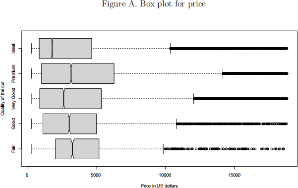
(b) Draw a box plot for “price” for different levels of “cut” as shown in Figure A.
The plot shows that the median price for ideal cut is significantly smaller than those for other quality levels of cut. Use table or graph to give an explanation for this unexpected phenomenon. (Hint: To draw box plot, add argument “hori- zontal=TRUE” to tell R to draw the plot horizontally. For explanation, consider variable “carat” .)
(c) Draw a scatterplot for x*y*z (in the x-axis) and “carat” (in the y-axis). Is there any interesting pattern in the data? Print the values of x, y, z and carat for the most extreme outlier (the carat of the outlier is 2). Use “quantile” command to find the five-number summary of the variable y for records with carat lying in [1.9, 2.1]. Do you think there is a typo mistake in this outlying record? If yes, what do you think is the true value of y?
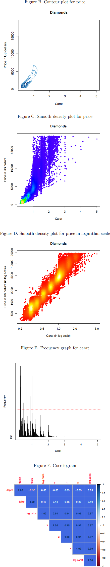
(d) Draw a density contour plot and a smooth density plot for “price” (in the y-axis) and “carat” (in the x-axis) as shown in Figures B and C respectively. Which plot would you recommend?
(e) Draw a smooth density plot for “price” and “carat” both in logarithm scale as
shown in Figure D. Instead of using topo.colors, use heat.colors in the plot. Does the plot show any pattern? (Hint: In the “densCols” command, you need to tell R to find the colors which encode the local densities of the logarithm of the variables. In the “plot” command, use the untransformed variables, and add an
argument “log=“xy”” .)
(f) Suppose (log(price)/ log(carat)) follow a bivariate normal distribution with mean
equal to the sample mean and variance matrix equal to the sample variance ma- trix. Use Prop. 2.19 to find Pr(price>carat s lU$10000). (Hint: price>carat s 10000 is equivalent to log(price) −log(carat) s log(10000). Use “pnorm” function to compute the distribution function of a normal random variable.)
(g) In Figure D, we find five hot spots (the yellow and white areas) in the graph. Use
‘table” command to create an object v for the frequency table of “carat” (do not print the large frequency table). Use the “plot” command to draw a frequency graph for “carat” . Use abline to add a horizontal red dashed line at frequency = 1000 (see Figure E). Find all values with frequency larger than 1000. Can you find any explanation for the five hot spots? (Hint: The “table” command outputs a table with all frequencies named by their values. To draw the plot, use “as.numeric(names(v))” where v is the table output, to get the corresponding numeric values for the frequencies, and use type=“h” to draw the vertical lines. Use “v[which(vs1000)]” to find values with frequency larger than 1000.)
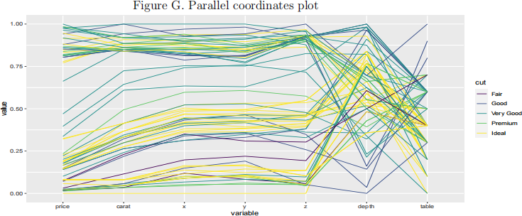
(h) Draw a correlogram for the correlation matrix of (depth,table,x, y, z, log(price),
log(carat)) as shown in Figure F. (Hint: Use “royalblue” as background color.)
(i) Draw the parallel coordinates plot in Figure G for the records with clarity = “IF”
and color = “D” . Is there any clustering pattern for the records with cut=“Ideal”? (Hint: You need to control the ordering of variables and select an appropriate value for the “scale” parameter (note that the y-axis is from 0 to 1).)
2023-02-27