Development Economics Problem Set 3
Hello, dear friend, you can consult us at any time if you have any questions, add WeChat: daixieit
Problem Set 3
Development Economics
Due: February 28
First, some quick questions, to get you warmed up
1. How quickly will a country, growing at 2% a year, double its income? What about a country growing at 4% per year? How would that compare with a country growing at alternating rates of 0% and 8% per year? (in other words, which country grew faster, a steady 4% per year, or the “unstable”growth country, after
20 years).
Please include your R code in addition to your answers.
2. Suppose a country’s per capita income is currently growing at 4% per year. Then it adds an additional percentage point to its population growth rate for the next twenty years, but overall income continues to grow at the same rate. How much poorer/richer would the country be at the end of twenty years (per capita)?
You don’t need to solve it out - just show us the equation. But the equation should not include the number“4”- you can simplify this problem.
Another iconic development article that we didn’t have time to discuss in class is Lucas, R. E. (1990). Why doesn’t capital flow from rich to poor countries?. The American Economic Review, 80(2), 92-96. The question that is raised in the paper is often called the “Lucas puzzle”. Briefly answer the following questions:
3. What does the simple economic theory predict? Shortly explain this prediction in your own words.
4. What counter example to the theory is given in the text? Can you think of a historical example for a time and place when the theory didn’t get it wrong?
5. Explain the first candidate answer Lucas raises for the question. (Hint:“ . . . each American or Canadian worker was estimated to be productive equivalent to about five Indians or Ghanians”). How does he refute this answer?
6. Choose another candidate answer from the next two in the text and briefly explain it, in your own words.
7. After reading this paper and hopefully thinking about this puzzle a bit, give your opinion - why doesn’t capital flow from rich to poor countries?
8. In the first problem set, you looked at the growth rates for one country. Now I want you to use the data to make slightly more complicated graphs. Specifically, I want you to make a graph that looks like the one on slide 30 of the problem set, reproduced below.
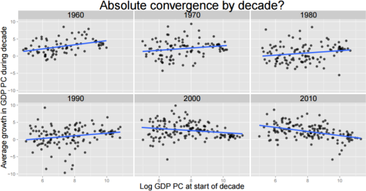
That is to say: a scatterplot for each time period and a best fit line, with labeled X and Y axis. Make one graph for GDP per Capita, just like the one above, and also make one for TFP (don’t use the PWT TFP measures, use the ones you calculated on the first problem set, but now calculate it for all countries. Since you didn’t start in 1960 for your problem set, your graphs don’t need to start in 1960 either. You don’t need to make exactly the same formatting choices for the graph - in fact you shouldn’t, since the one on the slides is hard to read in black and white.
This question is left intentionally vague. You may find yourself with lots of options at various steps, where the options seem pretty similar. You should do whatever you think is reasonable, but please write out what the various choices you made along the way were. You do not need to include your code, just a words-based description (and then of course you should include the graphs).
I am also intentionally not giving you instructions or hints for how to do this. There are lots of good resources online for ggplot2 help.
9. As we discussed in class, there are many different sources for per capita gdp. Another source of data is the World Development Indicators, also called the WDI. Plot the an equivalent of the decade-by-decade convergence pictures from the question above, but now for real gdp per capita from the WDI. Hopefully this is pretty easy, since your code should be straightforward to adapt to a new dataset. You should read question 11 before doing this question, since it will be more efficient to download more than out outcome at once.
10. There is a very famous view that there is a “middle income trap.” Does either dataset suggest that middle income countries are trapped?
11. The WDI has all sorts of interesting indicators about development beyond GDP. Pick one that you think is interesting, the main website is good for exploring which ones exist. Try to pick one that exists for lots of countries and for several decades. Make the convergence plot for this outcome too. What does the pattern look like?
2023-02-21