COMP0034 Coursework 1 Target Audience
Hello, dear friend, you can consult us at any time if you have any questions, add WeChat: daixieit
COMP0034 Coursework 1
Target Audience
0-1. Persona
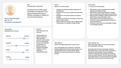
Target audience of the web app can be seen on the image above. Target audience is a middle-aged astrophysicist who is a tech enthusiast. Generally, he is introverted, active and thinking-focused. The persona is tech-savvy and uses far more software customisations than an average user. For example, using Linux and Android, rather than the alternatives. As an astrophysicist, he is very interested in meteorite landings and would love to find out more about them.
With this web-app, he should be able to conveniently get data about meteorite landings as well as gain insight into it. For this app to be successful, the target persona feels like web-app should have relevant updated data, functional UI and must be interactive.
Questions addressed by visualisations
1. Where each meteorite has landed?
2. When each meteorite has landed?
3. What is meteorite mass distribution?
4. What are the most popular meteorite classes?
Based on the target audience above, these are the most important questions to be considered. This web-app should contain all of the visualisations necessary to answer the questions above.
Explanation of visualisations
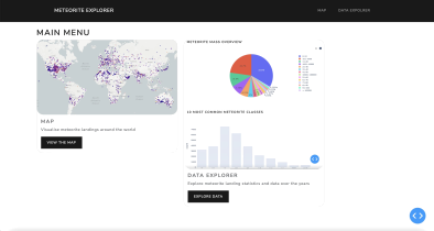
Visualisation 1 - Main menu
0-2. Map
This is the first page that user sees when they open the app. On the top navigation bar, there are 2 options available: Map and Data Explorer. On the left side there is a name of the web-app that redirects users back to the home page when clicked on. The right side contains links to the two apps. Same options are displayed on the page itself. Each of them is in a container that also has an image of the page it leads to, in order to create a better visual experience for the user.
Visualisation 2 - Map
0-3. Map
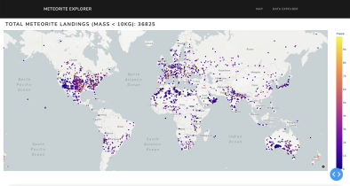
Visualisation on the first tab of multi-page-app shows the map of meteorite landings. The map is interactive and user can zoom in as well as change the area to display. Data about all meteorites from the dataset is displayed. Users can gain valuable information simply by interacting with the map. On the map only meteorites below 10 kg are displayed because there are very few over 10 kg and omitting them creates an overall better visual experience - the scale and colours are more accurate and users can gain more insight from them.
Visualisation 3 - Map Hover
0-4. Map
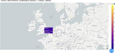
Upon hovering cursor on the map, user can see more detailed information about each meteorite, such as name, weight and coordinates.
Visualisation 4 - Pie chart
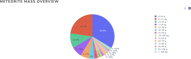
0-5. Map
On this pie chart, meteorite mass distribution data is visualised. The data is grouped for convenience and a better visualisation. Categories are displayed on the right side with different data ranges specified together with units in grams and kilograms. Each sector on the pie chart has a different colour for better visual appeal.
Visualisation 5 - Bar chart
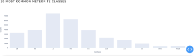
0-6. Map
On this bar chart, 10 most common meteorite classes are displayed in a form of a bar chart. Upon hover, user can see the precise numbers in each column. The chart is simple and intuitive and is not designed to be complicated.
Visualisation 6 - Data table
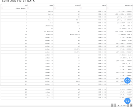
On this table, the users of the web-app can browse through data. There are 5 columns displayed: id, name, class, date and location of the meteorite. Sort and filter functions are supported on all of the columns. 30 rows of data are displayed at the same time and the user can select a different page. This is done in order to not overload the website and for user’s convenience. By default, the data is sorted by id, in ascending order.
References
2. https://dash.plotly.com/datatable/interactivity
3. https://dash.plotly.com/datatable/filtering
2023-02-07