ECON 4331W – Assignment 1 2023
Hello, dear friend, you can consult us at any time if you have any questions, add WeChat: daixieit
ECON 4331W – Assignment 1
(2023)
Data visualization of GDP data
We have discussed the evolution of material living standards over time and across countries. In this exercise,
you will do independent work on data on GDP per capita, a standard measure of living standards. You should submit a zipped-folder with your assignment. The zip folder be named First- Name_LastName_A1.zip. It should contain
● The script with your code, “FirstName_LastName_A1 .R”. Please read the content of the assignment for which questions you need to submit code in your R script.
● An .Rproj file called “FirstName_LastName_A1 .Rproj” (this will simply be a link to ensure that the grader sets it up in the right folder, see Chapter 8 in “R for Data Science”)
● A pdf file with the answers to all the exercises, “ FirstName_LastName_A1 .pdf.” This file should include written answers to each question (in English, no code) and/or the graphs that the exercise is asking you to generate.
You are responsible for naming your files appropriately, and that the code should run without errors. This includes having in your R script the library statements that load the packages you will be using.
The exercises use R. For instructions on how to get started with R, please refer to Section 1.4-1.6 in “R for Data Science”.
This exercise is a re-write of Chapter 3 in "R for Data Science" using other examples. If you are interested in the orignal resource, you can find it at http://r4ds.had.co.nz/data-visualisation.html
Introduction
“The simple graph has brought more information to the data analyst’s mind than any other device.” — John Tukey
This exercise will teach you how to visualize your data using ggplot2. R has several systems for making graphs, but ggplot2 is one of the most elegant and most versatile. The ggplot2 package implements the grammar of graphics, a coherent system for describing and building graphs. With ggplot2, you can do more faster by learning one system and applying it in many places.
If you’d like to learn more about the theoretical underpinnings of ggplot2 before you start, I’d recommend
reading “The Layered Grammar of Graphics”, http://vita.had.co.nz/papers/layered-grammar.pdf.
Prerequisites
The ggplot2 package is one of the packages in “tidyverse”, a collection of packages created by Hadley Wickman
to do data science in R. To load tidyverse, write
library(tidyverse)
That one line of code loads the core tidyverse; packages which you will use in almost every data analysis.
If you run this code and get the error message ‘there is no package called “tidyverse” ’, you’ll need to first
install it, then run library() once again.
install .packages("tidyverse")
library("tidyverse")
You only need to install a package once, but you need to reload it every time you start a new session.
First steps
Let’s use our first graph to answer a question: Do countries with higher income levels have a longer life expectancy than countries with low income levels? You probably already have an answer, but try to make your answer precise. What does the relationship between income levels and life expectancy look like? Is it positive? Negative? Linear? Nonlinear?
The Gapminder data
You can test your answer using data from Gapminder. Gapminder is a foundation that works on making data on development broadly accessible. Gapminder has data on GDP per capita data taken from the Penn World Table (PWT), the data source that we talked about in lectures.
R has a custom-designed package to access the Gapminder data on GDP per capita and life expectancy. Install the gapminder package as we did above and then load it by writing the following command: library("gapminder")
Loading this package gives us access to the gapminder data frame. A data frame is a rectangular collection of variables (in the columns) and observations (in the rows). gapminder contains observations collected by
the Gapminder on GDP per capita and life expectancy in a selection of countries for different years. Print the data frame by writing:
gapminder
|
## # A tibble: 1,704 x 6
|
|
|
|
|
## country continent year |
lifeExp |
pop |
gdpPercap |
|
## <fct> <fct> <int> |
<dbl> |
<int> |
<dbl> |
|
## 1 Afghanistan Asia 1952 |
28 .8 |
8425333 |
779 . |
|
## 2 Afghanistan Asia 1957 |
30 .3 |
9240934 |
821 . |
|
## 3 Afghanistan Asia 1962 |
32 .0 |
10267083 |
853 . |
|
## 4 Afghanistan Asia 1967 |
34 .0 |
11537966 |
836 . |
|
## 5 Afghanistan Asia 1972 |
36 .1 |
13079460 |
740 . |
|
## 6 Afghanistan Asia 1977 |
38 .4 |
14880372 |
786 . |
|
## 7 Afghanistan Asia 1982 |
39 .9 |
12881816 |
978 . |
|
## 8 Afghanistan Asia 1987 |
40 .8 |
13867957 |
852 . |
|
## 9 Afghanistan Asia 1992 |
41 .7 |
16317921 |
649 . |
|
## 10 Afghanistan Asia 1997 ## # . . . with 1,694 more rows |
41 .8 |
22227415 |
635 . |
To learn more about gapminder, open its help page by running ?gapminder.
In our exercise, we will start by focusing on the latest set of observations from 2007. To restrict attention to these observations, run the code
gapminder07 <- dplyr ::filter(gapminder, year == 2007)
In a later exercise, you will learn how the function “filter” works. For now, it is enough to know that the operation above creates a data frame “gapminder07” which contains all observations from 2007. Print the data frame in the console.
Creating a ggplot
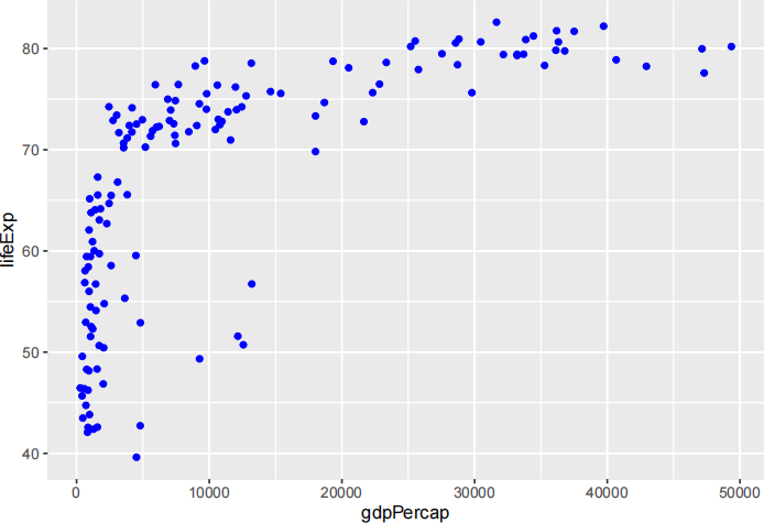
To plot gapminder, run this code to put gdpPercap on the x-axis and lifeExp on the y-axis:
ggplot(data = gapminder07) +
geom_point(mapping = aes (x = gdpPercap, y = lifeExp))
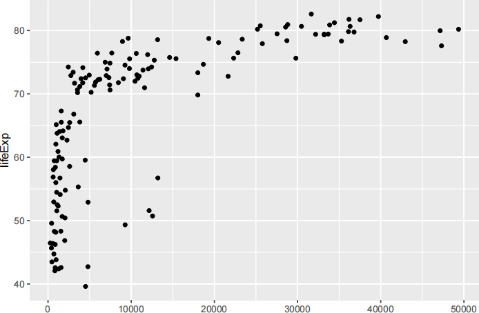
gdpPercap
The plot shows a positive relationship between country income level (gdpPercap) and life expectancy (lifeExp). In other words, countries with high incomes live longer, on average. Does this confirm or refute your hypothesis about income levels and life expectancy?
With ggplot2, you begin a plot with the function ggplot(). ggplot() creates a coordinate system that you can add layers to. The first argument of ggplot() is the dataset to use in the graph. So ggplot(data = gapminder07) creates an empty graph, but it’s not very interesting so I’m not going to show it here.
You complete your graph by adding one or more layers to ggplot(). The function geom_point() adds a layer of points to your plot, which creates a scatterplot. ggplot2 comes with many geom functions that each add a different type of layer to a plot. You can also add modifiers that change the axes, add labels, and many other useful things. The powerful property of ggplot2 lies in this possibility of building up charts step-by-step.
Each geom function in ggplot2 takes a mapping argument. This defines how variables in your dataset are mapped to visual properties. The mapping argument is always paired with aes(), and the x and y arguments of aes() specify which variables to map to the x and y axes. ggplot2 looks for the mapped variable in the data argument, in this case, gapminder07.
A graphing template
Let’s turn this code into a reusable template for making graphs with ggplot2. To make a graph, replace the bracketed sections in the code below with a dataset, a geom function, or a collection of mappings.
ggplot(data = ) +
<GEOM_FUNCTION>(mapping = aes (
The rest of this chapter will show you how to complete and extend this template to make different types of graphs. We will begin with the
In general, ggplot works by starting from plot and adding more components using the + sign. Thus, you could continue the code above using
ggplot(data = ) +
<GEOM_FUNCTION1>(mapping = aes (
<GEOM_FUNCTION2>(mapping = aes (
to add a new function. You will learn more about different functions you can add below.
Section 1 exercises:
1. (5 pts.) Run ggplot(data = gapminder07). What do you see and why?
2. (5 pts.) How many rows are in gapminder07? How many columns?
Aesthetic mappings
The plot above shows that people in rich countries, on average, live longer than people in poor countries. However, it tells us very little about which countries belong to different categories. For example, where
are the different continents on this graph? We saw in the data frame that it contains information about continents. How do we bring this information into the graph?
In ggplot2, you do this by adding an additional variable, like continent, to the two dimensional scatterplot by mapping it to an aesthetic. An aesthetic is a visual property of the objects in your plot. Aesthetics include things like the size, the shape, or the color of your points. You can display a point (like the one below) in different ways by changing the values of its aesthetic properties.
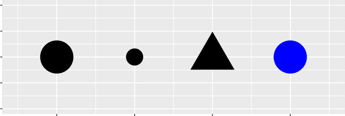
Figure 1:
Since we already use the word “value” to describe data, let’s use the word “level” to describe aesthetic properties. You can convey information about your data by mapping the aesthetics in your plot to the
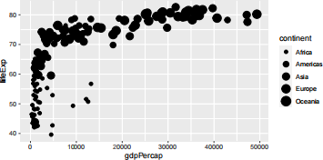
variables in your dataset. For example, you can map the colors of your points to the continent variable to reveal the continent of each country.
ggplot(data = gapminder07) +
geom_point(mapping = aes (x = gdpPercap, y = lifeExp, color = continent))
(If you prefer British English, you can use colour instead of color.)
Try it out in your code! Which continents are relatively rich and relatively poor? How does the variation look within different continents?
In general, to map an aesthetic to a variable, associate the name of the aesthetic to the name of the variable
inside aes(). In the example above, we used “color”, but there are other aesthetics such as shape and size that we can also map variables. Whenever we do so, ggplot2 will automatically assign a unique level of the aesthetic (here a unique color) to each unique value of the variable, a process known as scaling. In the case of continents, every unique continent (i.e., every unique level of the variable “continent”) is assigned to a unique color. Automatically, ggplot2 will also add a legend that explains which levels correspond to which values.
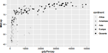
In the above example, we mapped continent to the color and aesthetics, but we could have mapped continent to the size aesthetic in the same way. In this case, the exact size of each point would reveal its continent. We get a warning here, because mapping an unordered variable (continent) to an ordered aesthetic (size) is not a good idea.
ggplot(data = gapminder07) +
geom_point(mapping = aes (x = gdpPercap, y = lifeExp, size = continent))
Or we could have mapped continent to the alpha aesthetic, which controls the transparency of the points, or the shape of the points.
# Left
ggplot(data = gapminder07) +
geom_point(mapping = aes (x = gdpPercap, y = lifeExp, alpha = continent))
For each aesthetic, you use aes() to associate the name of the aesthetic with a variable to display. The aes() function gathers together each of the aesthetic mappings used by a layer and passes them to the layer’s mapping argument. When we write x and y together with color and shape, we see get useful insight about the structure of graphs. The x and y locations of a point are themselves aesthetics, in the sense that they are visual properties (in this case, location), that can be related to the value of variables in your datasets. In that sense, x and y are similar to shape and color in that they are visual properties revealing something about the data.
Once you map an aesthetic, ggplot2 takes care of the rest. It selects a reasonable scale to use with the aesthetic, and it constructs a legend that explains the mapping between levels and values. For x and y
aesthetics, ggplot2 does not create a legend, but it creates an axis line with tick marks and a label. The axis
line acts as a legend; it explains the mapping between locations and values.
You can also set the aesthetic properties of your geom manually. For example, we can make all of the points in our plot blue:
ggplot(data = gapminder07) +
geom_point(mapping = aes (x = gdpPercap, y = lifeExp), color = "blue")
Here, the color doesn’t convey information about a variable, but only changes the appearance of the plot.
To set an aesthetic manually, set the aesthetic by name as an argument of your geom function; i.e. it goes outside of aes(). You’ll need to pick a level that makes sense for that aesthetic:
● The name of a color as a character string.
● The size of a point in mm.
● The shape of a point as a number.
Common problems
As you start to run R code, you’re likely to run into problems. Don’t worry — it happens to everyone. I have been writing R code for years, and every day I still write code that doesn’t work!
Start by carefully comparing the code that you’re running to the code in the book. R is extremely picky, and
a misplaced character can make all the difference. Make sure that every ( is matched with a ) and every " is paired with another ". Sometimes you’ll run the code and nothing happens. Check the left-hand of your console: if it’s a +, it means that R doesn’t think you’ve typed a complete expression and it’s waiting for you to finish it. In this case, it’s usually easy to start from scratch again by pressing ESCAPE to abort processing the current command.
One common problem when creating ggplot2 graphics is to put the + in the wrong place: it has to come at the end of the line, not the start. In other words, make sure you haven’t accidentally written code like this:
ggplot(data = gapminder07)
+ geom_point(mapping = aes (x = gdpPercap, y = lifeExp))
If you’re still stuck, try the help. You can get help about any R function by running ?function_name in the
console, or selecting the function name and pressing F1 in RStudio. Don’t worry if the help doesn’t seem that helpful - instead skip down to the examples and look for code that matches what you’re trying to do.
If that doesn’t help, carefully read the error message. Sometimes the answer will be buried there! But when you’re new to R, the answer might be in the error message but you don’t yet know how to understand it.
Another great tool is Google: try googling the error message, as it’s likely someone else has had the same problem, and has gotten help online.
Section 2 exercises
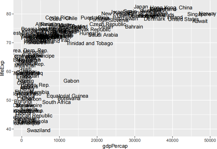
1. (15 pts.) Google the geom_text command and use this to plot the graph with country names instead of points, as below. Note that the GDP variable is very unevenly distributed across the horizontal axis. Use Google to find out how to convert the horizontal axis to a log-scale in ggplot2 (don’t forget to appropriately rename axis labels as well, and as always in economics, make sure to use the natural log function.)
Then, Google the geom_smooth command and use this to add a linear fitted line to this graph. After you have drawn the plot, write ggsave(“gapminder_filename.pdf”). This command saves the latest ggplot as a pdf. The file will go into your current working directory, which you can find by writing getwd(). Add a copy of your final plot in your write-up. Note: this applies to all questions where you are asked to create a graph or other type of output. Submit code in your R script for this question.
2. (5 pts.) Some countries are considerably below the line. Why do you think they are so much below? Try checking the Wikipedia of two of these countries and give an hypothesis.
3. (5 pts.) What does the following line of code do when added to ggplot? scale_x_continuous(trans = 'log ' , breaks = 1000* 2**(0:10))
4. (5 pts.) Google the “labs” command and use it to add informative x and y labels to your previous graph. Also use the “caption” argument in the labs command to add “Source: Gapminder” to the lower right corner of the graph. Submit code in your R script for this question.
Facets
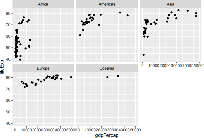
One way to add additional variables is with aesthetics. Another way, particularly useful for categorical variables (e.g., continent, poor vs rich, rather than numerical, GDP per capita, life expectancy), is to split your plot into facets, subplots that each display one subset of the data.
To facet your plot by a single variable, use facet_wrap(). The first argument of facet_wrap() should be a formula, which you create with ~ followed by a variable name (here “formula” is the name of a data structure in R, not a synonym for “equation”). The variable that you pass to facet_wrap() should be discrete.
ggplot(data = gapminder07) +
geom_point(mapping = aes (x = gdpPercap, y = lifeExp)) +
facet_wrap (~ continent, nrow = 2)
To facet your plot on the combination of two variables, add facet_grid() to your plot call. The first argument of facet_grid() is also a formula. This time the formula should contain two variable names
separated by a ~. To try this, we can create the Gapminder data with two different years, 1952 and 2007: gapminder5207 = dplyr ::filter(gapminder, year %in% c (1952 , 2007))
Then you can facet on two variables to create a two-by-two graphs.
ggplot(data = gapminder5207) +
geom_point(mapping = aes (x = log(gdpPercap), y = lifeExp)) +
scale_x_continuous(trans = 'log ' , breaks = 1000* 2**(0 :10)) +
facet_grid(year ~ continent)
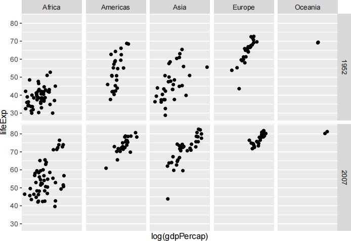
If you prefer to not facet in the rows or columns dimension, use a . instead of a variable name, e.g. + facet_grid( . ~ cyl).
Section 3 exercises
1. (5 pts.) What happens if you facet on a continuous variable and why?
2. (5 pts.) Try running the code below. What does . do?
ggplot(data = gapminder5207) +
geom_point(mapping = aes (x = gdpPercap, y = lifeExp)) +
scale_x_continuous(trans = 'log ' , breaks = 1000* 2**(0 :10)) +
facet_grid(year ~ .)
ggplot(data = gapminder5207) +
geom_point(mapping = aes (x = gdpPercap, y = lifeExp)) +
scale_x_continuous(trans = 'log ' , breaks = 1000* 2**(0 :10)) +
facet_grid( . ~ continent)
ggplot(data = gapminder5207) +
geom_point(mapping = aes (x = gdpPercap, y = lifeExp, color = factor(year))) +
scale_x_continuous(trans = 'log ' , breaks = 1000* 2**(0 :10)) +
facet_grid( . ~ continent)
2023-02-03